Cheap as in Computing

There’s a good case for an iPhone that costs less. But with this lower cost, developers fear that device specifications will suffer:

As someone who’s actively working on an iOS 7 update, I’m noticing a definite pattern emerging: we’re removing a lot of shadows, gradients, and transparency. A lot of views that were previously required to make an app look at home on iOS 6 are no longer needed.

The visual simplification of iOS has led directly to a simplified implementation. As every developer knows, the less work your app does on a mobile device, the better it performs. It’s a lot easier now to make an app that feels fluid and uses less CPU and GPU resources.

While everyone focuses on what Jony Ive has put on the screen, he’s also made the hardware under that screen able to do more with less. And yet again, Apple’s tight integration of hardware and software is going to kick everyone’s ass.

Updated August 14th, 2013: A lot of Twitter followers are saying, “But what about the live blurs? Aren’t those CPU/GPU intensive?”

Yes, they are. And you should also note that access to those features is strictly through private API. An iPhone 4 turns off blur, an iPhone 5C could do the same if necessary.

(If you look closely at the blur behind a toolbar, you notice that there’s some kind of sub-sampling of the screen image. Because this implementation is private, the algorithm could also be adapted for other devices.)

There’s also the question of all the new dynamics in the UI (like bouncy messages.) The highest costs in a GPU, both with computation and hardware components, is with dealing a lot of textures. The math for a physics engine is relatively easy to handle.

AMBER Alert Usability

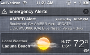
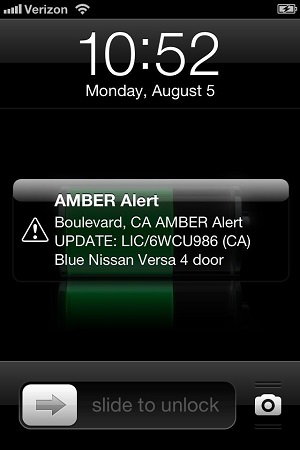
If you live in the State of California, you got an AMBER Alert last night just before 11 PM. If you have an iOS device, you saw something like this on your lock screen:

Or like this in Notification Center:

And if you’re like most people, you had no idea what it meant. Considering it’s a broadcast to locate missing children, that’s a bad thing. Let’s examine the usability of this alert and think about how this system can be improved.

Updated August 6th, 2013: Lex Friedman has written a great summary of AMBER Alerts at Macworld. Among the revelations: the text of the messages are limited to just 90 characters!

First Impressions

In our household, there are many iOS devices. At the time of the alert, we were in the living room with two iPads and an iPhone. The alert’s sound is designed to get your attention, and that it did!

Both my wife and I gave each other that “what the hell is wrong” look as I grabbed my iPhone from my pocket. Turns out we weren’t the only ones who were frightened by the sound:

My wife’s first question as I looked at my phone was “Are we having a tsunami?” (we’ve had these kind of emergency broadcasts before.) I replied with, “No, It’s an AMBER Alert”. To which she replied, “What’s that?”

And therein lies the first problem: I had no idea.

Unlike all other notifications on my iPhone, I couldn’t interact with the alert. There was no way to slide the icon for more information or tap on it in the Notification Center to get additional information. Through a combination of Google and my Twitter timeline, I eventually figured it out:

But I was also seeing a lot of people on Twitter whose response to the confusion was to ask how to turn the damn thing off. And since AMBER Alerts aren’t affected by the “Do Not Disturb” settings, a lot of people went to Settings > Notification Center so they wouldn’t get woken again in the future.

That’s exactly what you don’t want to happen when a child is abducted.

Alert Text

In looking at the message itself, it’s hard to tell what it’s about. Starting an alert with an acronym may make sense to the government, but there’s wording that could resonate much effectively with normal folks:

It’s also hard to tell if this is a problem with “Boulevard, CA” or a “Nissan Versa”. And where is Boulevard? And what does a Nissan Versa look like? Who do I call if I see license 6WCU986? In summary, this notification provides more questions than answers.

This one image has answers to all of these questions and more. Why can’t I see that image after tapping on the notification?

The Alert Sound

As I mentioned above, the sound definitely let us know that something was wrong. But we were sitting comfortably in our living room. A friend of mine was driving at the time and probably listening to music from their iPhone on a car stereo. Being startled at high speed is dangerous:

Unlike the devices that existed when the AMBER Alert system was first introduced in 1996, our iPhones and iPads do a lot more than calls and texts. Music and video are immersive activities and hearing a loud horn can be a cure that’s worse than the disease.

Also, we’re all conditioned to immediately look at our phone when the normal alert sounds are used: a simple ding would have gotten just as much attention.

Do Not Disturb

And what the heck is up with this crazy sound happening if Do Not Disturb is turned on? Dammit, it’s my phone and I get to tell it what to do. Stupid Apple!

Well, take a look at your government first:

And if you want the details, it’s only going to cost you $205 to download:

Bottom line: these bugs aren’t going to be easy fixes.

(And if you think getting woken up because of an AMBER Alert is such a terrible thing, why don’t you explain your pitiful situation to this boy’s parents.)

File A Radar

Even though these bugs probably aren’t Apple’s direct problem, I’m still going to file a bug report. If you have a developer account, please feel free to duplicate that Radar.

Apple is in a very unique position to address these issues:

  • It has direct access to millions of customers and their mobile devices.
  • It employs many people with a deep understanding of how mobile devices are affecting our lives.

This is clearly a problem where cooperation between Apple, the Department of Justice, and the public can improve a system where everyone benefits. Better usability with AMBER Alerts is case where “think of the children” isn’t a trite platitude.

The Origin of Tweet

Last week, one of my colleagues informed me that the word “tweet” was now included in the Oxford English Dictionary (see “Quiet announcement” at the end of the page.)

The noun and verb tweet (in the social-networking sense) has just been added to the OED. This breaks at least one OED rule, namely that a new word needs to be current for ten years before consideration for inclusion. But it seems to be catching on.

John Simpson
Chief Editor, Oxford English Dictionary

It’s not everyday that a word you helped create gets added to this prestigious publication, so I thought I’d share a bit of the early history of the word “tweet.”

In the early days of Twitter, the service used “twittering” as a verb and “twitter-ers” as a noun. The December 2006 newsletter is a great example of the lingo that was in use back then:

From: "Biz Stone"  
Date: Wed, 06 Dec 2006 07:51:31 +1100
Subject: Twitter Now Supports AIM and More

Hello Twitter-ers!

Things are really heating up at Twitter headquarters these days.  Last month, the number of Twitter users doubled and it looks like it's going to double again before we run out of December. We  thought the best way to react to all this positive activity would be to keep on making improvements. So come on by and check out  http://twitter.com!

…

That's it for now, Happy Twittering!
Biz Stone and The Twitter Team
http://twitter.com/biz

I started started using Twitter at the beginning of December. Like John Gruber and my colleagues at the Iconfactory, I loved our new “water cooler for the Internet.” I was, however, unhappy with using Twitter via the website or Dashboard widgets.

While taking a shower in the middle of December, an idea struck me: it wouldn’t be hard to hook up Twitter’s new API to the Cocoa networking classes and display a table with tweets. So I dried off and started prototyping: the next day I had the world’s first Twitter client running on my Mac.

A few days later, I checked all my code into our repository and Twitterrific was born:

r174 | craig | 2006-12-20 17:54:11 -0800 (Wed, 20 Dec 2006) | 1 line

Initial import

There was a problem, however.

As I started to implement the user interface, it was clear that nouns and verbs were needed. Menu items with labels like “Post a Twitter Update” were both wordy and boring. And as someone who loves language, using a phrase like “Refresh Twitterings” made the hairs on the back of my neck stand up.

So we started calling them “twits”; more as a placeholder than anything. Using the term in January 2007 felt just as awkward as it does today:

@Dan: my wife was using the Mac when your twit popped up, followed by “there’s a guy named Dan who’s looking for love”. Classic.

(Thanks to Jordan Kay at Twitter for digging that tweet up. Also, the “Dan” is Dan Benjamin—in those early days we hadn’t figured out screen names, and as far as I knew, there was only one Dan on Twitter!)

Luckily, things were about to change. On the 3rd of January, I checked in a temporary application icon. I always check in something crappy as an inspiration for the talented folks I work with:

r215 | craig | 2007-01-03 13:46:11 -0800 (Wed, 03 Jan 2007) | 1 line

Added a temporary application icon. Updated preferences panel (with quit and about info.) Tweaked on window size. Added expanded size to preferences. 

Less than 24 hours later, David Lanham sent me something much better.

I couldn’t check it in quickly enough:

r225 | craig | 2007-01-04 13:21:01 -0800 (Thu, 04 Jan 2007) | 2 lines

Added new app icon

We didn’t know it at the time, but this is also the moment when a bird became synonymous with Twitter. Prior to that point in time, Twitter’s only identity was a logotype.

Work was proceeding at a very fast pace during the first week of January 2007. Beta releases were frequent and widely distributed. Fortunately, the folks at Twitter were using our app with its snazzy new bird icon. One of our beta testers was an API engineer named Blaine Cook who sent me the following email:

From: "Blaine Cook" <[REDACTED]>
To: "Craig Hockenberry" <[REDACTED]>
Date: Thu, 11 Jan 2007 18:29:01 -0800
Subject: Twitterific

Hey Craig,

I work on Twitter with Jack, and just wanted to ping you re: Twitterific. First off, great work - I love it, and I think so does everyone else in the office! :-)

Two thoughts; first, how about changing "twit" to "tweet" - the "official noun" is "Twitter Update", but that's boring...? 

Second, I'm in the process of building a real (re: flickr-style) authentication API, so that you'll be able to obtain tokens for users without having to store their usernames and passwords. I don't want its pending release to stall your development or release date, since we will continue to support basic auth for existing clients, but would you be interested in beta-testing the api machinations? 

Thanks again for Twitterific!

blaine.

(In retrospect, this email is also the first hint that we spelled the app’s name wrong!)

It’s rare to have unanimous agreement when naming things in software, but in this case everyone loved the word “tweet”. I quickly updated both the app and the website:

r263 | craig | 2007-01-12 11:46:22 -0800 (Fri, 12 Jan 2007) | 1 line

Changed "twits" to "tweets". Removed auto launch of Twitterrific web page. Added link to Twitterrific web page in config window.
r2183 | craig | 2007-01-12 11:44:07 -0800 (Fri, 12 Jan 2007) | 1 line

Changed "twits" to "tweets"

And not a moment too soon! We released the first version of Twitterrific just three days later with the following copy on the product website:

About Twitterrific

Twitterrific is a fun little application that lets you both read and publish posts or “tweets” to the Twitter community website. The application’s user interface is clean, concise and designed to take up a minimum of real estate on your Mac’s desktop.

This is the first time “tweet” appeared on the Internet in reference to something you do on Twitter.

Our new app was a hit with users everywhere. We even got a mention in Twitter’s next newsletter:

From: "Biz Stone"  
Date: Wed, 17 Jan 2007 07:37:07 +1100
Subject: =Things Are Heating Up At Twitter

Hello Twitter-ers!

…

Continued Hotness: Twitterrific

The folks over at The Icon Factory have created a brilliant little application that lets you both read and post updates to Twitter. The application's user interface is clean, concise and designed to take up a minimum of real estate on your Mac's desktop. Twitter headquarters is sporting this little jobbie on every monitor in the house! Download it for free from The Icon Factory web site.

Twitterrific: http://iconfactory.com/software/twitterrific

…

Things are heating up!
-Biz Stone and The Twitter Team
http://twitter.com/biz

Unfortunately, the work I had done to expunge “twit” from our app was not complete: I had forgotten to remove it from some button tooltips. After the release of version 1.1 on January 25th, “twit” was gone for good.

Even though the use of the word “tweet” spread quickly, Twitter took awhile to embrace the new terminology. Even after several months, “twitter-ers” were still “twittering”.

As far as I know, the first time “tweet” appeared on Twitter’s site was when they referred to our product. (And yes, there was a point in time when the founder of Twitter would send us feature suggestions!)

Almost a year later, “tweet” was used on the company blog (but again, in a quote by a third party).

The word “tweet” didn’t appear unquoted on Twitter’s blog until June of 2008. Coincidentally, it was in reference to the WWDC where we won an Apple Design Award for Twitterrific!

It still feels strange to hear a word I helped create be mentioned over and over again in the media. It’s a great word to go along with a great service, and in the end, I’m just happy we’re not calling each other twits!

Addendum – July 13th, 2013

I dug around through my Twitter archive and came up with some interesting tweets that show how and when the first Twitter client came to be.

The first notion that Twitter didn’t belong solely on the web happened on December 5th, 2006 (a couple of weeks before the first check-in in the Twitterrific repository.) This line of thinking was inspired by a tweet John Gruber had posted about the Dashboard widget he was using:

Less than an hour later, I posted this:

A couple of days later, I started poking around with the new Twitter API:

(Note that in the early days of Twitter, the website was designed around @jack’s original idea of posting status messages. The user name was implied in the post, hence “Craig Hockenberry” “is experimenting”.)

By the 20th of December, I felt confident enough in the state of the project to go public (that’s also the day that the prototype code got checked into the repository):

At the Iconfactory, everyone gets a two week Christmas break. I’d rather code than shop :-)

Unlike many products, we knew the name of what we were building very early on:

And from this point on, I never posted from the website again:

Here’s the first tweet with a source parameter (that tells Twitter which client posted the tweet.) We worked with Twitter engineering to implement this, and for a long time Twitterrific was the only source besides “web”. Note that this happened just two days before the release!

Of course on January 14th, 2007, the release was announced on Twitter:
The First Apple Channel

Dear Tech Media,

While you’re looking for meaning in the shadows of an Apple press invite, you’re missing something important: Apple is producing content for its own distribution channel.

For the month of September, Apple is letting customers view live shows through a combination of apps, the web, and Apple TV. It’s the fourth year of the iTunes Festival in London, but this is the first year that it’s been broadcast via iTunes.

Why is this important? Let’s look at what this means for the various players involved:

Artists

As an app developer, I know what it’s like to be featured by Apple in one of its promotions. It sells a lot of product. And that, in turn, funds our creative efforts.

I’m sure the featured artists will gain fans as a result of their performances. I’ve watched a few shows and have already seen some bands that I’ll be keeping my eye on.

A lot of these artists are also probably working with Apple for the first time and getting a feel for what a more direct relationship with a distributor feels like.

Customers

As a customer, I’m all too familiar with the hassles and restrictions on digital content. It’s an eye opener to be able to play this content wherever and however I want. No crap, just good shows.

Tickets for the events are also free: seeing your favorite band in a small venue where all you have to buy are the drinks? Sign me up!

Apple has chosen the artists wisely. I couldn’t care less about some of the bands, but you should have seen my niece’s eyes light up when I told her that she could watch a free One Direction show on September 20th. Talk about keeping your customers happy!

Media Industry

The iTunes Festival shows everyone above what a world without a middle man would be like. We’re loving it: they’re fearing it.

Apple

You need an iTunes account to view these shows. If you didn’t have one already, you’ll certainly get one to see your favorite band.

The best viewing experience for these shows is on a $99 Apple TV. That’s less than the cost of a couple of tickets to see the big name acts. The drinks aren’t watered down, either.

It also sets a precedent for the future. Could this be akin to HBO creating premium content for it’s subscribers? Or Netflix producing its own shows to make it’s streaming service more desirable?

Apple first got its feet wet in the content business with music in iTunes. What we’re seeing here may be the company’s first effort in the video business.

Updated September 6th, 2012: I’ve heard from several sources that last year’s iTunes Festival was an iPad-only app (with AirPlay capabilities.) Apple has taken small, calculated steps with the Apple TV platform and this is another example of that approach.

Responding to App Store Reviews

When developers talk about wanting to respond to reviews, many of them haven’t thought through the social implications of what that means. Matt Gemmell has. As Marco Arment points out, replying publicly also leaves iTunes (more) open for abuse by unscrupulous or uninformed developers.

One idea I’ve had is giving developers the ability to add a support link to a review. This helps both the developer and customer in several ways:

  • The customer who reported the problem could be notified that a support link was added to their review and would be directed to a site which is designed to help them out. This could also lead to direct contact if there are other issues to be resolved.
  • Potential customers that are reading reviews can see how a developer responds to problems. If you come across a product with lots of support links, you know that’s a developer who cares about his customers.
  • Putting customer service front and center in iTunes makes it desirable for developers to create and maintain sites that provide helpful information. There are far too many products where the customer support link just goes to a product page that’s unhelpful.

Of course, restrictions would be needed to prevent abuse of these external links. For example, Apple could decide to only allow links to a developer’s support domain. There could also be limits on the number of support links a developer has at their disposal (like promotion codes, we would then use them judiciously.)

Finally, these thoughts only cover the information we exchange with the customers publicly. I still think there are cases where private contact via email is vital.