Or maybe you’ve been frustrated that you can’t add that code because you’re in the middle of debugging?
Yeah, me too. Many times.
The locations shown above, and many others, are available from Xcode using the xcrun simctl command. Every application on every device on every platform can be queried. But these lookups are difficult for developers because the information is structured around automatically generated GUIDs. The GUID you’re looking for changes every time a new OS is available, a device is added, or an application is installed. And we do that a lot!
There are other tools available to help you navigate the Simulator, but they all do much more than I really need and take up space in my menu bar even though they are used infrequently. Additionally, none of these tools help find the “On My iPhone/iPad” container used by the Files app: a folder that I use whenever I’m testing import and export code.
By now, you probably know where this is going: yes, I wrote my own utility and call it SimBuddy. It’s a FREE download from the Iconfactory.
SimBuddy uses two popup menus for navigation: the top one shows which devices are running in the Simulator and the one below shows all the applications installed on that device (your apps are listed first). Once you make a choice with those popups, you can use the buttons at the bottom of the window to navigate in the Finder. If you are using app group containers for sharing information between an extension/widget and your main app, you open those folders by selecting the ID and using “Open”.
If the Terminal is more your thing, you can hold down the option key while clicking a button and a path to the folder is put on the clipboard. Paste that into a command line and away you go!
It’s not a complicated app, as you can see from the source code, but it’s one that I’m very happy to have in my developer toolbox now. I hope you enjoy it, too!
P.S. I love putting Easter eggs in apps. This time it’s in the app icon.
Beginning with Xcode 14, the Simulators for watchOS and tvOS are available as separate downloads (iOS and macOS are still “built-in”). This reduces the app download size significantly, but it also means that you now have to manage these large (3-4 GB) components yourself.
When you launch Xcode 14 the first time, you are prompted to download additional platforms. Another prompt is displayed when you try to run a target for a platform without a runtime.
But what are these downloads and where are they stored?
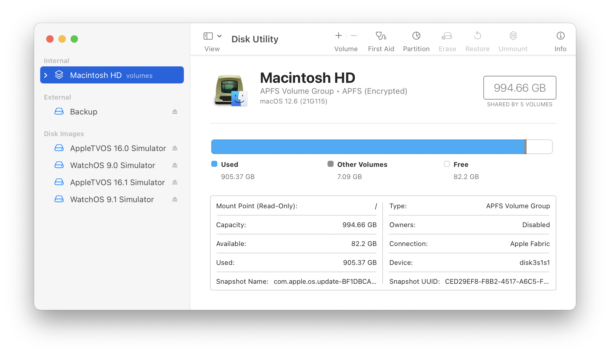
The first hint is when you look at Disk Utility. You’ll see a bunch of new “Simulator” volumes mounted under Disk Images:
Disk Utility showing four Simulator runtimes.
When you select these volumes, you’ll see that they all mount at /Library/Developer/CoreSimulator/Volumes. Within each volume you’ll find a legal PDF and a path to a .simruntime package in a Runtimes directory. This structure is the same as additional iOS runtimes in /Library/Developer/CoreSimulator/Profile/Runtimes. These .simruntime packages contain all the information needed to simulate the device.
Now that you know what Xcode is using, you’ll wonder where it’s getting the disk image. It’s located in a sibling directory: /Library/Developer/CoreSimulator/Images. That folder also contains an images.plist file that contains metadata for the disk images. There are only a handful of files there, but on my Mac they use 13 GB of disk space.
And up until a couple of hours ago, that folder contained 7 GB of data that was incompatible with the current version of Xcode. I had to delete these files manually. But how?
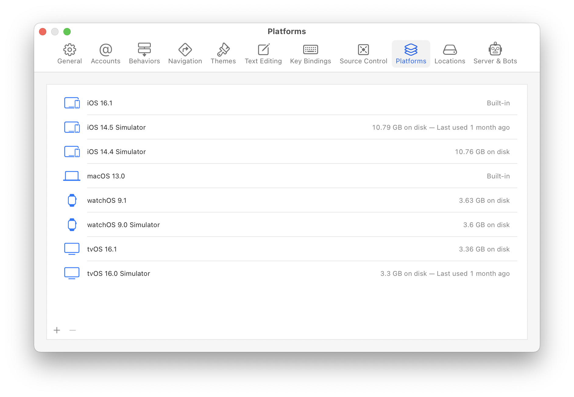
The simplest way to manage this space is using the new Platforms panel in Xcode preferences:
Xcode settings showing all built-in and downloaded Simulator runtimes.
This window also shows when you last used the runtime: in the screenshot above it’s clear that I can get rid of the iOS 14 and tvOS 16.0 runtimes and save about 25 GB of storage. It’s easy to get those runtimes back if needed, just press the + button. (After downloading a new runtime, it can be used in the Devices & Simulator windows to create a new test device.)
If the command line is more your thing, you can use xcrun to gather the same information:
$ xcrun simctl runtime list
Add a -v option there if you want more details (from the images.plist mentioned above). To delete any one of the items listed, use the listed GUID in this command:
$ xcrun simctl runtime delete <GUID>
In the end, this short post saved me 32 GB of disk space. If you’re developing for platforms other than the current iOS, you’ll likely see something similar. As time passes, you’ll need to manually keep an eye on this stuff: Xcode can’t clean things up for you because it has no idea what you need.
It’s been awhile since I’ve done one of these deep dives on what goes on behind the scenes during the development of an Iconfactory app. There’s a common thread to each one: I feel the need to document our work when there’s a major change in how we build user interfaces.
The first one was for the “flattening” of Twitterrific 5, a task that preceded Apple’s work in iOS 7 by six months. The next one was for Flare 2, when the Aqua face of macOS began a dramatic evolution in Yosemite.
With Wallaroo, there’s another major change that may not be noticeable on the surface: it’s the Iconfactory’s first app written completely in SwiftUI.
A Discovery
It all started while I was working on Shortcuts support in Tot. During March of this year, I noticed that there was an action to “Set Wallpaper”. I also learned how Shortcuts could be downloaded, installed, and managed using a URLs.
The Iconfactory has been making wallpaper images since the dawn of time, but it never made sense to make an app because changing your wallpaper was a manual task. Shortcuts radically changed this calculus and the idea for an app was born. I threw together a quick prototype that let you set two wallpapers. Sean and I had the beginnings of Wallaroo.
Our wallpaper prototype became one of those “we’ll do it some day” projects. Then something important happened: WWDC 2022. After Lock and Home Screen customization was announced, the idea immediately became a “we need to do this before September!” project.
Time is Tight
We built Wallaroo from scratch in a little over two months.
The project started with a couple of wrinkles: the “Set Wallpaper” action didn’t work with the new features on iOS 16, so we filed FB10377111 on June 6th (a couple of hours after the keynote ended). We placed our faith in the abilities of the Shortcuts team and decided to carry on in spite of this setback. (We wish everyone at Apple wrote release notes like they do!)
The other wrinkle was that we all had work-in-progress that needed to be finished up. We knew that the short timeframe meant that this was an “all hands on deck” situation, so it wasn’t until the end of June before we all freed up. We put the prototype on TestFlight and got to work.
Divide and Conquer
There were three major areas where we focused our attention:
Content – Hundreds of wallpapers had been created over the years, but resolution and aspect ratio varied widely. Things needed to be cleaned up.
Backend – Over years, we had done releases in an ad-hoc manner: uploading ZIP files to a Patreon account would no longer be acceptable. We needed a server to manage the wallpapers.
Frontend – An app to display the wallpapers: it had to look and work great. Sexy and fast were primary design goals.
Ged, Anthony, Dave, and Talos immediately got to work on the first bullet, but without a backend server, there was no place to put files and metadata. So we made a Numbers spreadsheet and shared it in Dropbox along with the source images. Our Slack channel for the project was filled with “I’m going in” and “I’m out!” to avoid write conflicts. (S.W.A.T. = Software Write Avoidance Technique)
I was responsible for the development of the backend. Importing a spreadsheet CSV file gave us our initial database and images in Dropbox let me manually generate thumbnails and other content that would be needed in the app.
Sean took the lead on the app. We’ve been holding back on SwiftUI due to its immaturity, but the changes in iOS 16 looked great, so we went all in (the only UIKit/AppKit code is in delegate connectors). The data in the spreadsheet was massaged again to give him some real data to use.
Talos took the lead on the app architecture and the wireframe was finished on July 5th. A week later we had enough working code to make a Git repository. A few days later Sean showed us his Captain Pike Appreciation App:
We were on our way, but had less than two months before an iPhone announcement. Time to kick butt.
Butt Kicking
July was a blur. Progress was quick and everyone was heads down on their app responsibilities.
Remember that bug in Shortcuts that prevented Set Wallpaper from working in iOS 16? It was still around and we were starting to get worried. When iOS 16 beta 5 dropped on August 8th, we rejoiced when our test ran. The shortcut action worked perfectly!
Our last update to the shared spreadsheet was on August 10th. From that point on, we were able to use our new content management system to add and update wallpaper. There was still a ton of work needed to clean up metadata and fine tune each wallpaper release.
With the new server up and running, we started testing push notifications. Since Sean’s focus was still in the primary user interface, I started working on the SwiftUI views and models that talked to our backend server. That work continued with integrating the Patreon API and hooking up StoreKit2 for subscriptions. I also had a blast doing the User License and Credits screens.
We started our first beta test with Patreon supporters on August 25th. We were going to make the mid-September release date!
SwiftUI FTW
Looking back on the development, I think there were two things working in our favor: experience and SwiftUI.
We’ve made a lot of apps and have an instinctual knowledge on how to build them. But no matter how little friction there is in working together, you still have to put the pieces together.
SwiftUI is incredibly good at doing that.
Keep in mind that neither Sean or I had created a full-fledged app using SwiftUI (widgets don’t count). We had to learn the idioms and best practices, but once that was overcome, development happened at a lightning pace.
We encountered roadblocks, of course. Tracking down memory leaks was harder than UIKit because of the abstractions. Figuring out how to share an image was a hugehead scratcher. Implementing parallax in a ScrollView was many days of hard work. And you should see the comments in our PagingView!
But overall, the experience was extremely positive. If you’ve been on the fence with this technology, iOS 16 feels like a turning point in SwiftUI’s evolution.
Give It a Go!
Now that you’ve read about how we made it, take Wallaroo for a spin. It’s a FREE download and a fun little app for iOS 16. And a great example of what you can do with SwiftUI.
Where there’s smoke, there’s fire. And as we approach WWDC 2022, there’s a lot of smoke around AR and VR. In some ways, this is going to be a huge inflection point, in other ways, it’s probably going to be a letdown.
Remember when the iPod was announced? Some folks called it lame because it didn’t meet their expectations.
The same thing will be true of anything Apple wants us to put on our face. It’s going to less impressive technically than any of the currently shipping products. And that’s good, because you don’t make fundamental changes by tweaking existing technologies. A Nomad audio player was a tweak. An Oculus headset is a tweak.
Everything we’ve seen to date with VR has been an attempt to bring information to a 3D world. Headsets are just a means to project that 3D environment so our eyes can see it.
I think Apple’s approach with AR will be completely different: they will bring 3D to an information world.
We all have the greatest source of information humankind has ever known in our pocket or purse. Much of that information relates to the world around us: weather, transportation, shopping, dining, etc. Relating that data to our physical space will be a powerful tool.
All the AR examples we’ve seen on Apple’s devices hint at this direction. They take the information on our phone and place it at derived 3D coordinates. Where people get tripped up in these demos is where the results are shown: on a standard screen.
I don’t think that’s Apple’s final goal, because any current screen technology will block your view of the real world. It’s also why I think 3D headsets will remain a niche technology: people have innate need to see what’s going on around them.
Our current screens also use a lot of power. And that means batteries. And that means weight. Not what I want on my face, for sure.
Apple knows this and that’s why I think a new display system is the thing they’re taking time to get right. We may or may not see this new display at WWDC. I can remember a time when all we had for an iPad was a simulator.
The changes caused by a new display will be incremental. There will certainly be technical limitations in the product that are imposed by size and weight: Apple will improve on those things as components allow.
Other changes will happen because no one, including Apple, really knows how this display will be used by normal folks (we, I should note, are not normal folks). The first Apple Watch tried to do a lot of things: iteration got rid of things no one used, and improved the things everyone wanted.
It’s likely that a first iteration will also be a “satellite device” where the iPhone does the heavy lifting. Much like the original iPod relied on a Mac. The realityOS could be nothing more than widgets for a new display on your face.
That will feel lame until you realize something else: after two decades, the basic form factor and functionality of that first iPod is now an essential part of our lives and we call it an iPhone. Don’t underestimate Apple’s ability to iterate.
This past summer we narrowly avoided a major user interface regression on Apple devices. The story ended well, but I think it’s important to look back on the situation and ask a simple question:
Why did this happen in the first place?
My answer is something I call “consistency sin”. Understanding the cause lets us avoid similar situations in the future.
Your first reaction to this nomenclature may be, “Isn’t consistency a good thing in user interfaces?”
Absolutely! Colors, fonts, and other assets should be similar within an app. Combined they help give the user a sense of place and act as a guide through an interface. And in many, cases these similarities should be maintained across platforms. There’s no sin there.
But you can get into trouble when this consistency starts to affect the user experience.
Design is not how it looks, it’s how it works.
Steve Jobs said a lot of smart things, but I use this advice most often.
The roots of consistency sin take hold when folks disregard the inherent differences between platforms. A greater importance is placed on making sure things match visually: how a person uses that design takes a back seat.
Platform controls and interface elements can differ at a fundamental level. The mouse is optimized for indirect interaction while a screen is optimized for direct interaction.
For the most part, developers are shielded from these details through the use of standard components that conform to the Human Interface Guidelines.
Enter Safari
Higher level interactions are driven by the type and quantity of information the user is working with.
To use Safari as an example, I can have hundreds of tabs open while I work on my Mac; on iOS it’s usually less than a dozen. Safari on iOS is also a full screen experience, while multiple windows and interactions with other applications are common on macOS.
Safari’s new tab design on iOS works great for me: swiping between tabs of fullscreen content is a better interaction for a limited number of pages. The grid of pages as a fallback for selection also works well for managing what I want to keep around.
The consistency sin in Safari was to come up with a good design for iOS and assume that it would also work well on iPadOS and macOS. It practice, these new tabs were difficult to use in a different work environment.
Luckily the folks working on Safari did the smartest thing possible: they listened to feedback and fixed the issues before shipping. That’s an important thing for a product that every Apple customer uses every day on every device.
It’s one thing to make a mistake, it’s a wholly different thing to deny that anything’s wrong. So let’s take a look at another example.
Notifications, Too
Notifications also suffer from consistency sin.
I look at my iPhone Lock Screen dozens of times each day, and sometimes just to just view a reminder or some other short notification. It’s quick, simple, and minimizes distractions.
On my Mac I see the Lock Screen only once or twice per day for just a few seconds as I enter a password. That means notifications occur while I’m actively working.
Again, consistency sin looks for a single solution that ignores my needs. On macOS I don’t want a minimal solution that is suitable for a mobile device. I want options that let me quickly dismiss or defer an item that’s interrupting my work. (And I certainly don’t want to hunt around in the window for a hidden control that lets me access a function.)
Placement is also an issue: on iOS controls tend toward the bottom of the screen (for reachability). The opposite is true on macOS where they tend toward the top of the screen so they’re closer to the menu bar and window controls. Consistency sin says that notifications should always be at the top of the screen.
With iOS, there’s a nice visual and functional separation between app interactions in the lower half of the screen and notifications in the upper half. On the Mac, notifications are just another thing fighting for real estate at the top of the screen.
We’ve Only Just Begun
The bad news is that we’re likely to have more consistency sin in our future, thanks to Electron and other cross platform frameworks.
While development teams try to attain feature parity, experience parity will suffer. Everyone who’s used an iOS app and immediately thought “this is a web page” will know what that means.
There is a long history of user interface frameworks that make work easier for a product team. Every time, these solutions end up being a least common denominator that makes it more difficult for customers. Don’t be surprised when they complain: as they did for Safari, and as they do for Notifications.
If you’re a designer or developer, it’s your job to push back on the notion of consistency when it begins to affect a user’s experience. Remember design is how it works, and work is not the same on every device.
