Confidence

We witnessed something amazing yesterday: a WWDC keynote that will be remembered for a long time. And not for the reason you might expect.

As developers, it’s easy to focus on the fantastic software that was announced: a UI refresh that’s getting a thumbs up from designers and developers alike, great new user-facing features in iOS and OS X, and literally thousands of new APIs that let developers do new and amazing things with their apps. We even got a new programming language!

**BLINK**

But that all pales in comparison to the undercurrent for all these changes: Apple has a newfound confidence in itself. It’s at the top of its game, and it knows it.

This is personified by the man who ran the show: Craig Federighi. It was only four years ago that we first saw him on stage at an Apple event. His shaking hand is still painful to watch, especially if you’ve felt that same fear while giving a presentation on stage. Yesterday, we saw a different man, one that owned the stage and the products being presented.

With this confidence, we’re starting to see some important cultural change in the company.

  • Legal agreements that lets developers talk about technologies without breaking confidentiality.
  • Opening up proprietary technologies like iCloud: providing more transparent access, without hiding things through opaque APIs.
  • Improvements to the App Store that give developers better ways to manage and sell their products.

This confidence manifests itself in many ways. When was the last time you heard an Apple executive tout the best product line he’s seen in 25 years?

In short, with confidence comes a new kind of openness. As developers, we’ve always struggled with a company that doesn’t want to give anything away. Yesterday, that started to change.

At

I recently appeared with John Gruber on The Talk Show. During the episode, the following exchange took place:

When it comes to naming characters, the Unicode standard is the bible. And code point U+0040 is named as “COMMERCIAL AT”.

So yeah, we’re “right.”

But then Twitter got ahold of this exchange and I quickly realized something important: we don’t all speak English:

It turns out “arroba” has a very interesting history that originated in Spanish commerce:

“Whatever the origin of the @ symbol, the history of its usage is more well-known: it has long been used in Spanish and Portuguese as an abbreviation of arroba, a unit of weight equivalent to 25 pounds, and derived from the Arabic expression of “a quarter” (الربع pronounced ar-rubʿ)”

As someone who loves iconography, it’s pretty amazing to see @ as a handwritten symbol in 1148:

I also realized that I knew the Italian word for the @ symbol: “chiocciola”. It’s one of the names for a snail (the other being “lumaca” which is commonly used when ordering them in a restaurant.)

And why is this name used?

(It’s fun to say, too. Something like “key-o-cho-la” but with more exotic hand gestures.)

This tweet led to many responses that show how varied the pronunciations are in different languages.

  • Dutch: “apenstaartje” = “monkey tail”
  • Hebrew: “strudel” = shape of the cake
  • Danish/Swedish: “snabel-a” = “with an (elephant) trunk”
  • German: “Klammeraffe” = “spider monkey”
  • Poland: “małpa” = “monkey”
  • Korean: “골뱅이” (gol-baeng-ee) = “a type of sea snail”

Wikipedia has a full list of how @ is used in other languages.

But do you notice the pattern with these pronunciations?

They’re being used as pictograms:

“A pictogram…, is an ideogram that conveys its meaning through its pictorial resemblance to a physical object. Pictographs are often used in writing and graphic systems in which the characters are to a considerable extent pictorial in appearance.”

While pictograms are fairly common in Asian languages, it’s rare to see this kind of usage in the West. Written Kanji characters, such as 木 for “tree”, have been in use since the first century AD. Indeed, these kinds pictures were man’s first form of expression and communication.

But in these writing systems, someone saw a thing with a trunk and leaves growing from the ground and put it on a piece of paper as an 木 symbol. What we’ve seen happen with the @ symbol is the opposite. Many different cultures have seen our “COMMERCIAL AT” symbol and given it a name based on its appearance.

So even though John and I are right about the pronunciation, this is certainly a case where English pales when compared with other languages. I envy my colleagues that get to play with snails and monkeys while coding in Objective-C!

Wearing Apple

Tim Cook has openly stated that Apple is working on “new product” categories. Many people, customers and competitors alike, assume that means some kind of wearable computing device. And of course that means it has to be some kind of “smartwatch”, right?

I don’t think so.

The Market

First, let’s look at the market for quality timepieces; ones that you’d be proud to wear on your wrist. It’s dominated by companies with centuries of experience. It’s also a high-end market: spending a few thousand dollars on a nice watch is chump change. You’re buying a work of art.

Apple certainly has great designers, but they’re going to be competing against craftsmen who’ve been refining their craft since the 15th century.

I realize that this sounds a lot like Ed Colligan talking about mobile phones:

“PC guys are not going to just figure this out. They’re not going to just walk in.”

There’s a big difference here: the companies that dominated the music player and mobile phone markets were making complete crap prior to Apple’s arrival. Granted, there are a lot of cheap and crappy watches on the market, but they’re not remotely interesting to the demographic that buys Apple products. And to many people, a fine timepiece is more about status than technology.

Taking all of this into consideration, watches don’t sound like product category that fits Apple well. One of the many reasons we love their products is because they are best of breed.

The Watch

Now, let’s look at the state of the “smartwatch” market. Smart companies, like Nike and FitBit, are creating products that aren’t really a “watch”. It’s like the “phone” being the least interesting thing on our “smartphone”.

In fact, Tim Cook is already wearing one of these devices:

Walt: Is wearables a thing — is it part of the post-PC era wearables that go beyond fitness devices?

Tim: Yes, I think so. I wear a Fuelband, I think Nike did a great job.

Note: This quote, and others in this piece, were made during Tim Cook’s interview at D11.

However, once manufacturers try to put a lot of smarts in a watch, they end up with a product that’s a bulky mess or ugly as sin. Probably both.

Again, Tim Cook has noticed this same thing:

“There are lots of gadgets in the space. I would say that the ones that are doing more than one thing, there’s nothing great out there that I’ve seen. Nothing that’s going to convince a kid that’s never worn glasses or a band or a watch or whatever to wear one. At least I haven’t seen it. So there’s lots of things to solve in this space.”

We all know that Apple’s designers and developers can solve these problems. But can they do it without making compromises?

“It’s an area that’s ripe for exploration, it’s ripe for us to get excited about. Lots of companies will play in this space.”

That exploration is all about saying no a thousand times. It’s easy to create a great looking concept, but turning that fantasy into a product is where it gets hard and compromises are often made.

It’s my view that the technology needed to make that great product that does everything just isn’t there yet. There are too many compromises.

The New Hub

Let’s assume for a second that you can make a compelling device for a wrist. I’d still be asking myself this question: “Why do I need a computer on my wrist?” I already have one in my pocket.

With the introduction of CarPlay, Apple’s answer to this question is becoming clearer. That device in your pocket is the new hub for your digital data. Ben Thompson calls it Digital Hub 2.0.

You don’t need a computer on your wrist. Apple’s wearable devices will become a part of this circle that surrounds your main device. And as with CarPlay, it’s going to be a two-way street where interactions and information in the player make their way back to the main device.

The Fashion

The development of wearable technology is going to enter a space where most companies in the Silicon Valley have no experience. As a geek, do you know who Anna Wintour is and why she would be important to the success of a wearable device?

Angela Arhendts certainly does…

Put aside your geek sensibilities for a second and think about this device as a piece of fashion instead of a cool gadget. What’s the primary function of fashion?

It’s about expressing a personal style. It’s an extension of your personality and way to show it in a public way.

Look at the huge variety of iPhone cases that are on the market. That’s only 16 examples of 4.7 million search results. Fashion is as diverse as the people who wear it.

An important part of this diversity is customer’s gender: men have different tastes than women. That concept watch mentioned above looks fantastic—if you’re a male. I can’t imagine my wife wearing it.

Then there’s the question of size: as someone who’s 6’7″ tall, I know firsthand that “one size fits all” is the greatest lie ever told by clothing manufacturers. Since everyone’s body is unique, wearable devices must also consider comfort and fit in the design.

Apple may be able to use something like an iPhone case to make a wearable device appeal to both sexes. Or adjustments that make a single device (SKU) adapt to multiple body shapes. But I suspect that it’s going to take more than that to be appealing as a piece of fashion.

The Customer

Now that we’ve looked at the challenges in developing these devices, let’s think about the most important question Apple is asking itself:

Who is going to buy this wearable technology?

Trends are always set by the younger generation. Especially with clothing, jewelry and other items that appeal to a demographic with a lot of expendable income. To me, this quote by Tim Cook is the most telling:

“To convince people they have to wear something, it has to be incredible. If we asked a room of 20-year olds to stand up if they’re wearing a watch, I don’t think anyone would stand up.”

This response to Kara Swisher’s question about Apple’s interests in wearable technology covers all the bases. It includes the target market (“20-year-olds”), product focus (“has to be incredible”), and most importantly, he’s seeing the same thing I am: people don’t need to wear watches because they already have that computer in their pocket.

Note also that in the response he doesn’t say “wear a watch”, it’s “wear something”. It’s implied, but not stated. Remember that he learned from the master of misdirection: Steve Jobs.

The Product

Given everything presented above, it’s pretty clear to me that a “smartwatch” isn’t in Apple’s immediate future. But they’re clearly interested in wearable technology. So what are the alternatives for a product that could be released this year?

The first step is to start looking at things from Apple’s point-of-view. I ask myself, “What problems can a wearable device solve?”

As I think about answers to that question, it leads me to the conclusion that Jony Ive and crew aren’t looking solely at the wrist. Wearable technology could take cues from other kinds of jewelry: rings and necklaces, for example.

What if Apple’s entry into this space is a ring?

  • Limited display — A discreet way to provide notifications—just an LED or two that indicate what’s happening on your iPhone. Maybe even a small, flexible E Ink display for high contrast text.
  • Tactile — A way for your finger to sense a notification. It’s easy to miss audio cues in a noisy room or a vibration in your pocket.
  • Small & light — A hallmark of Apple design. Simplicity in form and function.
  • Customer appeal — Those 20-year-olds don’t wear watches, but jewelry is already a part of their culture. “Bling” came from the world of hip hop.
  • Sensors — Your finger has a pulse and blood pressure for Healthbook.
  • Power — The Lightning connector is small for a reason.
  • Competition — While all its competitors are rushing watches to market, Apple catches them with their pants down.
  • Low cost — How many of these rings could Apple sell if they were priced at $99?

But the biggest feature of all would be that this wearable device could support iBeacon. This technology is based on Bluetooth LE which Apple describes as “a new class of low-powered, low-cost transmitters that can notify nearby iOS 7 devices of their presence.”

Let this sink in for a second: your wearable device is transmitting a signal with a unique identifier that can be picked up by an iOS 7 device. And the proximity detection is sensitive within a few inches. Presumably, this signal could be also be detected on your Mac as well, since they have supported Bluetooth 4.0 since mid-2011.

By wearing this ring on your finger, your devices can know how close you are to them.

This opens up a world of possibilities: imagine the joy we’d all feel when a notification only popped up on the device we’re closest to. Right now my ring finger is hovering over my MacBook Air’s keyboard by 2-3 inches, while the phone in my pocket is over a foot away. Notification Center needs this information.

Conclusion

Predicting Apple’s future is always fraught with difficulties. I may not be right about the end result being something other than a watch, but I’m certain that there are people at Apple thinking about the issues I’ve outlined above.

And I, like many others, am really looking forward to wearing Apple.

Font Points and the Web

When sizing fonts with CSS, there’s a rule of thumb that states:

1em = 12pt = 16px = 100%

There are even handy tools that help you calculate sizes based on this rule.

But this rule of thumb leaves out a very important piece of information. And without that information, you could be left wondering why the size of your type doesn’t look right.

Testing Points and Ems

To illustrate, let’s take a look at some work I’ve been doing recently to measure text accurately on the web. I have a simple test page that displays text in a single font at various sizes:

<!DOCTYPE html>
<html lang="en">
<head>
  <meta charset="utf-8" />
  <title>Em Test</title>
  <meta name="generator" content="BBEdit 10.5" />
  <style>
    body {
      font-family: "Helvetica Neue", sans-serif;
      font-size: 100%;
      line-height: 1;
    }
    p {
      padding: 0;
      margin: 16px 0 16px 0;
    }
  </style>
</head>
<body>

<p style="font-size: 2em; background-color: #eee;">MjṎ @ 24pt / 2em</p>

</body>
</html>

You can view a slightly more complex version of the page here.

The W3C recommends specifying fonts using either ems or pixels. Since high resolution displays are becoming ever more common, that really leaves you with just one choice: the em.

(Note: In the examples that follow, I’m using text set at 2em since it’s easier to see the problem I’m going to describe. The effect, however, will happen with any em setting.)

The body is set in Helvetica Neue at 100% so 1em will be the equivalent of 16px when the user’s browser is using a default zoom setting. The line-height is 1 so there’s no additional padding around the text: the default of “normal” would make the line approximately 20% taller.

When you display the test page, everything looks good because the sizes are all scaled correctly relative to each other. A quick check of the light gray background with xScope shows that the height of the paragraph element is 32 pixels (2 ems):

Browser

But then things got confusing.

Points aren’t Points

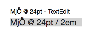
I had just been measuring some text in TextEdit and noticed something was amiss. Comparing the two “24 point” fonts looked like this:

TextEdit versus Browser

I’m no typography expert, but there’s something clearly wrong here: a 24pt font in TextEdit was noticeably smaller than the same size in my web browser.

I confirmed this behavior in three browsers running on my Mac: Safari/Chrome (rendering with WebKit) and Firefox (rendering with Gecko) displayed the larger version of 24 point text. Why were the sizes different?

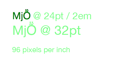
After some experimentation, it appeared that rendered glyphs were from a 32pt font:

72 DPI

What the hell?

A Brief History of Type

When confronted with a problem like this, it’s always a good idea to question your assumptions. Was I measuring the right thing? So I started learning more about type…

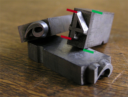
In general, points are meaningless. It’s a relic of the days of metal type where the size specified the height of the metal, not the mark it made on the page. Many people mistake the size of a glyph (shown below with red bars) with the size of a point (green bars):

Point versus Glyph

(Photo by Daniel Ullrich. Modifications by yours truly.)

Even things like the word “Em” got lost in translation when moving to the web: it originally referred to the width of a typeface at a given point size. This worked in the early days of printing because the metal castings for the letter “M” were square. Thankfully, we’re no longer working in the 16th century.

In modern fonts, like Helvetica Neue, a glyph for a capital “M” may be square, but the flexibility of digital type means that the width and height of a point rarely match.

Thanks Microsoft!

After doing this research, I was sure I was measuring the right thing. The sizes of the glyphs should match, regardless of point size. Something else was clearly in play here.

Let’s just say I spent a lot of quality time with Google before eventually stumbling across a hint on Microsoft’s developer site. The document talks about using a default setting of 96 DPI. I’ve been spending a lot of time lately with the Mac’s text system, so I knew that TextEdit was using 72 DPI to render text.

I quickly opened a new Photoshop document and set the resolution to 96 pixels per inch (DPI). And guess what?

96 DPI

All the text got larger and it matched what I saw in my browser. Mystery solved!

72 DPI on the Mac is 75% smaller than 96 DPI used by the Web. So the 24pt font I was seeing in TextEdit was 75% smaller than the 32pt font used in the browser.

Further research about how 96 DPI is used on the web turned up this Surfin’ Safari post on CSS units written by Dave Hyatt back in 2006:

This is why browsers use the 96 dpi rule when deciding how all of the absolute units relate to the CSS pixel. When evaluating the size of absolute units like pt browsers simply assume that the device is running at 96 CSS pixels per inch. This means that a pt ends up being 1.33 CSS pixels, since 96/72 = 1.33. You can’t actually use the physical DPI of the device because it could make the Web site look horribly wrong.

That’s another way to think about this problem: a single point of text on your Mac will be 1.33 times larger in your browser.

Now What?

Now that we know what caused the problem, how can we avoid it?

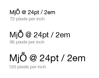
The key piece of information that’s missing in the “1em = 12pt = 16px = 100%” rule is resolution. If you’re specifying point sizes without also specifying resolution, you can end up with widely varying results. For example, each of these is “24 points tall”:

Comparison

If you’re lucky enough to have a Retina Display on your Mac, you’ll be rendering text at 144 DPI (2 × 72 DPI). That’s 20% larger than the last example above (Windows’ 120 DPI setting.) Display resolution is increasing and so are the number of pixels needed to represent “a point”.

Note that you can’t “fix” this problem by specifying sizes in pixels. If you specify a font size of 16px, your browser will still treat that as 12pt and display it accordingly.

As a designer or developer, you’ll want to make sure that any layout you’re doing for the web takes these size differences into account. Some apps, like Photoshop, allow you to specify the resolution of a document (that’s how I performed my sizing tests.) Make sure it’s set to 96 DPI. Resolution may not matter for exporting images from Photoshop, but it will make a difference in the size of the text in your design comps.

Most other Mac apps will rely on Cocoa’s text system to render text, so if there’s no setting to change the document’s resolution, a default of 72 DPI should be assumed.

An alternative that would suck is to start doing your design and development work on Windows where the default is 96 DPI. That setting also explains why web browsers use this resolution: remember when Internet Explorer had huge market share?

And finally, expect some exciting new features for measuring, inspecting and testing text in your favorite tool for design and development. I’m doing all this precise measurement for a reason :-)

Updated February 25, 2014: It turns out Todd Fahrner first identified this problem back in the late 1990’s. His work with the W3C was instrumental in standardizing on 96 DPI. What’s depressing is that I knew about this work: Jeffrey Zeldman and I even developed the Photoshop filters mentioned on his site. Maybe I should send in my AARP membership form now.

Sonderklasse

Let’s talk about cars for a second.

If you’re driving a car manufactured in the past five years, it’s likely it has anti-lock brakes. A standard feature at this point in time, but who came up with it first?

Mercedes-Benz first introduced it on the S-Class line back in 1978. It was a revolutionary technology and the first hint of how digital electronics would change the course of the automotive industry.

The S-Class pioneered many other safety innovations: crash crumple zones, air bags and traction control are a few of the most notable. This line has also become synonymous with comfort and luxury: it was the first Mercedes to be available with an automatic transmission. There’s even an armored version with a customized crocodile, gold and birch interior!

It’s clear this car is in a class by itself: “Sonderklasse”

“S-Class” is an anglicisation of “”S-Klasse,” a German abbreviation of “Sonderklasse,” which means “special class” (in the sense of “a class of its own”). In automotive terms thus refers to “a specially outfitted car”.

The current S600 model sports a 5.5L twin turbo V12 motor with a 7-speed automatic transmission. Enough power to propel a 4,950 lb vehicle from 0 to 60 mph in just 4.5 seconds. And that’s before AMG gets their hands on it. Impressive automotive technology, to be sure.

More importantly, these special cars have been recognized as a driving force behind the company’s success.

And now…

Another premium technology brand has an S-Class product: iPhone 5s.

“Craftsmanship”, “Power”, “Safety & Security”, “Ahead of its time”. Are we talking about a car or a phone?

Look at the words that dominate the iPhone 5s features page: Forward thinking. That’s a strategy that’s worked superbly at Mercedes-Benz for almost 60 years. I suspect Apple will get a pretty good run out of it, too.