After releasing a update for xScope with fixes for El Capitan, I launched the app on a fresh install of the OS and was greeted by this dialog:
I had tested the build on Yosemite, and it passed without any problems:
$ spctl -a -v ~/Downloads/xScope.app
/Users/craig/Downloads/xScope.app: accepted
source=Developer ID
Clearly there is something new with Gatekeeper in El Capitan. As the author of a tool used by so many early adopters, I often get the job of figuring out what’s new with code signing. Lucky me :-)
I quickly filed a Radar about the problem. This led to feedback from Apple that helped me understand why Gatekeeper rejected my app. The change in El Capitan has the potential to affect a lot of developers (including the big guys), so it’s time to share what I learned.
(If you’re one of those people that claims that “Radar never works”, then that last paragraph just proved you wrong.)
When I ran the spctl tool on El Capitan, I saw an “obsolete resource envelope” error:
This is a sign that there’s a problem with the code signature. In the past, this has been caused by a change to the signature version number (from 1 to 2). In El Capitan, the cause is more stringent code signature checks.
(Note that I also used the --raw option. According to the man page, “This is useful … to access newly invented assessment aspects that spctl does not yet know about.”)
The functional equivalent to spctl -a is the following codesign command. The --deep option checks any embedded code (such as the Sparkle framework.) Note that --strict is a new option in El Capitan (so new, that it’s not documented yet):
Gatekeeper is rejecting xScope because it thinks some files in Sparkle have been modified after the code signature was generated. This seemed unlikely since the frameworks are code signed during the copy build phase and our automated build process creates a ZIP archive just after the app bundle is created.
I dug around in the application package contents and saw the following:
Gatekeeper rejected the app because I’m using Sparkle 1.5b6. The framework has symlinks to paths on a Mac that I doubt Andy Matuschak uses anymore. That’s completely reasonable: those symlinks could just as easily point to something a lot more damaging than a non-existent directory.
The --strict option currently checks the validity of symlinks. You can point a symlink at a path in your own application package, /System or /Library, but nowhere else. The code signing rules also allow language translations to be removed, but if they are present they must be unmodified.
The quick fix for this problem was to remove the invalid symlinks; a new build passes the same check without any problems:
$ codesign --verbose=4 --deep --strict xScope.app
--prepared:/Users/craig/Downloads/xScope.app/Contents/Frameworks/Sparkle.framework/Versions/Current/.
--validated:/Users/craig/Downloads/xScope.app/Contents/Frameworks/Sparkle.framework/Versions/Current/.
--prepared:/Users/craig/Downloads/xScope.app/Contents/Frameworks/YAML.framework/Versions/Current/.
--validated:/Users/craig/Downloads/xScope.app/Contents/Frameworks/YAML.framework/Versions/Current/.
xScope.app: valid on disk
xScope.app: satisfies its Designated Requirement
A better solution is to update to a newer version of Sparkle. The project was dormant from 2008 to 2014, so many of us didn’t realize that the team behind the project is doing regular updates again.
Many of your customers will be downloading and running your app on the El Capitan public beta: you should do the codesign --deep --strict check on any new releases to avoid customer support issues. It’s also likely that a similar check will be performed for you when the Mac App Store eventually allows submissions for 10.11.
And let’s get together again when 10.12 is released! In the meantime, enjoy this new release of xScope on Apple’s new release of OS X.
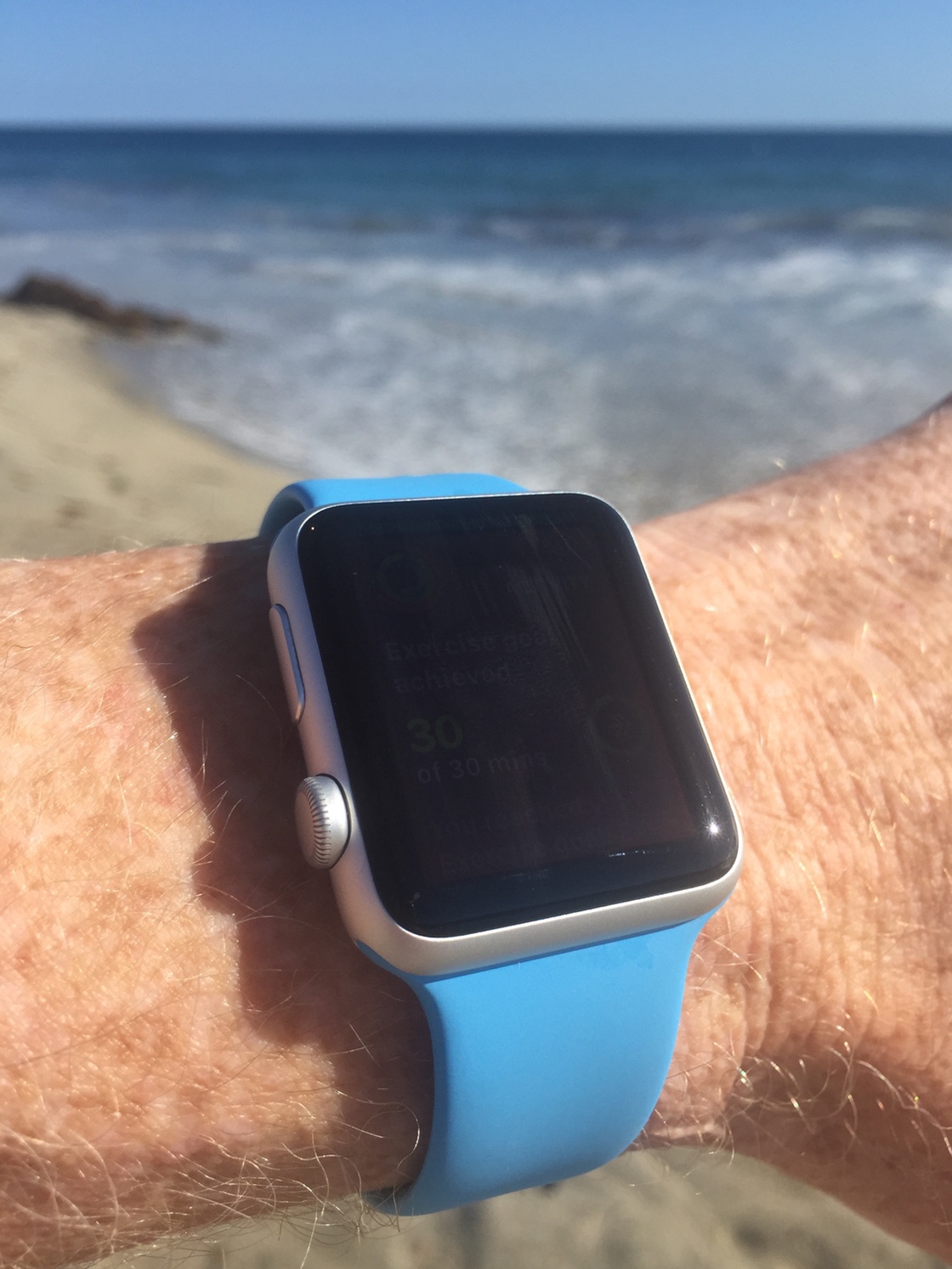
The most common question I get about my Apple Watch is this: “Is it waterproof?”
Everyone from followers on Twitter to Laguna Beach lifeguards have noticed that I wear my watch while swimming and want to know how this new device holds up when it comes in contact with 71% of the Earth’s surface.
If you look closely, you’ll see that I just completed my exercise goal with a swim in the Pacific Ocean.
This report will explore how well the watch works when it’s exposed to water. I’ll also make some recommendations for Apple to improve the usability of its Workout app, especially when tracking water sports.
The Specs
The first thing I wanted to know after the Apple Watch announcement was its water resistance. Swimming is my favorite way to work out, so I knew I’d want to use the watch in the water. But there wasn’t much information available other than Tim Cook saying he wore his in the shower.
Luckily, as the watch got closer to shipment, a key piece of information was published in the user guide:
Submerging Apple Watch is not recommended. Apple Watch has a water resistance rating of IPX7 under IEC standard 60529. The leather bands are not water resistant. Water resistance is not a permanent condition and Apple Watch cannot be rechecked or resealed for water resistance.
A little bit of research shows that “IPX7 under IEC standard 60529” means the watch can be submerged in 1 meter (3.3 feet) of water for up to 30 minutes. That’s certainly more than a shower and perfect for the kind of swimming I do.
After the watch shipped, I discovered that I wasn’t the only person interested in the watch’s ability to be used during swim workouts. Ray Maker at the DC Rainmaker blog did a series of tests, including diving off a 10 meter (33 foot) platform and 40 meter (130 foot) pressure test. The Apple Watch passed these tests with flying colors, and along with the research below, I was convinced I wouldn’t have any problems. So far, that analysis has proven correct.
I suspect that the watch’s water resistance has been undersold by Apple just like battery life: it’s better to under-promise and over-deliver. Still, it’s a personal decision on whether you want to ignore Apple’s recommendation. You’re not likely to get much sympathy at any subsequent trips to the Genius Bar.
Now that we know the Apple Watch can go in the water, how does it work while submerged?
The First Problem with Water
Water and electricity don’t mix. Anyone who’s dropped an iPhone in the toilet knows this. But what is the cause?
On its own, water is an insulator which does not conduct electricity. You can drop any electronic device in 100% pure water and the only damage will be the components getting wet; everything will continue working, even while immersed.
The problem is that most water isn’t pure: the liquid we come into contact with every day is an electrolyte that conducts electricity. Minerals in the water, such as sodium chloride (salt), create an electrochemical reaction:
When electrodes are placed in an electrolyte and a voltage is applied, the electrolyte will conduct electricity. Lone electrons normally cannot pass through the electrolyte; instead, a chemical reaction occurs at the cathode, consuming electrons from the anode. Another reaction occurs at the anode, producing electrons that are eventually transferred to the cathode. As a result, a negative charge cloud develops in the electrolyte around the cathode, and a positive charge develops around the anode. The ions in the electrolyte neutralize these charges, enabling the electrons to keep flowing and the reactions to continue.
In effect, water is trillions of microscopic wires that can fry any electronics they touch.
Deionized water has a very low TDS and conducts at about 5.5 μS/m. Drinking water is about 1,000-10,000 times more conductive at 5-50 mS/m. Water in the ocean is about a million times more conductive at 5 S/m.
Chlorinated water, especially when coming from a salt chlorine generator, has mineral content (TDS) and conductivity that’s much higher than plain tap water.
The bottom line is that water in your public or residential pool, nearby beach, or even the tap in your bathroom can conduct electricity. And that has some major implications for the Apple Watch.
Don’t Touch Me There
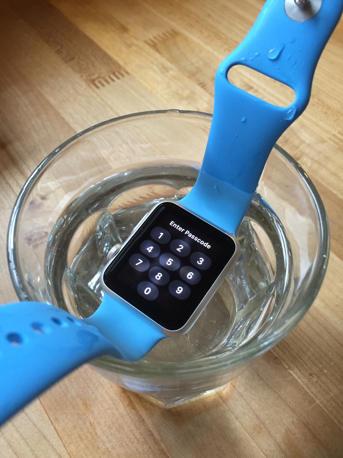
Like other iOS devices, the Apple Watch uses a capacitive touchscreen. Using our bodies as a conductor, the screen senses changes in capacitance using an electrostatic field that surrounds the display. When you surround your body and screen with a conductive liquid, that dynamic is shot to hell.
Unless you’re swimming in distilled water, the touchscreen on your Apple Watch just won’t work.
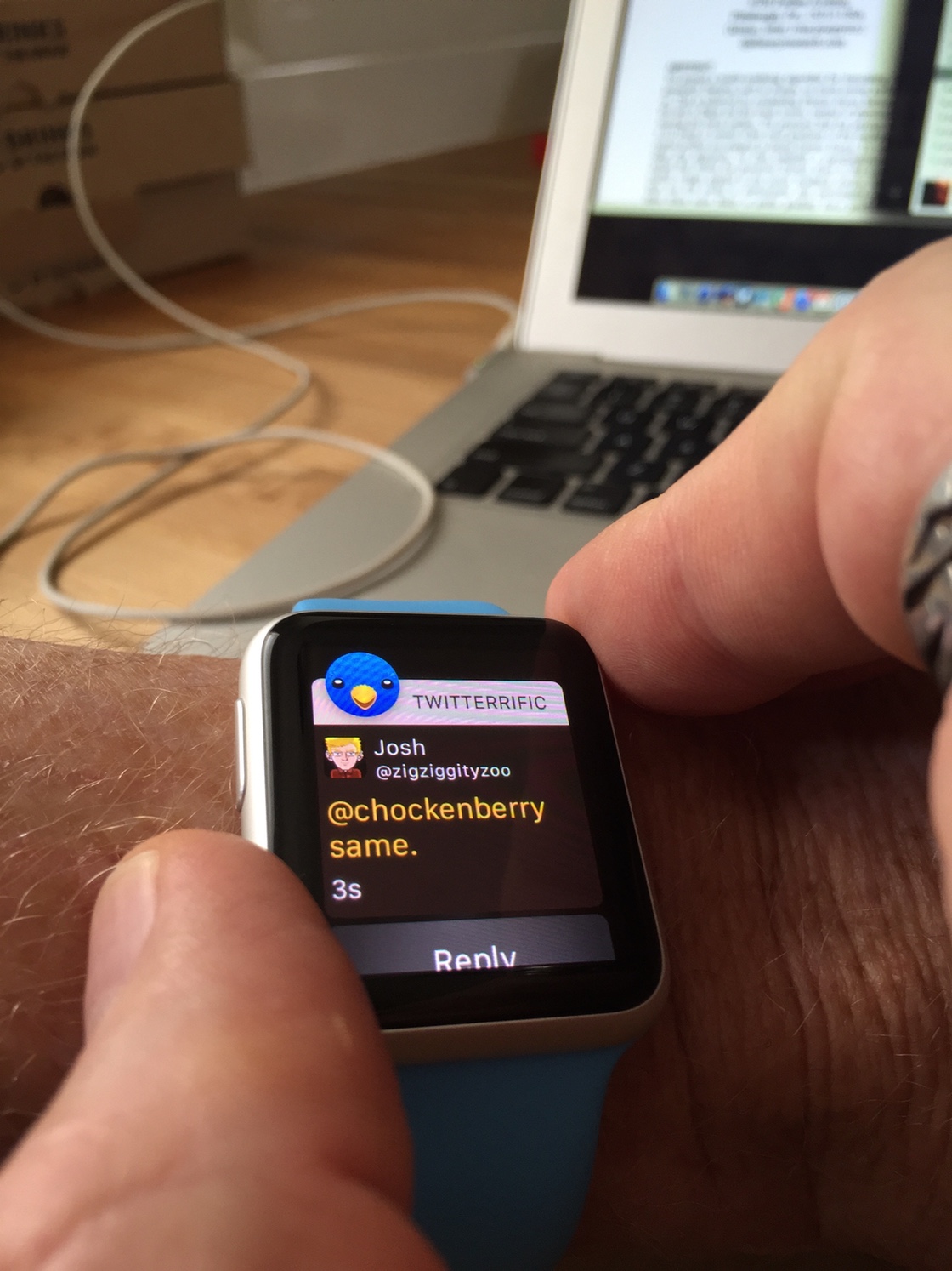
You can see this effect for yourself quite easily: just put your watch in a glass of water and try to enter the passcode:
Try using the touchscreen like this and you’ll start to understand a fundamental problem with Apple Watch.
Interestingly, the San Francisco Bay Area has some of the cleanest municipal water in the United States. The water in Silicon Valley literally comes from a pure mountain stream that is free from sediments. Most of us aren’t so lucky: if you’re trying this test in Cupertino, try dissolving a little salt in the water first.
The touchscreen isn’t the only thing that stops working: the watch’s Force Touch feature is blocked by software.
Any pressure on the screen’s sensors is ignored unless there’s corresponding touch registered on the display. You can test this for yourself by placing an insulator between your finger and the watch’s screen (I used a wooden spatula.) No matter how hard you press, nothing happens until you remove the capacitance barrier.
We’ll explore the usability implications of these shortcomings after learning a little more about water.
Where the Rubber Meets the Water
The electrochemical process that causes conductivity in water also causes corrosion. Anyone that’s spent time in or around the ocean knows that anything coming in contact with sea water gets cleaned with fresh water.
So how does the Apple Watch hold up under these conditions?
Note: The following research is focused on the Apple Watch Sport. The other models use different materials for both the case and display face. I suspect most people who are interested in using their watch in water will own the Sport model. Also, experimentation is much easier to justify with the cheapest watch!
The Metal
The case of my Sport watch is anodized Aluminium. The anodizing process causes a very thin (2-3 nm) protective layer to form. That layer is non-conductive, providing good electrical and corrosive protection. My multimeter shows over 6 MΩ of resistance between the speaker and microphone ports on the watch.
The protective layer is also very tough. My experience with the anodized case shows this is true: after several months of abuse, it’s still scratch-free.
Glass is also an excellent insulator: high-voltage power distribution uses glass and other ceramics to prevent current from passing through power lines to the ground.
The Rubber
Obviously, the Apple Watch is not a solid piece of anodized aluminium or Ion-X glass: there are gaps between these materials. In these spots, you’ll find CHOCK’s favorite material: Rubber.
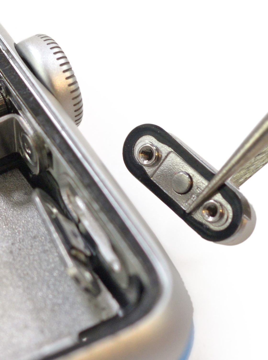
Apple hasn’t said anything about this important material. For example, we don’t even know if it’s a natural or synthetic rubber. All we know is that it’s there: the teardowns of the Apple Watch by iFixIt provides some valuable insights.
The first place where it’s easy to see one of these rubber gaskets is when they remove the side button:
An example of the rubber gaskets used to protect the Apple Watch from water intrusion.
Another good place to see these gaskets is when iFixIt removes the diagnostic port cover. The X-ray of the digital crown also shows several bushings that are likely to act as water barriers.
You might think that rubber would be a weak point in the watch’s fight against the intrusion of water, especially when it’s highly corrosive salt water. It’s a weak point, but not for environmental reasons.
A study by the U.S. Navy, motivated by the use of natural rubber in torpedo launchers, examined the aging process in air and sea water. Their conclusion:
A severe deterioration of properties requires impracticably long time periods.
As any scuba diver can tell you, rubber has no problems with water as long as you follow one simple rule…
The Cleansing
Make sure you rinse your equipment in fresh water after it has been exposed to salt water. As you’ve seen above, that includes a swimming pool.
I make sure to wash my watch thoroughly after every swim. It doesn’t take much to get the corrosive liquid off. If you’re working out, it’s likely that you have a bottle of water handy: a few splashes is all it takes. Don’t use a sports drink for this rinse: it contains the same harmful electrolytes you’re trying to get rid of!
Chances are also good that you’re going to take a shower after a workout. Just hold your wrist up to the shower head and you’re done!
One thing I’ve noted after getting out of the ocean is the digital crown feeling a little “gritty” while being turned. My guess is that some small grains of salt or sand are getting between the crown and the case body. This friction goes away as soon as I rinse the watch and underscores the importance of keeping it clean.
If you wear your Apple Watch in water, rinse it off when you get out.
Workouts
Once you start getting in the water with your watch, you’re going to want to start tracking activity.
Unfortunately, the only category in the Workout app that can be used is “Other”: there are no indoor or outdoor swim workouts available. Given Apple’s cautious approach to water, that’s understandable.
The Data
The “Other” workout works like the other categories: you can set a calorie, time or open goal. Here are my swim workouts to date:
Date
Minutes
Calories
Cal/Min
Avg. BPM
6/19
13.5
111
8.2
128
6/21
15
102
6.8
108
6/22
13
108
8.3
125
6/23
16
117
7.3
113
6/24
23
175
7.6
113
6/25
16.5
139
8.4
117
6/26
16.5
153
9.3
140
6/29
17
136
8.0
105
7/1
18
160
8.9
108
7/2
20
175
8.8
99
7/3
20
162
8.1
103
7/4
24
217
9.0
100
7/8
19.5
169
8.7
105
7/9
21
210
10.0
144
7/10
23.5
166
7.1*
108
7/11
20.5
152
7.4
103
7/12
21
168
8.0
116
7/13
18
179
9.9
145
* This was a swim with friends, not a workout
The first few swims of the season are always a little tough: they’re short because my muscles burn out quickly. I’m also not swimming as hard, so fewer calories get burned. There is some variance in the readings due to water temperature: on cold days I swim harder for a shorter time (to keep the body’s core temperature up.) Missing days are because the water was below 67 °F and I don’t swim with a wetsuit.
You’ll also see in the next section that it’s hard to accurately time a swim. I rounded off to the half minute in the table above, but even then some measurements may be off by a minute or more.
I calculated the Cal/Min metric to check how consistent the workout tracking is in water. From what I see, the Apple Watch has no problem tracking activity in water. I haven’t seen the watch lose skin contact and lock during a swim workout; another good indicator that the heart rate sensor is staying put and doing its job.
The OLED display on the watch also works really well under water. The “wrist flip” to turn on the display sometimes won’t work, but pressing the digital crown is very reliable. Out of the water, the screen is readable, but just barely in bright sunlight (see the first photo above.)
Out Of Controls
The biggest problem with the Workout app is that it’s basically unusable while you’re in the water. As we’ve learnt, both the touch and force press controls stop working. There’s no way to pause the workout. You have to start the workout before getting in the water and stop after you’ve gotten a chance to dry off.
For an ocean swim, this screws up your timing: you don’t really start swimming until after you get beyond the surf break. If there’s heavy surf, this can take several minutes. Workout data is being collected while you’re standing and waiting for waves to clear.
This delay can also make it difficult to measure your progress: I know how long it takes to reach several landmarks along the coast. If a minute or two is added at the start, I have to mentally adjust the timer readings.
Another frustration in the Workout app caused by water: the movement of a conductive liquid can fool the app into registering a swipe that takes you from the timer to the calorie display. Sometimes you can tread water and blow on your watch and finger until a swipe is registered, but this is very disruptive to the workout.
Native Apps
With the arrival of native apps in watchOS 2.0, more advanced swimming apps are possible. The video below shows some very promising development:
This video is also a good demonstration of the difficulties swimmers have with a touchscreen. Pressing the digital crown is the only way to reliably interact with the device.
The only caveat here is section 13.1 of the app review guidelines:
Apps that encourage users to use an Apple Device in a way that may cause damage to the device will be rejected
Since using the watch in water is not recommended, Apple may choose to reject swimming apps. Given the inherent difficulties of using a capacitive display in an electrolyte, we may be waiting a long time.
Sweat Solution
There is another source of mineral-rich liquid that affects the Apple Watch’s performance: perspiration from your body.
And any good workout means that there’s going to be plenty of it. Your sweat glands love to pump out conductive electrolytes that are going to mess with your watch.
Even if you’re not in a swimming pool, you’ve probably experienced the Apple Watch’s erratic behavior during a heavy workout. If you haven’t, try wiping your finger across a sweaty brow and then interacting with the touchscreen.
Runners and cyclists, welcome to the swimmer’s world.
Sports drinks are a popular way to replace essential fluids lost during a workout. These drinks contain electrolytes, and as we’ve seen, they’re not good for your electronics. Keep these drinks away from your watch!
The Second Problem with Water
Water is heavy. At room temperature, it weighs in at about 62 pounds per square foot (9.8 kN/m³).
As you descend in water, all of the water above you exerts a downward pressure force. For every meter of water, there’s about 1.4 pounds per square inch (psi) of pressure. The deep sea research vessel, Trieste, gives you an idea of the extreme engineering challenges presented when there’s 35,797 feet of water above you.
We saw above that rubber is a hearty material when it comes in contact with corrosive liquids. The danger rubber faces in water is due to hydrostatic pressure; at 40 meters (120+ feet), about 57 psi is exerted. Imagine a seven year old child standing on the face of your Apple Watch: that’s about the same amount of pressure force on the watch.
Our bodies don’t feel the same pressures because we’re basically bags of fluids that equalize with the surrounding water. The pressure force is more pronounced in hard materials, such as those used in the Apple Watch. The softest material, rubber, is also the one most likely to fail because of its flexibility.
Ray Maker showed that the watch held up to 40 meters of hydrostatic pressure, but I still don’t feel comfortable diving with it. On recent dives at Molokini crater, my watch stayed at home. Besides the risk of blowing a gasket, there’s not much you’re going to be able to do with it at depth and my dive computer records much more valuable information (like how to keep me from dying.)
One downside to Apple Watch not participating in this water sport: my activity rings looked like I’d been resting comfortably all day, despite burning thousands of calories. Keeping your core temperature up, even in warmer waters, burns a lot of energy.
Recommendations
Now that we’ve seen how the Apple Watch handles water, let’s take a look at how Apple’s engineers could improve things.
Life Without A Touchscreen
The elephant in the room: the touchscreen doesn’t work reliably anywhere near water. The source can be the ocean, a swimming pool, or your own sweat. At the same time, the Workout app is heavily dependent on touch:
The only way to launch the Workout app is from the watch home screen. Siri won’t work because your iPhone doesn’t like to go near water!
Workouts are started by tapping, swiping and tapping again.
Workouts are stopped by force press, tapping, swiping or scrolling, and then tapping again.
All of these things are extremely hard to do when the screen is wet. I’m convinced Apple’s recommendation to not use the watch in water is because of the erratic behavior it causes.
My biggest complaint about the Workout app is its usability at the end of a workout. There is a lot of pressing and navigation at a time where your muscles are barely working, your whole body is moving as it tries to replenish oxygen in your lungs, and blood is rushing to your head. You’re not at your best, yet the app requires some significant mental and physical gyrations.
First, you have to force press to get the “End” button. If your hand is sweaty or wet, this action is difficult to trigger because electrolytes are defeating the touch sensor.
Then you have to remember that pressing “End” really isn’t the end of your workout. I’ve had to explain this behavior to more than one person who’s wondered why the activity isn’t displayed on their green ring.
It’s not obvious there’s a “Save” button because it’s at the end of a long list of data you couldn’t care less about at that moment (your main challenge is to stay upright!) If your hand is wet, getting to the end of that list means you have to use the digital crown, but fine motor skills are lacking, so even that’s hard.
Now you have two buttons to press: one is good, the other discards some data you worked very hard to get. These buttons are placed next to each other and your motor skills are impaired. If your hand is wet, you’ll have to tap several times, increasing the chances of destroying your data.
After you finally hit “Save” you get kicked back to the home screen. Just like when an app crashes.
Every time I’ve saved a workout, I immediately go back to the app to verify the data was recorded. I have no trust in the app even though it’s worked reliably for months.
Finally, after I’ve had a chance to rest, I have no way to look at the data collected during my workout. I have to wait until I get back to my phone before I can see how I did. (I don’t have my phone nearby because I don’t want it anywhere near water.)
Adding to these challenges is bright sunlight. The OLED display is beautiful and easier to read outside than an LCD display. But even though it’s better, the display is still hard to read during an outdoor workout.
Given Apple’s legendary secrecy, it wouldn’t surprise me if a lot of the watch’s development and testing was done in a gym. I find the display much more comfortable to use during an indoor cycle than an outdoor run.
Taptic feedback feels like a lost opportunity here. For a timed workout, give me a tap on the wrist at five minute intervals (which would also act as a nice reminder if you forget to end a workout!) Calorie-based workouts could give you feedback when you go above or below a target range.
These kinds of feedback mechanisms would benefit all kinds of workouts: you can focus on your workout more by looking at your watch less.
I can’t see Apple adopting another type of touchscreen sensor technology: capacitive devices work flawlessly in the vast majority of cases. But as we’ve seen, there are some very real problems during all types of workouts.
Going forward, the only solution I can see to these problems is some kind of physical button. Given the history of other iOS devices, I also don’t see Apple adding buttons to the case design.
Runners and cyclists don’t want to poke at their wrists to get a lap time or mark the end of a workout. It’s cumbersome and potentially dangerous to take your eyes off the road. Swimmers don’t even have the option of diverting their attention.
This situation reminds me a lot of the problem with a shutter switch on the iPhone. When your attention needs to be focused on framing your photo, finding a virtual button is counterproductive. A physical button is much simpler and more practical, even if it’s normally used to adjust the volume.
So why can’t the side button be used during a workout? A single click could start or pause the workout; a double-click could stop the workout. Maybe a triple-click could do something more advanced like a lap time.
Like taking a photograph, a workout is a special mode in your life. I can’t imagine a use case where you’d want to use Apple Pay during a workout. Likewise, sending a heartbeat to a friend during a workout would make them think something was seriously wrong with you. If you feel the need to text someone during a workout, you need to re-evaluate your strategy for good health.
Athletes have been using chronographs to track their progress since it was possible to put time in your pocket. I think it would be wise if Apple Watch took some cues from the physical interactions we use on a stopwatch.
In case you haven’t guessed by now, I love my Apple Watch. I find myself working out more and having a better understanding of my overall health.
I’m also thrilled that the watch is working so well with my favorite workout: swimming in the ocean. Despite some hiccups in functionality, I still get enough information to improve my performance and extend my goals.
I hope the information in this report will help others understand what the watch can and cannot do in the presence of water. I also hope my experiences will help Apple improve the watch’s capabilities for swimming workouts.
In the meantime, look for me and my Apple Watch here.
Now that we’ve all had a few weeks with this new watch, it’s natural to start analyzing the interaction models: there’s been some great commentary from peopleIrespect.
However, one area I haven’t seen discussed much is the ergonomics of this device: how efficient are we at performing tasks on the watch? The physical interactions with a device attached to our body are just as important as the mental ones.
One of the first things I noticed about using the Apple Watch was that pressing the digital crown on my left wrist required a fairly awkward position of the index finger on my right hand. While pressing on the crown without another finger to provide resistance, the strap twisted uncomfortably. When you try to get your thumb on the opposite side of the case to provide support, you either cover the face or resort to contortions.
Luckily, I had spent some time digging around in the settings in the Apple Watch app and remembered seeing some odd settings in General > Watch Orientation. The wrist selection is obvious enough, but being able to change the position of the digital crown had no obvious benefit. That is, until I tried it.
I left the wrist setting alone and changed the digital crown to be on the left (it defaulted to the right side.) This is what it looks like after the change:
I’ve been referring to this orientation as the “reverse crown”.
With any ergonomic change, you need to give yourself a few days to overcome the bias for something new and different. I gave myself three days to form an opinion.
I will say my immediate reaction was positive: I could use my thumb to activate the crown while using the side my index finger to provide stability. Also, our phones have taught us to use the thumb as a quick navigational tool.
An added benefit to this new orientation is that the speaker and microphone are directed toward your face when your wrist is raised. It’s easier to hear sounds and Siri recognition seems a little better. It will be interesting to see how much better this works when we’re wearing heavy winter jackets.
With the crown on the left side, you use your thumb to scroll. Initially, I was concerned that my hand would block the screen, but the display fits nicely in the space between your thumb and index finger:
When using your thumb on the crown, your index finger is also in a convenient location for tapping and scrolling on the display.
Apple never adds settings without a good reason. The inclusion of a preference for the crown position is a pretty clear indication that someone important knew that this was an ergonomically superior choice. But it’s also one that goes against horologic convention: Apple’s desire for this device to be visually appealing won out over ergonomics. I’ll be the first to admit that the “reverse crown” looks weird.
Luckily, Apple has given us a choice between what works best and what looks best. It’s been several weeks since I made the change and have never once considered changing back to the default setting. I encourage you to give it a try, too.
A lot can happen in fifteen years, especially on the web. At the turn of the millennium, many of us were coming to terms with the dynamic nature of a new medium that connected our world. I was honored to be a part of this collection of thoughts and reflections of that time.
I’m a firm believer of moving forward in your work and not relying on past accomplishments. The best way to find the path into the future is to look for clues from where we’ve been. A collection of thoughts from people I admire is priceless.
And before you dismiss this as information that’s only relevant for “web designers”, look at how your apps rely on web infrastructure to do something meaningful. Then think about how difficult it is to build an interface that works well on all screen sizes. These are the same things we struggled with as the web entered adolescence.
To date, Apple’s Retina displays have relied on LCD technologies. Since the iPhone 4, our mobile devices have used in-plane switching (IPS) technology to achieve high resolution with accurate color from a wide range of viewing angles. The IPS LCD panels are also present in many of the desktop monitors we use on our Macs.
Unless you’ve done work on Android, you’re probably unaware how different AMOLED displays are from LCD. Let’s take a look at what lies ahead.
Physical Differences
An LCD display relies on a backlight that’s projected through three layers: one for each of the primary colors. Red, green and blue appear on screen because crystals in those layers can be aligned electrically to allow the backlight to pass through.
OLED has no backlight and has only one layer that produces light. That layer is an organic compound that emits light when subjected to an electric current. When you put them in a two dimensional matrix of transistors, you end up with an AMOLED display.
Based on these short descriptions, it’s easy to see why an OLED is thinner than its LCD counterpart: there are simply fewer layers of electronics. And it gets even better when you discover that the compounds and electronics can be fabricated on flexible plastic substrates.
LCDs have always been problematic in direct sunlight because the backlight must pass through filters which can also reflect ambient light. This has also been an issue for OLED displays where the light is emitted below a reflective metal cathode. The good news is that recent advances with the technology are producing brighter results than an LCD.
The biggest challenge for OLED is with the organic material where light is emitted. Basically, byproducts of the chemical reaction that produces light accumulate over time and reduce the efficiency of the output. Again, this is an area where manufacturers are focusing their efforts. In just a few years the lifespan of these devices have increased by several orders of magnitude, but is still limited to tens of thousands of hours. Don’t expect your Apple Watch to become a family heirloom.
How Not to Do It
OLED displays have gotten a bad rap on mobile devices primarily because of a thing called PenTile.
PenTile mimics how our eye works: 72% of the luminance we perceive is determined by the green wavelengths of the electromagnetic spectrum. The RGBG arrangement of sub-pixels lets a display get brighter without increasing the overall number of transistors needed. This, of course, keeps manufacturing costs down.
Unfortunately this physical layout of the light emitters also makes colors grainy and text hard to read. Color accuracy also suffers. PenTile is also a trademark of Samsung. I can’t see Apple using this approach in their Retina displays.
It’s much more likely that Apple’s industrial designers have been working hard to find a new and better way to use OLED technology without losing fidelity. I can’t wait for someone to look at the Apple Watch’s display under a microscope.
Black is Best
From Apple’s point-of-view, one of the most important things about OLED is how it consumes power. A transistor on the display only uses energy when it’s producing light. Compare this with an LCD backlight which must be lit in order to see any pixel.
It’s also important to remember that each pixel on the display has a limited lifetime. The less time the OLED spends producing light, the longer it lasts.
One of my first impressions of the Apple Watch user interface was that it used a lot of black. This makes the face of the device feel more expansive because you can’t see the edges. But more importantly, those black pixels are saving power and extending the life of the display. It’s rare that engineering and design goals can align so perfectly.
And from what we’ve seen so far of the watch, that black is really really black. We’ve become accustomed to blacks on LCD displays that aren’t really dark: that’s because the crystals that are blocking light let a small amount pass through. Total darkness lets the edgeless illusion work.
Flat Black
I’ve always felt that the flattening of Apple’s user interface that began in iOS 7 was as much a strategic move as an aesthetic one. Our first reaction was to realize that an unadorned interface makes it easier to focus on content.
But with this new display technology, it’s clear that interfaces with fewer pixels have another advantage. A richly detailed button from iOS 6 would need more of that precious juice strapped to our wrists. Never underestimate the long-term benefits of simplification.
The Future
Apple is a company that likes to leverage its technologies across a wide range of products. Look at how many of their devices are using IPS LCD displays now, then imagine a move to an OLED display pioneered by the Apple Watch.
When Jony Ive taps the home button on his iPhone and says, “The whole of the display comes on. That, to me, feels very, very old.” it’s a sign that individually addressable sources of light are the wave of the future.
Of course it will take time for this to happen, but you know it’s going to look awesome when they’re done. And along the way, we’ll learn to think about pixels differently.