What if I told you that you could add a Retina Display to your MacBook Pro for under $100? And what would you think when I showed how it plugs into your computer?
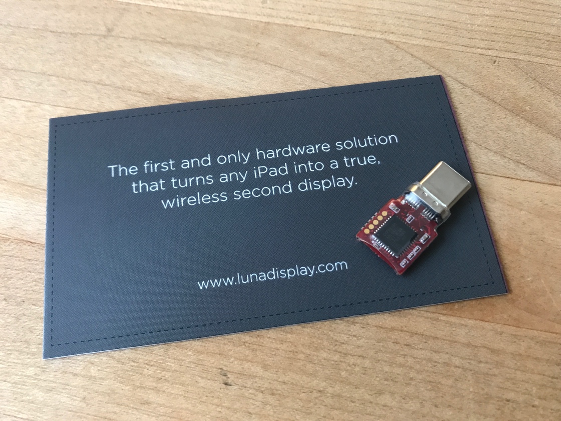
The business card underneath this hardware gives you some hints, but where did this magical device come from and how does it work?
This story all starts out in The Iconfactory office in Minnesota where we do custom app development. It’s a co-working space that we share with the fine folks at Astro HQ, the makers of the popular AstroPad app.
Troy Gaul showed me the video from the Kickstarter page, Matt Ronge asked me if I’d give it a try (“Hell yeah!”), and Savannah Reising sent me the prototype hardware you see above.
I’ve had two displays on my development machines since the 1990’s. By now, it’s fully ingrained in my habits and makes for a very efficient workflow. So much so that it’s the capability I miss the most when I travel, especially when I have an iPad with a kick-ass display. It’s not hyperbole to say that this new product, called Luna Display, solves this problem completely.
It’s also got me thinking about how to reorganize my home office, because this is a great setup no matter where you are!
The prototype hardware arrived late last Saturday, so here is how my Sunday morning started…
Setup
I put the USB-C hardware you saw above into my wife’s MacBook Pro. My laptop is a bit older and uses Mini DisplayPort for attaching external displays (Astro HQ is working on this interface but the prototypes aren’t quite ready.) The device immediately started blinking. Who doesn’t love a blinking light on new hardware?
I then downloaded the Luna Display app for the Mac. It’s clearly labeled as a “Technology Preview” and I’m fully aware of what that means :-) For example, there are some menu options in this version, like “Reload Codec Config” and “Luna Device Reset”, that tell me engineers are still tweaking things. Like any Kickstarter project, anything I write about now may not be in the shipping product.
Even that blinking light, which stopped after I launched the app, might not be in the final product. But I hope it is, because it’s simple feedback that the Mac side isn’t running. And it blinks!
Earlier in the week, I got a TestFlight invite for the Luna Display app on iOS, so I got that all set up. After launching this app, you get a message saying “Look at your Mac Screen”. Man, I love it when developers think about how you’re going to use something!
On the Mac, there was a dialog asking if PRO BABY could connect via Wi-Fi. That’s my 9.7” iPad Pro, so of course I clicked “Allow”, but it’s good to know that they’re thinking about who gets to see what’s on my Mac.
At this point, Luna Display is all set up and I’ve got dual displays. This is awesome!
Tweaking Things
The Mac app presents two buttons: “Enable HiDPI” and “Display Arrangement”. Getting the Luna Display in the right place was the first thing I wanted to do, so it was very helpful to have that second button.
The first button presented a message to “Install the Luna System Extension”. This extension is needed to put the display into a full Retina resolution, but years of happy marriage have taught me that you don’t install with a password on your spouse’s laptop. So I declined and can’t wait to do it when my miniDP prototype arrives!
Since the Luna Display is running on an iPad, touches and Pencil input work as you’d expect. In fact, they work a little too well, because I caught myself moving my finger over to the MacBook sitting next to it. Maybe Microsoft is onto something here, after all.
I was also curious if I could use multiple iPads simultaneously, I’m an iOS developer so conceivably I could have a MacBook with six displays of varying resolution and speediness. As we’ll see next, there’s a good reason you’re limited to only one iOS device at a time.
A Networked Display
The first thing on my mind, and probably yours, is how’s the display quality? And the answer to that question leads us to the most important part of this technology: the link between your Mac and iPad.
When we renovated our 1920’s bungalow in Laguna Beach, Wi-Fi was just getting started and the speeds weren’t great. As a result, we have a lot of gigabit Ethernet and not a lot of motivation to upgrade a bunch of old Airport Extremes. The network isn’t terribly fast, but most of the devices that can outrun it can be hardwired.
Except now I have a Mac that’s sending screenfuls of compressed pixels to my iPad’s Retina Display over an aging network. And guess what?
The display looks pretty damn good! If I look closely, there’s some blockiness as I move the windows around quickly, but things like the iTunes visualizer look much better than I expected.
I have some experience flinging pixels between a Mac and an iOS device so the effectiveness of Astro HQ’s LIQUID technology is not lost on me. It’s clearly something they’ve honed over the years with their Astropad product. It also explains that oddly named menu item we saw above: “Reload Codec Config”.
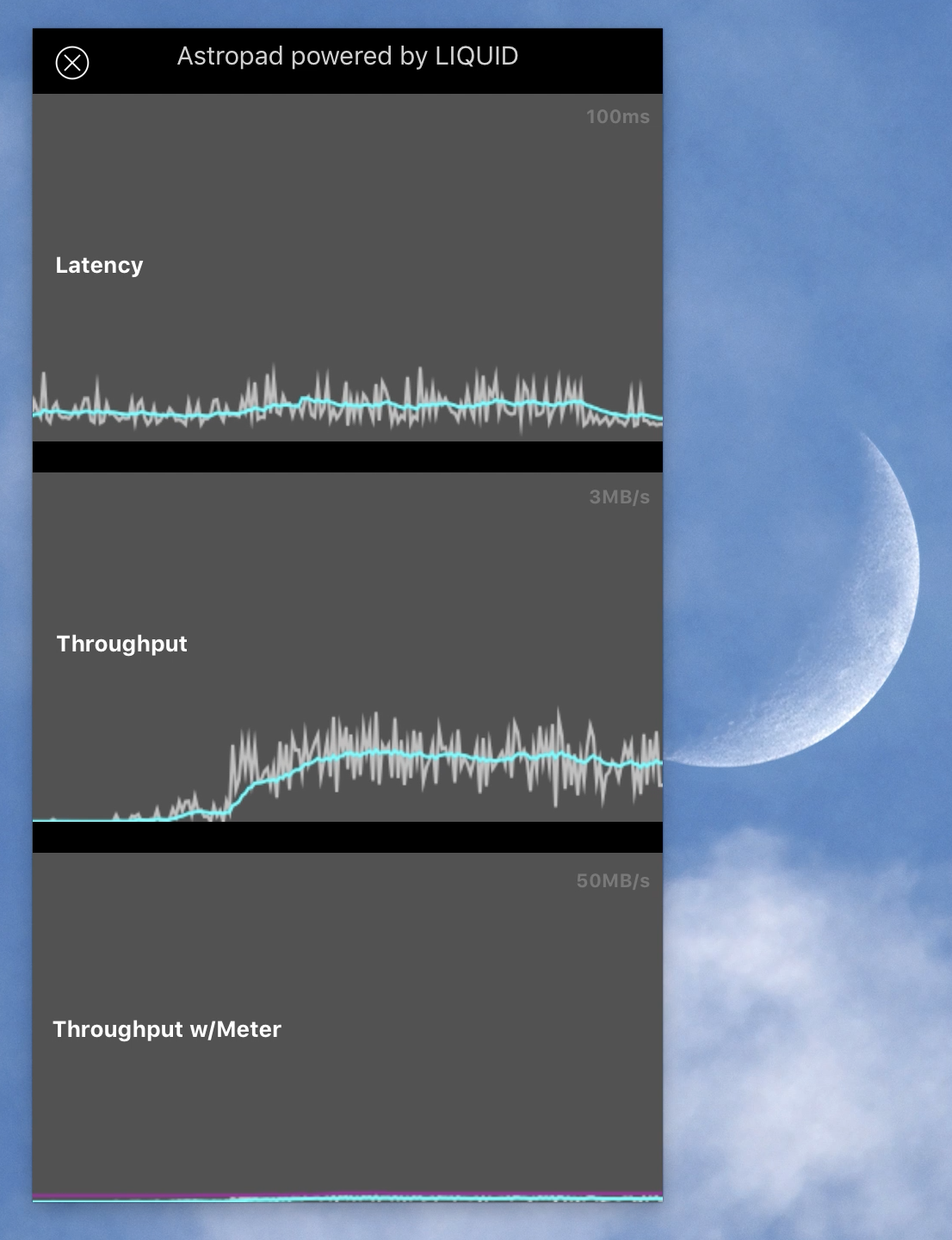
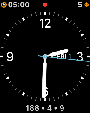
There’s also a “Vitals” window that you can open on the Mac to see how well this technology is working. I love to geek out on graphs and the data shown above helped me understand what was going on under the hood: it’s all about the bandwidth. The more you can give Luna Display, the better it looks. You want those blue throughput lines to be as high as possible. The bump in graphs is while I was moving a window around furiously on the Luna Display — I saw similar results while running the iTunes visualizer.
To make my wireless network worse than it normally is, I started a download Xcode on another Mac connected to the same access point. This chewed up about 50 Mbps, and the quality of the Luna Display decreased dramatically.
So yes, someone else in your office could ruin your productivity. Bummer.
A Wired Display
It was at this point I remembered that you could also use a USB connection between the Mac and iPad. Let’s give that a try!
As soon as the cable went in the display quality was perfect. Wowza.
And those blue graph lines you saw above? They were literally off the chart with the USB connection.
(Something tells me that the price to upgrade my network will be way more than this Kickstarter is costing me.)
Practically speaking, I think this is a likely configuration if you’re using these devices for an entire workday. The USB cable lets you share the power load and recharge during extended use. It also completely avoids the problem of your coworkers watching 4K video on YouTube all day.
In the likely event that you’ll take your Luna Display while you travel, make sure to pack a cable, because we all know how great hotel Wi-Fi can be.
A Display With an OS
Everything else behaves just as you’d expect and acts like any other display you’d plug into your Mac. The only difference with Luna Display is that there’s an operating system controlling what gets sent to your second screen.
When you put the Luna Display app into the background with the iPad’s home button, the display disappears from the Mac after a few minutes. All iOS apps have a limited time in the background and Luna Display is no different. When this timeout occurs, you’ll see the Mac’s display reconfigure and windows will move to new spaces. As soon as the iOS app is brought back to the foreground, all your windows move back to their original locations.
Quirks
All new software has its quirks, but I encountered surprisingly few of them while testing Luna Display. This product is much more mature than I expected from a Technology Preview.
One thing I didn’t expect to see was “Luna Display” as the color profile for the display. Considering that I’m running on the first “Display P3” device that Apple shipped, that wider gamut should be utilized. Changing the profile didn’t appear to have any effect, either. I’m kind of a stickler for this kind of thing :-)
In talking with the Astro HQ developers, the reason is because this version uses an 8-bit color pipeline. They are working on 10-bit color and wider gamuts since it’s a great feature for designers using AstroPad.
There were a few times where things disconnected unexpectedly or got hung up. Nothing serious, and it was easy to recover from (it’s like accidentally unplugging a display: the Mac handles that gracefully.)
Even so, the developers are working to improve this situation, which is mainly caused by congested Wi-Fi. They still have some work to do on their UDP-based network protocol when other HTTP requests start hoarding bandwidth.
As I’ve only had the device for a few days and been testing on my wife’s computer, I didn’t do any battery life measurements. I did notice that plugging in the USB cable between the Mac and iPad caused the iOS device to charge, decreasing the battery life of the MacBook Pro.
In Conclusion
I know the folks behind this device. They’ve been shipping great products on macOS and iOS for many years, and I have great confidence that they will iron out any of the kinks in Luna Display.
I also know that I’ll never have a MacBook or an iPad without this tiny bit of magic. Please join me in backing the Kickstarter.