As every Apple developer knows by now, Apple Watch is becoming a reality. If you do nothing else right now, watch the video at that link: it’s a great overview of WatchKit that will only take a half hour of your time.
David Smith put it best: there’s a lot more here than most of us expected. I spent yesterday exploring the APIs and have some thoughts and links to share below.
Software Design
The local and remote nature of WKInterfaceObject feels a lot like the days of a dumb terminal talking to a mainframe. Except this time, the terminal ain’t dumb, and the mainframe fits in your pocket.
But still, there’s RPC going on here, and a lot of the design patterns and limitations are due to that fact. Our IBOulets and IBActions are traveling around in thin air: let’s take a look at what that means.
No customization
WKInterfaceObject inherits from NSObject, but don’t let that fool you. There’s absolutely no customization here: you can’t subclass WKInterfaceWhatever.
If you don’t believe me, try to set a Custom Class for one of the objects in Interface Builder. While this is a limitation, it’s also a good thing for a new platform: it forces consistency in the user interface. None of us have even held an Apple Watch before, so constraints will help us to not shoot ourselves in the foot.
One thing that some of us are wondering: why aren’t these classes that can’t be instantiated just protocols? Time will tell, I’m sure.
No properties
In a similar vein, these WKInterfaceObject classes aren’t like other UI objects we’re used to dealing with. There are no @properties, only setters. Why?
Querying a property would mean a round-trip over Bluetooth to get a control’s current state. It’s more efficient for your iPhone app to keep track of things instead of consuming power with a radio.
Object marshaling
When you set a property using an object, you may be fooled into thinking that object goes over the wire.
Look at UIFont in an attributed string, for example. If you try to instantiate one of the San Francisco fonts that you find in the SDK, you’ll be surprised that it returns nil. Remember, you’re creating this instance on an iPhone (where the font doesn’t exist) to use on a watch (where it does exist.)
I’m guessing that things like font instances are marshaled over to the device. At this point, it’s important to remember that an object you create may not be the one used in the user interface.
Images
Images are a large part of what makes a great looking app these days. We’ve gotten pretty good at it. Understanding how they work in WatchKit is essential.
It’s best to make your images static resources in the bundle that gets delivered to the watch. It’s expensive to transfer these large assets over Bluetooth. The best experience for the user is to pay that price at the time the watch app is installed.
To get an idea of the extent of this philosophy, download the Lister sample code and look in the Watch App assets for the Glance UI. You’ll find 360 images: one for each degree of the circle’s movement. Your designer is going to love making these images. j/k LOL
Still, there are cases where you’ll need to send images to the watch dynamically. Think about avatars for a social networking service: no amount of memory can hold all the images you’d need for Twitter.
This confused me at first, so I asked someone who’d know. The solution is to use WKInterfaceDevice to add images by name. These can then be used in WKInterfaceImage using the -setImageNamed: method. The image cache can hold up to 20 MB and is persistent across launches. Think of it as a way to dynamically extend the contents of the bundle you delivered during the install process.
Another approach is to create the image on the iPhone and transfer it directly to WKInterfaceImage using the -setImage: method. This is reasonably fast in the simulator, but I’ll bet money there’s a significant lag on the actual device.
WKInterfaceGroup
My first impression of the user interfaces you could design in Interface Builder wasn’t entirely positive. I could create designs that were functional, but I couldn’t personalize the layout. That all changed when I figured out how WKInterfaceGroup worked.
The light went on when I saw that a WKInterfaceButton had a content setting for “Text” and “Group”. When you specify “Group”, you get a container where you can place other items. It was only a matter of time until I ended up with this:
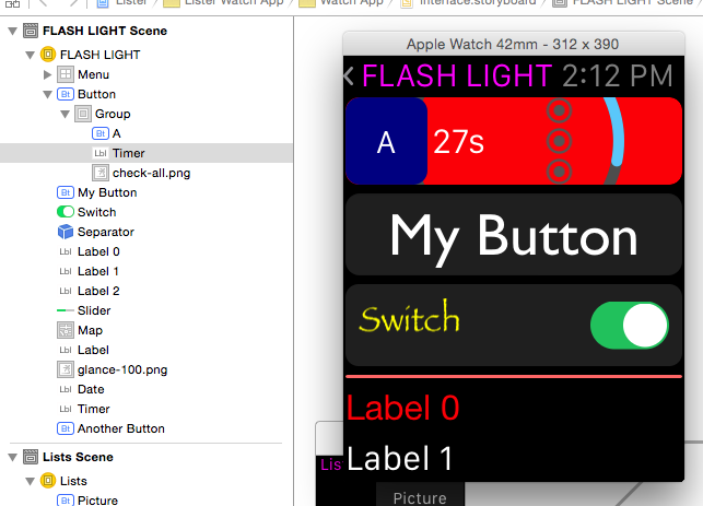
The pretty part is the list of objects on the left, not my abuse on the right!
The topmost “Button” uses the group content mode, so it’s layout is defined with a container. That container includes three more items: another blue button with an “A”, a WKInterfaceTimer that counts down, and an image with the “check-all.png” graphic. The Group container uses a red background with another transparent image (the teal arc.)
The interesting thing here is that while you only get one IBAction for the button, you can set up multiple IBOutlets for the items in the container. As a test, I hooked up the button’s action to change the background color of the group, reset the timer, and swap one of the images.
In Interface Builder, the Size and Position settings in WKInterfaceObject’s Attribute inspector let you define where the items in the container are placed and how much space they should use. Since you don’t know if you’re going to be running on a 38mm or 42mm device, think in fractions. The example above uses 0.25 for the button and the timer, and 0.5 for the image.
Power Consumption
Bluetooth Low Energy must be really low power: the design of WKInterfaceObject means it’s going to be on a lot. Every interaction with the watch has the potential to move actions and data between your pocket and wrist using the radio.
But more importantly, this API design gives Apple a simple way to put a cap on power consumption. We saw this approach in the early days of the iPhone and that worked out pretty well, didn’t it?
One final thought about the API design: your code never runs on the watch.
Physical Design
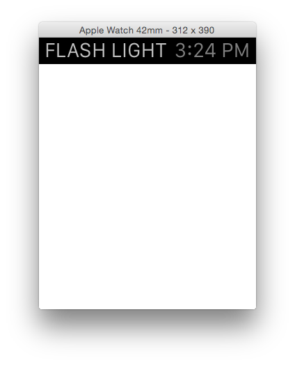
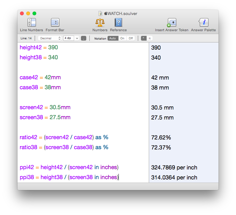
In addition to new APIs, more information about the physical characteristics of the watch have been made available. We now know that the 42mm model has a 312×390 pixel display and that its 38mm counterpart uses 272×340 pixels.
Screen resolution
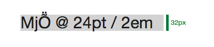
In addition to its size, the placement of the display on the face of the watch has been documented in the layout section of the Human Interface Guidelines. That has led some of us to estimate the screen resolution.
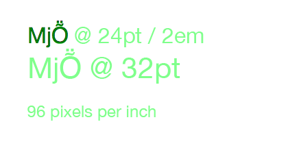
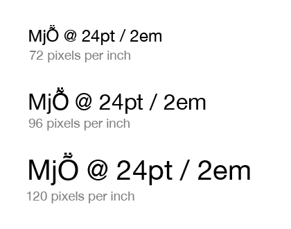
My calculations put the resolution somewhere above 300 ppi:
Since we’re not dealing with engineering drawings here, it’s impossible to be precise. For one thing, we don’t know where Apple is measuring 38 and 42 millimeters. Traditionally, it’s measured from the center of the lugs, but since the Apple Watch uses a different mechanism, it could be the size of the sapphire crystal.
John Gruber, who has a stellar record at this guessing game, thinks the display will be 326 ppi, just like on the iPhone 6.
But you’ve got bigger problems than pixel perfect design now anyway…
Screen size
The display layout drawings give us enough information to create a reasonable physical facsimile of the watch.
It’s small. Very small.
Much smaller than you think if you’ve been looking at it in the simulator.
You’ll want to download this PDF created by Thibaut Sailly and print it out at 100%. My first thoughts were that my finger covered more than half the screen and that I could fit eight of these displays on my iPhone 6!
After this “physical contact” with the Apple Watch, some of the controls that we see in the simulator feel ridiculously small. There’s no way you’re going to tap the back arrow in the nav controller with your finger: I’m guessing that control is there solely for developers who are using mice and trackpads to develop their apps.
Mockups
Once you have the PDF to give you an idea of the physical size, you can then start to see how your design works at that scale. Thibaut has already made the world’s ugliest watch and it’s doing important information design work. Here it is showing a simulated scroll view and exploring glance interactions.
You can even take these mockups a step further and strap a phone to your wrist. While it may look and feel a bit strange, there are definitely some interesting insights being discovered in that Dribbble post. The Mirror tool in xScope could be very handy for this kind of work: design in Photoshop, view on your wrist and learn.
These physical interactions with your designs are incredibly important at this point. Wondering why the scroll indicator only appears in the upper-right corner while you scroll your view? I was until I realized that’s where the digital crown is physically located.
Orientation
One thing that none of us are going to miss in WatchKit: you don’t have to worry about device orientation changes.
As my friend, and party pooper, John Siracusa points out, this is probably just a temporary situation. As a fashion accessory, Apple Watch could easily become a pendant watch.
Where to go from here
So there you have it: a day spent with another revolutionary set of APIs. If you’re just starting out, the links to the HIG and sample code above are great places to start learning.
If design interests you as much as code, you’ll also want to download the Apple Watch Design Resources (the link is at the bottom of that page.) You’ll find all the fonts and Photoshop documents you need to start pushing pixels. But as you saw above, make every effort to put those pixels into physical perspective.
As Apple has stated, this is only the initial phase of the API rollout: fully native apps will be possible later this year. Even though this is a first step, it’s a really good one.
All that’s left to do now is start making awesome apps.