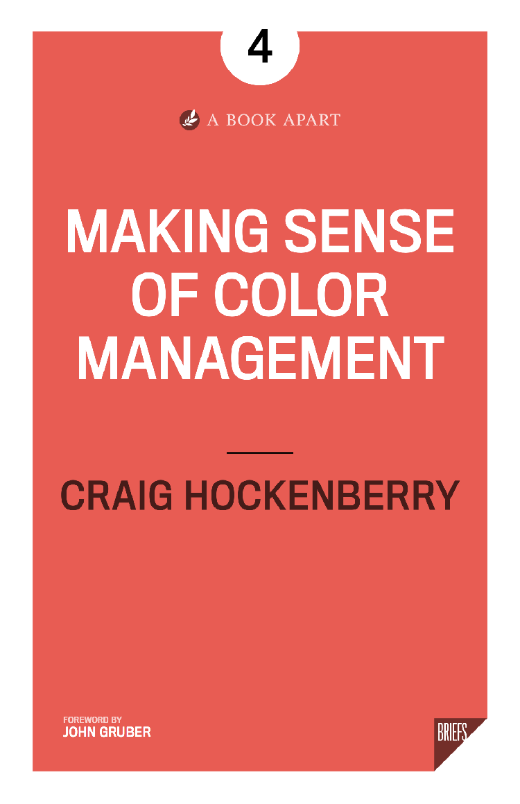
A Responsive Factory

Back in May 2014, we introduced a new Iconfactory home page. One of the main design goals for that site was to make the layout a responsive web design: the same site looked great whether you were looking at it on a desktop PC or an iPhone. Reading Ethan Marcotte’s book was a revelation.

Of course, that site was just a beginning. We run a lot of web sites (including some you’ve probably never heard of before). Clearly we had to pick our responsive battles.

We started with an update to our blog in January 2015. In October, we updated our iOS and OS X app catalog. And yesterday we launched a responsive design portfolio.

A year and a half after our first responsive design, we’ve hit a milestone. All of the sites listed in the Iconfactory’s red navigation bar are responsive designs and will display correctly on any device. Woo hoo!

Along the way, we cleaned up some of our branding elements and worked toward a more consistent experience across all the sites. Check out the post at the Iconfactory about the new SVG icons in Safari to see what that’s all about.

It’s clear we’re at a point in time where the vast assortment of screens is daunting. If you haven’t thought about how your site works on this wide variety of devices, now is a great time to start.

I Left My System Fonts in San Francisco

Note: This post contains out-of-date information and is left here as a historical record. Please refer to this new post on using system fonts in CSS. Thanks!

Apple is working on a lovely new system font for both iOS and OS X. We first saw the San Francisco font on the Apple Watch: we’ll soon be seeing it on all of Apple’s devices.

As a developer, there are often cases where we need to use the system font on web pages. Many times these pages are embedded in our apps and manage things like remote settings or documentation. In these contexts, matching the content to what the customer sees in their surrounding environment makes a big impact on the user experience. Think about how out of place an app feels when it displays Sparkle release notes in Lucida Grande while running on Yosemite.

We’ll soon be faced with a lot of surrounding content that’s displayed in San Francisco and will need ways to specify that same font in our CSS. It turns out that’s not a simple thing to do.

Traditionally, we’ve specified fonts explicitly. Something like this could be used to get San Francisco:

body {
  font-family: "San Francisco", "Helvetica Neue", "Lucida Grande";
}

Unfortunately, on a fresh install of OS X 10.11 (El Capitan) there’s no San Francisco font installed:

All Fonts on El Capitan

But it’s the system font, so how is this possible?

Apple has started abstracting the idea of a system font: it doesn’t have a publicly exposed name. They’ve also stated that any private names are subject to change. These private names all begin with a period: the Ultralight face for San Francisco is named “.SFNSDisplay-Ultralight”. To determine this name, you need to dig around in the font instances returned by NSFont or UIFont; it’s not easy by design.

The motivation for this abstraction is so the operating system can make better choices on which face to use at a given weight. Apple is also working on font features, such as selectable “6” and “9” glyphs or non-monospaced numbers. It’s my guess that they’d like to bring these features to the web, as well.

As a part of this abstraction, there’s now a new generic family name: -apple-system. The markup looks like this:

body {
  font-family: -apple-system, "Helvetica Neue", "Lucida Grande";
}

Unfortunately, it’s very poorly documented. Most of the information I’ve found about this name comes from the WebKit source code. It certainly feels like work-in-progress.

Another disappointment is that this generic family name only works in Safari. Of course you wouldn’t expect Google to support an “-apple” prefix, but the WebKit source also shows a -webkit-system-font. Since the latest version of Chrome is based on a fork of WebKit, it’s not surprising that it’s ignored by Blink.

Adding to the confusion, Safari on iOS has added system font styles that match the Dynamic Type feature. These keywords can be used on iOS 7 and later:

-apple-system-headline1
-apple-system-headline2
-apple-system-body
-apple-system-subheadline1
-apple-system-subheadline2
-apple-system-footnote
-apple-system-caption1
-apple-system-caption2
-apple-system-short-headline1
-apple-system-short-headline2
-apple-system-short-body
-apple-system-short-subheadline1
-apple-system-short-subheadline2
-apple-system-short-footnote
-apple-system-short-caption1
-apple-system-tall-body

Since OS X doesn’t have a way to adjust type dynamically, these keywords are unavailable on the desktop (source). Of course, there’s no support in Chrome either.

Also note that these keywords won’t work in your font-family definitions; they only work when used with font. If you’d like to learn more about this functionality, these tutorials by the ChocolateScript developers and Thomas Fuchs are very helpful.

If you’re a designer or developer who works on Apple devices, chances are good that you’ve installed the San Francisco font manually. Don’t get fooled like I did: most of the folks that visit your site won’t have these fonts installed. Also, Apple’s license for San Francisco limits redistribution, so it can’t be used as a web font. (And you agreed to this license before downloading the font.)

So what’s a coder to do?

If you know that your content will only appear in an Apple browser or web view, the markup is pretty simple:

body {
  font-family: -apple-system, "Helvetica Neue", "Lucida Grande";
}

You’ll get the system font on the most current browsers and a fallback to Helvetica Neue or Lucida Grande on older systems.

If Chrome or another browser is a part of the picture, I’d suggest the following:

body {
  font-family: system, -apple-system,
      ".SFNSDisplay-Regular", "Helvetica Neue", "Lucida Grande";
}

The “.SFNSDisplay-Regular” is the private font name for the regular face of San Francisco in the current beta release (remember, it can change at any time!)

Chrome now supports a BlinkMacSystemFont so the private font name is no longer needed:

body {
  font-family: system, -apple-system, BlinkMacSystemFont,
      "Helvetica Neue", "Lucida Grande";
}

For more information about this change in Chrome, see the links at the end of this post.

The “system” generic family name doesn’t currently exist, but I’d encourage browser manufacturers to adopt this technique. It would be helpful for coders on all platforms. On Android, Roboto or Noto could be selected as needed. On operating systems like Windows, where the user can choose their system font, the automatic selection would make content fit in more easily.

Before closing, I’d like to point out the HTML and CSS I used for doing this research. If you’re not running El Capitan yet, this is is how that markup looks in Safari:

Test Page shown in Safari running on El Capitan

And the same page rendered in Chrome:

Test Page shown in Chrome running on El Capitan

The purple line of sample text displays correctly on both browsers using the “hybrid” hack I’ve shown above. That text will also display in Helvetica Neue on Yosemite (10.10) and Lucida Grande on Mavericks (10.9).

As Apple starts to roll out the new software releases that feature San Francisco, I hope the information presented here will be of help. Enjoy!

Updated July 12th, 2015: After some discussion with folks on the WebKit team, the preferred generic font name is “-apple-system”, not “-apple-system-font”; I’ve updated the post accordingly. Also, as I suspected, this change is very much a work in progress and the team is aware that there needs to be more documentation. They also reminded me that Chrome is now based on the Blink fork of WebKit, so I’ve clarified that as well.

Updated July 14th, 2015: Some folks have suggested using “sans-serif” to get the system font on El Capitan. My testing shows that all browsers on all versions of OS X render this generic font name in Helvetica (not Helvetica Neue.) Also many browsers give users ways to override this default font. I also updated the sample code so that it works better with Firefox.

Updated July 27th, 2015: Apple’s Surfin’ Safari blog has more information on the new “-apple-system” CSS value for font-family. It also looks like they’re working with the W3C to standardize a “system” generic font family.

Updated January 20th, 2016: Chrome now supports a BlinkMacSystemFont generic font name that behaves like Safari’s -apple-system. Marcin Wichary does a great job of explaining how to use it. As a bonus, he shows how to get the system fonts on other platforms, including Android and Linux.

A New Way to Display

To date, Apple’s Retina displays have relied on LCD technologies. Since the iPhone 4, our mobile devices have used in-plane switching (IPS) technology to achieve high resolution with accurate color from a wide range of viewing angles. The IPS LCD panels are also present in many of the desktop monitors we use on our Macs.

Chances are good that’s about to change with an OLED display in the Apple Watch.

Unless you’ve done work on Android, you’re probably unaware how different AMOLED displays are from LCD. Let’s take a look at what lies ahead.

Physical Differences

An LCD display relies on a backlight that’s projected through three layers: one for each of the primary colors. Red, green and blue appear on screen because crystals in those layers can be aligned electrically to allow the backlight to pass through.

OLED has no backlight and has only one layer that produces light. That layer is an organic compound that emits light when subjected to an electric current. When you put them in a two dimensional matrix of transistors, you end up with an AMOLED display.

Based on these short descriptions, it’s easy to see why an OLED is thinner than its LCD counterpart: there are simply fewer layers of electronics. And it gets even better when you discover that the compounds and electronics can be fabricated on flexible plastic substrates.

LCDs have always been problematic in direct sunlight because the backlight must pass through filters which can also reflect ambient light. This has also been an issue for OLED displays where the light is emitted below a reflective metal cathode. The good news is that recent advances with the technology are producing brighter results than an LCD.

The biggest challenge for OLED is with the organic material where light is emitted. Basically, byproducts of the chemical reaction that produces light accumulate over time and reduce the efficiency of the output. Again, this is an area where manufacturers are focusing their efforts. In just a few years the lifespan of these devices have increased by several orders of magnitude, but is still limited to tens of thousands of hours. Don’t expect your Apple Watch to become a family heirloom.

How Not to Do It

OLED displays have gotten a bad rap on mobile devices primarily because of a thing called PenTile.

PenTile mimics how our eye works: 72% of the luminance we perceive is determined by the green wavelengths of the electromagnetic spectrum. The RGBG arrangement of sub-pixels lets a display get brighter without increasing the overall number of transistors needed. This, of course, keeps manufacturing costs down.

Unfortunately this physical layout of the light emitters also makes colors grainy and text hard to read. Color accuracy also suffers. PenTile is also a trademark of Samsung. I can’t see Apple using this approach in their Retina displays.

It’s much more likely that Apple’s industrial designers have been working hard to find a new and better way to use OLED technology without losing fidelity. I can’t wait for someone to look at the Apple Watch’s display under a microscope.

Black is Best

From Apple’s point-of-view, one of the most important things about OLED is how it consumes power. A transistor on the display only uses energy when it’s producing light. Compare this with an LCD backlight which must be lit in order to see any pixel.

Folks with OLED displays on their Android devices have figured out that a lot of black pixels makes their battery last longer. So too Apple.

It’s also important to remember that each pixel on the display has a limited lifetime. The less time the OLED spends producing light, the longer it lasts.

One of my first impressions of the Apple Watch user interface was that it used a lot of black. This makes the face of the device feel more expansive because you can’t see the edges. But more importantly, those black pixels are saving power and extending the life of the display. It’s rare that engineering and design goals can align so perfectly.

And from what we’ve seen so far of the watch, that black is really really black. We’ve become accustomed to blacks on LCD displays that aren’t really dark: that’s because the crystals that are blocking light let a small amount pass through. Total darkness lets the edgeless illusion work.

Flat Black

I’ve always felt that the flattening of Apple’s user interface that began in iOS 7 was as much a strategic move as an aesthetic one. Our first reaction was to realize that an unadorned interface makes it easier to focus on content.

But with this new display technology, it’s clear that interfaces with fewer pixels have another advantage. A richly detailed button from iOS 6 would need more of that precious juice strapped to our wrists. Never underestimate the long-term benefits of simplification.

The Future

Apple is a company that likes to leverage its technologies across a wide range of products. Look at how many of their devices are using IPS LCD displays now, then imagine a move to an OLED display pioneered by the Apple Watch.

When Jony Ive taps the home button on his iPhone and says, “The whole of the display comes on. That, to me, feels very, very old.” it’s a sign that individually addressable sources of light are the wave of the future.

Of course it will take time for this to happen, but you know it’s going to look awesome when they’re done. And along the way, we’ll learn to think about pixels differently.

For hire

We’ve been making award-winning apps since the App Store opened. Now we’re doing it for clients.