We’re hearing from customers that some of our apps are running slowly on Tahoe and I suspect that this bug has something to do with it. Unfortunately, it’s hard for customers to check which version of Electron is being used and see if that might be a cause. So I decided to do something about that…
Luckily there’s a script written by Tomas Kafka that lets you check all your apps quickly and easily. I took that script, updated some parts that required Xcode to be installed, and wrapped it up in an AppleScript applet that’s easy to download and run:
When you run the app, you’ll see a short introduction:
The first time you run the app, you’ll see a warning that the app was prevented from modifying other apps on your system. This is “normal” because the app needs to read other apps to do its job:
After all apps are checked, you’ll see the results:
Eventually, you’ll see ✅ in that window and know that one or all of your Electron apps have been updated.
If you’re one of those people who’s wondering when it’s a good time to upgrade to Tahoe, you can run TahoeElectronDetector on older versions of macOS and give yourself an idea of when it’s safe to move to the new operating system.
Additionally, there’s a website that lists the status of the most popular apps. This will be helpful in locating newer versions since some of them will not update automatically.
If you’re a Mac developer who’s hearing from customers about weird slowness, feel free to point them at this web page or give them a copy of the app to check their own system. If you need the source code, it can be downloaded here.
And if you’re a developer, this is your periodic reminder not to use private and undocumented parts of an API. They will break, and in cases like this, it will be spectacular.
In a previous essay, I briefly expressed some thoughts about why Liquid Glass is inappropriate for the Mac:
I’m having a much harder time seeing how Liquid Glass will benefit other platforms like the Mac or Apple TV (where Apple doesn’t even make the screen). Forcing tactility where it’s not needed or wanted feels like a misstep.
I’ll now go into depth regarding these thoughts.
In 2010, John Gruber wrote The Future of the Mac in an iOS World for the Macworld back page. He explained why the Mac was still so important in the new world dominated by the iPhone:
It’s the heaviness of the Mac that allows iOS to remain light.
…
When I say that iOS has no baggage, that’s not because there is no baggage. It’s because the Mac is there to carry it. Long term — say, ten years out — well, all good things must come to an end. But in the short term, Mac OS X has an essential role in an iOS world: serving as the platform for complex, resource-intensive tasks.
It’s been fifteen years since he wrote that — have we reached the point where the Mac can come to an end?
I’d say not.
Apps like Final Cut Pro on iPad are an impressive achievement, but they lack the features, file management, and expansive screen real estate of the Mac. It’s a great tool for casual editing on the go, but I can’t imagine Apple saying that the Mac app is end-of-life without there being a huge uproar.
Another example is Xcode: even though the hardware on iPad and Mac shares the same processor, there is still no port of the user interface. And even if you can whittle the complexity of an IDE down to fit on a smaller screen, you’d still have problems with locking down the app. On the Mac, Xcode doesn’t run in an app sandbox and does not use the hardening that prevents certain security exploits. iOS mandates the use of both these things: it’s not even an option for app developers.
Xcode also sports 54 entitlements that let it do things other apps can’t. Things like authorization, device pairing, and inspecting the memory of other processes. A port of Xcode to iPad would immediately make it an attack surface for hackers.
So while iPadOS has obviously gotten more capable, I don’t see it displacing the Mac desktop as the place where the heavy lifting gets done.
Now let’s talk about that heavy lifting.
It’s done by professionals who have highly tuned desktop spaces and workflows. Windows and controls are in just the right place so focus can be wholly devoted to the task at hand. Everyone’s workspace is different and as unique as the person who created it.
If you’re someone who’s only using email, a web browser, and some messaging apps to get stuff done, changes to your desktop appearance aren’t going to be disruptive. It’s also likely that you’ll appreciate changes that make it look like your phone.
If you’re doing anything more complex than that, your response to change will be much different.
Have you ever wondered what the inside of a semi-truck looks like? Watch this short tour!
Professionals on the Mac are like truck drivers. Drivers have a cockpit filled with specialized dials, knobs, switches, microwave ovens, refrigerators, and pillows that are absolutely necessary for hauling goods across country. Those of us who are making movies, producing hit songs, building apps, or doing scientific research have our own highly specialized cockpits.
And along comes Alan Dye with his standard cockpit, that is beautiful to look at and fun to use on curvy roads. But also completely wrong for the jobs we’re doing. There’s no air ride seat, microwave oven, or air brake release. His response will be to hide these things that we use all the time behind a hidden menu.
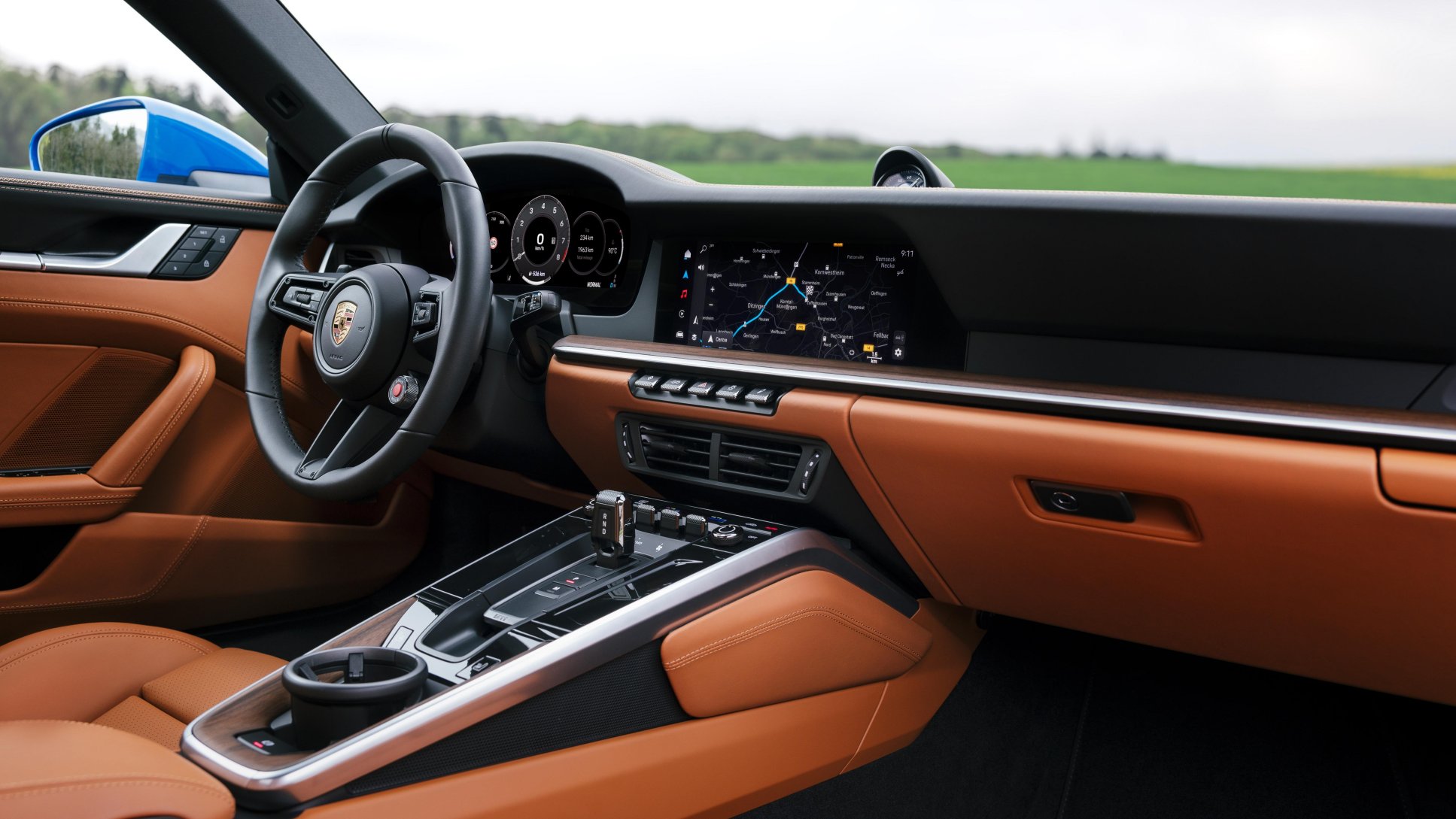
A beautiful Porsche 911 cockpit that’s perfect for high performance driving. But be sure to compare the angle of the steering wheel with the previous photo.
It’s no wonder our reaction is somewhere along the lines of “fuck off”. Or maybe something a little more polite and eloquent. The bottom line is that one size does not fit all: we don’t want a Mac that looks or works like a phone, tablet, watch, or TV.
Worse, this situation is going to be like notifications on the Mac: a minimal design that mimics other platforms, and completely annoying in day-to-day use.
Liquid Glass is currently in a barely presentable state on iOS. It’s going to be like iOS 7 and take another year to sand down the rough edges. And then several more years to tone down the design, as with Aqua.
With the Mac typically lagging other platforms, I don’t expect to see any design improvements on my desktop for several years. It’s going to be an unpleasant and lengthy slog with various accessibility workarounds in place until the standard design looks decent. Or maybe, like with notifications, that will never happen because Alan Dye knows best.
My Mac has been a truck since the beginning of this century. When my desktop computer got Unix and Aqua it was the perfect platform to craft my cockpit. It’s going to be really hard to abandon that and create a new one, but the way things are heading, it feels likely.
I submitted the following feedback today. If you ever plan to change your business model from a paid up-front to freemium model, read this report and avoid a day of headache and stress.
Title: The sample code for a business model change was written by someone who’s never submitted an app to the App Store
Please describe the issue and what steps we can take to reproduce it:
And when you use that sample code, that you cannot test in the Xcode transaction simulator or in the TestFlight sandbox environment, it will fail spectacularly on launch day. You will be inundated with support requests from people who are expecting to see a payment for the previous version AND you’ll be in a state of panic because YOU HAVE NO IDEA WHAT THE HELL IS GOING ON. And did I mention that you can’t test this in production?
The sample code implies that the originalAppVersion is a string that’s separated by periods (“.”). The sandbox environment returns a value of “1.0” which reinforces this notion that it’s a value that separated by periods.
It is not.
If you’d read the Xcode documentation, you’d know that it automatically generates an app’s Info.plist. This has been the default setting for quite while – most developers have no idea this is a configurable option: they fill in the “Version” and “Build” number in the target’s General settings and are done with it.
For most, the build number will just be a single number that increments each time you submit to TestFlight (and eventually to the App Store).
When GENERATE_INFOPLIST_FILE is enabled, it sets the value of the CFBundleVersion key in the Info.plist file to the value of the build number (CURRENT_PROJECT_VERSION, or the “Build” in General settings). And that means your Info.plist is getting a CFBundleVersion without periods.
So what happens when you use this code?
let versionComponents = appTransaction.originalAppVersion.split(separator: ".")
let originalMajorVersion = versionComponents[0]
Well, if you’re an inexperienced Swift developer, your app is going to crash with an array index that’s out of bounds. Those of us who are more careful in our receipt processing code will skip over the originalMajorVersion because versionComponents is empty.
And that’s when the emails from customers start arriving.
The originalAppVersion remains constant and doesn’t change when the customer upgrades the app. The string value contains the original value of the CFBundleShortVersionString for apps running in macOS, and the original value of the CFBundleVersion for apps running on all other platforms.
So even though CFBundleVersion was originally intended as a major/minor/patch format, its current use is as a single integer that increments when you submit to TestFlight. So the code above is expecting “1.0” and is actually getting “83”.
(And why the hell is it different on macOS? You do realize that cross platform apps are a thing, right?)
Again, you have no way to test this theory other than going through App Review (with an expedited review if you’re lucky). And if you’re even luckier, you’ll have folks on Mastodon that will confirm that this sample code is a piece of shit. A few hours later you’ll breathe a sigh of relief when folks start telling you that things are working fine.
And then the next day, you’ll write this bug report and post it publicly because no one else should have endure the stress caused by this sloppy code.
The addition of UITabAccessory in iOS 26 is welcome. It does, however, create a problem as far as backward compatibility is concerned. How do you present the new accessory view on older versions of iOS?
This backward compatibility is especially important for Triode. A lot of folks turn an older device into a dedicated radio player. I have an old iPad in the kitchen, for example.
So what do you do on the other side of the availability check where you set UITabBarController.bottomAccessory?
You’ll need to create two subclasses: one for UITabBarController and another as base class for all the view controllers you add as tabs (mine is creatively named as TabViewController).
In the UITabBarController subclass, you’ll do the check for availability in viewDidLoad and for versions older than iOS 26, you just add the accessory view to the tab controller’s view hierarchy using view.addSubview(accessoryView). You’ll also style the accessoryView as needed (e.g. adding a backgroundColor and cornerRadius). The same gesture recognizer is the attached to the accessoryView regardless of how you add it to the tab bar.
Then, in viewDidLayoutSubviews, you use tabBar.frame to position the accessoryView relative to the tab controls.
The other piece of the puzzle is doing the automatic inset adjustments on the tab controller’s views. In your common subclass (e.g. TabViewController), you’ll implement viewDidLayoutSubviews. On iOS 18 and earlier, you can check if the view or its first subview is an instance of UIScrollView. If it is, set contentInsetAdjustmentBehavior to .always and make new UIEdgeInsets to match the metrics you used in your tab bar controller.
(Side note: if you are having problems with the bottomAccessory on iOS 26 not animating as you scroll, make sure that your UIScrollView is the first subview. If something like a search field is the first view, it won’t work correctly.)
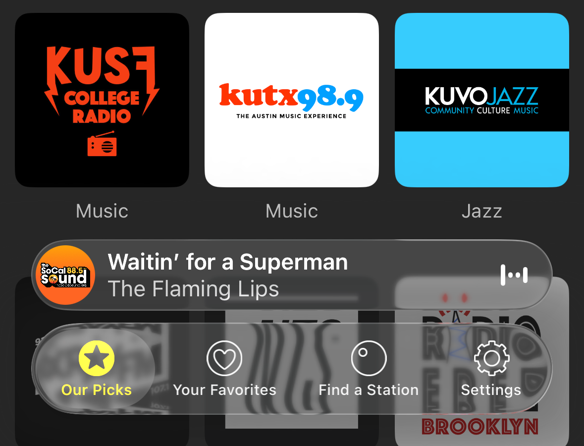
On iOS 26, Triode’s tab bar looks like this:
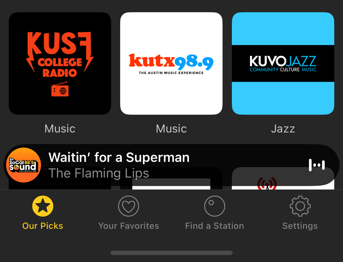
And thanks to the work above, folks on older systems can use the same accessory view:
You don’t get the fancy animations and effects, but folks on older devices will appreciate having the same capabilities. And better text contrast ;-)
Whether you love it or hate it, there is no shortage of opinion on Liquid Glass. I have thoughts about what it is, but today I want to focus on why it exists.
Apple’s public rationale for the new design language is that it offers a universal solution across platforms that takes advantage of recent hardware advances. Its touted benefits are a more lively experience that puts a greater focus on content.
The transition from iOS 6 to 7 was used as an example of how Apple has been successful with visual refreshes. But I don’t think that applies in this case.
In late 2012 and early 2013, there was a movement outside of Apple to simplify user interfaces: the highly textured designs introduced with the first iPhone had run their course. You can see this in our own work with Twitterrific 5 and other apps like Vesper. The launch of iOS 7 in 2013 was startling to some designers and developers, but not everyone. There was clearly a need, and the app ecosystem has benefitted from this change for over a decade.
I’m unaware of anyone outside of Apple who’s thinking “we really need to have more fluid glass in our designs”. Of particular note during the introduction is how much time they spend showing off glass blocks and talking about the physical effect itself. While not addressing the most important question: “why do we need this?”
And I’m pretty sure the answer is “we don’t”. The answer is “Apple does.”
I’ve spent the last few months updating Tot for iOS 26 while watching Sean do the same thing with Tapestry. One thing that’s clear from this work is that you never want a control or container that touches the edge of the screen.
It’s like when safe area insets appeared in iOS 11: it wasn’t clear why you needed them until the iPhone X came along with a notch and a home indicator. And then it changed everything.
There has also been an emphasis on “concentricity”. It’s an impossible thing to achieve and an easy target for ridicule. But it’s another case where Apple wants to take control of the UI elements that intersect with the physical hardware.
All of this makes me think that Apple is close to introducing devices where the screen disappears seamlessly into the physical edge. Something where flexible OLED blurs the distinction between pixels and bezel. A new “wraparound” screen with safe area insets on the vertical edges of the device, just like we saw with the horizontal edges on iPhone X.
The user interface work of the past few months will all make a lot more sense, and developers who haven’t been paying attention will have their “holy shit” moment.
I can see this new physical design being very successful with touch-oriented devices: it will feel natural with a phone, tablet, or watch. Hardware and software becoming one in classic Apple fashion.
I’m having a much harder time seeing how Liquid Glass will benefit other platforms like the Mac or Apple TV (where Apple doesn’t even make the screen). Forcing tactility where it’s not needed or wanted feels like a misstep.
Other challenges, like infusing your own branding into an app with clear buttons will be easier to reason about once the reality of the hardware drops. Until then, stay away from the edges and wait for Apple to reveal the real reason for Liquid Glass.