If you’re reading my essays, it’s likely that you’re selling some kind of software on the Internet. (Or soon will be.)
To be successful at this endeavor, you need to monitor your sales and plan development around the revenue. Ask anyone who’s had success with a software product, and I can guarantee you that they have some kind of metric that tells them how well they are doing.
What I’d like to do today is share one of my favorite methods. But before I do, let me share some advice that will help you understand why this tracking scheme is so effective.
If you’ve released a product, you no doubt have witnessed the “first day spike.” It’s one of the great things about doing a release: you find that people really do love your work.
But there can be a problem. Typically, that initial spike is followed by an exponential curve: every month you’re making half as much money. And even though your income is less and less each month, the support load from existing and new customers stays fairly constant. You’re working just as hard, but earning less.
So how do you work around this? As you would in any other business: by planning ahead.
As software developers we often fall into the “just one more feature” trap. We want a 1.0 release to be awesome, and that one more thing will only take a day or two, and people will love it, so why not?
Because that awesome feature could be a very good thing to generate buzz and sales for a 1.1 or a 1.2 release. And by not “doing it all” in the first release, you get your product to market faster. You’ll be making money while you implement that cool new feature.
And holding back can have another advantage: you might find that your users want something different than what you had planned. Their input can often change your idea, so don’t waste time doing something without feedback.
So when do you know that it’s a good time to do a 1.1 release? A general rule of thumb is 30-90 days after your 1.0 release. On the day you release your 1.0, you should have some code already in the works for the 1.1 release. Give yourself a head start on the next release, because you’ll find those first 30-90 days are consumed by customer support and go by very quickly.
(I can also guarantee that you’ll have a 1.0.1 release because of some stupid little bug you overlooked. So make sure you plan ahead for that, too.)
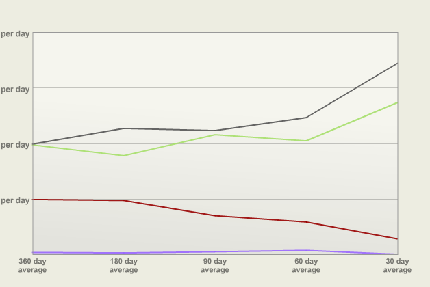
With all this in mind, I present a simple way to visualize your release cycles by graphing trends of averaged daily sales:
The graph shows four hypothetical products and their sales. The Y axis shows how much the product earned. The X axis shows increasingly short time intervals. To plot each Y value, you just take the total amount sold in that period and divide it by the number of days. The intervals were chosen because they’re nice approximations of monthly, bi-monthly, quarterly, bi-yearly and yearly cycles.
Let’s say the Y grid lines are at $10, $20, $30 and $40 earned per day. The red product has sold about $2.50 per day over the past month, and about $10 per day over the past year. It’s a product that’s definitely in need of a version bump. An update should push it over $10 per day in the 30 day interval.
The gray product shows how a new release looks. Instead of seeing a spike, you’ll see the averages for all intervals go up (with the most change at the most recent intervals, of course.) You’ll also see the most recent averages go up as a result of ads, reviews and other good PR. As time goes on, the 30 day average will eventually drop. When it gets below the 60 or 90 day average, that’s a good time to do a release.
The goal is to end up with a product like the green one. For the most part, it trends upwards. You’re doing things right.
Finally, this graph also shows products that you shouldn’t spend time on. The lavender product isn’t performing as well as the others. Your time is better spent on things that are going to generate more revenue.
In case you’re wondering how I generated these graphs, it’s proprietary Ruby on Rails code that reads our financials and feeds them to XML/SWF Charts. The information in these graphs will change frequently: you’ll want to find a way to automate the collection and processing of your own sales data.
I’ve been talking with Dylan Bruzenak about incorporating this trend graph into AppViz. Hopefully we’ll see it in a future release—make sure to let him know if you’d find it helpful. (And if you’re not already using AppViz to track your iTunes sales, pull your fricken’ head out and start using the trial version.)
Who knew that accounting could be so trendy?
