Now that we all have our iPhones and are discovering what they can do, attention will turn to what they cannot do. And that, in turn, will lead to the fact that there is no third party development of native applications for the device.
Of course, you can use HTML and AJAX to do web-based applications. But as Steve Jobs said regarding their Google Maps implementation:
And, you know, that client is the result of a lot of technology on the client, that client application. So when we show it to [Google] , they’re just blown away by how good it is. And you can’t do that stuff in a browser.
Personally, I do not begrudge Apple for the lack of a Cocoa-based iPhone SDK. The amount of time and effort required to develop this new and compelling device is not insignificant. Discovering new metaphors and mechanisms for a touch-based user interface is much harder than it appears. Documenting best practices and exposing APIs for the internal frameworks are equally difficult.
There’s also the issue of maintaining a small and efficient footprint on the iPhone. It’s smooth and natural interface could easily be destroyed by a rogue application.
(I’m convinced that is also the reason why Flash and Java are currently off-limits, and why I think that will continue in the future. If you doubt this, try monitoring your CPU usage with iPulse while watching a YouTube video. As your fans kick in, think about how much battery the application is chewing up.)
Of course, the hallmark of a great user interface is that it looks easy. So easy, that it hides the underlying difficulty that went into its production.
I can guarantee you that the past couple of years have not been easy for the developers at Apple. I’m sure that countless approaches have been brainstormed, prototyped and evaluated. Version 1.0 of the iPhone is not the first attempt.
So even though we don’t have an iPhone SDK, we can begin this difficult process of rethinking our designs. And in many cases, HTML and Javascript can be used to prototype these redesigns.
The following observations are a result of my thinking about porting both our Frenzic and Twitterrific applications. Both are well suited to a mobile environment, and would be outstanding products for the iPhone. It’s also clear that the Iconfactory will be working on new versions of these applications, not just ports of existing user interfaces. It’s a brave new world.
Finger size limits the UI
An interface on the iPhone has much larger areas for hit testing. Try this experiment: press your fingertip against a ruler. You’ll see somewhere between 1/4″ and 1/2″ diameter at the point of contact. That corresponds to anywhere between 40 and 80 pixels of screen real estate on the phone’s 160 dpi display.
Contrast that with the typical 20 pixel hit area on a mouse-based UI and you’ll see your standard assumptions change quite a bit.
As an example, let’s look at a popular phone game: Bejeweled. Typically, this game consists of 8 columns of graphics which the user manipulates. With the iPhone’s 320 pixel width, that’s 40 pixels or 1/4″ for each column of graphics. Too small to manipulate with your finger, especially considering that this game involves working with adjacent pieces.
Another issue is that your finger has a “shadow.” Unlike a mouse, you can’t see what’s directly below the object you are pointing at. Primary control mechanisms reside at the bottom of the screen, unlike a desktop application whose control layout normally works from top to bottom. Tabs are at the bottom of the panels they control so your finger does not obscure their contents.
Throughout the iPhone UI, you see examples of how Apple has had to work around these limitations. Things like adaptive hit testing on the keyboard (using predictive word completion) and the magnifier for the insertion point are all due to the fact that our fingers are big and bulky when compared to a mouse pointer.
One hand or two? Portrait or Landscape?
A subtle, but critical, decision is whether you plan on having an interface that requires one or two hands to operate. Some iPhone applications, like iPod, benefit from being one handed in portrait mode and two handed in landscape mode.
Of course, one handed interfaces give the user more mobility and flexibility to do other things while controlling the device. It also limits what you can do in your UI.
It also appears that landscape mode is not conducive to a one handed interface since your thumbs have limited reach. Portrait mode gives you a lot more freedom: two thumbs, one thumb, or your palm and index finger.
You also need to remember that not everyone is right handed.
Simplicity is good, but it means stuff is missing
The iPhone’s UI is decidedly simple to use. But this simplicity comes at a cost. Features such as cut/copy/paste are notably absent. The same is true with drag and drop.
It’s conceivable (and likely) that clipboard operations will be added as gestures in a future version of the iPhone UI. Swiping your index finger to the left as a shortcut to delete is an example of how these common operations could be implemented.
On the other hand, I don’t expect drag and drop to ever become a widespread metaphor in the iPhone. That’s because dragging your finger on the display is reserved for scrolling. It’s possible that a tap to pick up, drag to scroll, and tap to drop interface could be developed, but that would be highly modal and something hard for people to discover. More importantly, it’s a difficult mode to escape from when it happens accidentally.
Another thing that is missing is loads of memory. Clearly, the iPhone team has been focused on the memory footprint of applications. Examples are the limited number of fonts available and the number of items each application can work with—8 windows in Safari, 3 panels in Weather, etc. Any application written for the iPhone will need to take these bounds into consideration. Swapping can’t save your ass.
Filesystem? What filesystem?
Of course there’s a filesystem on the iPhone. Crash logs show standard paths to files and folders (/System and /usr/lib, for example.)
But that doesn’t mean you get to show it to the user. Do you see any open and save dialogs on the iPhone? How is your application going to manage documents?
Much of the current document management is handled externally by syncing with iTunes. Getting a document onto the iPhone is a source of frustration with many earlier adopters—with arcane techniques like mailing items to yourself as a workaround.
In my mind, the iPhone is really a satellite device that’s dependent on another machine for managing documents. As the mobile environment evolves and becomes a more central player, we may see local management of information. Until that happens, it’s best to think of document management being either a simple set of +/- buttons or something that is out of your control (e.g. syncing.)
Another option is to rely on web-based storage mechanisms. It’s probably more viable in the short term and fits into the “iPhone as satellite” metaphor.
Tap vs. Gesture
Tapping is the action we are most familiar with as desktop application developers and users. A mouse click and a tap are analogous—button clicks are going to work the same way.
But things get interesting when you begin to consider gestures. Swiping to the right is a natural gesture for deleting: similar to drawing a line through a completed list item in your Moleskin.
Would a circular gesture be a natural way to represent undo? Or would a back-and-forth motion (like an eraser) be more appropriate?
Would pinching (squeezing) a text selection mean delete? Or would flicking your fingers apart combined with a poof be a better way to represent removal?
Think about the the original Mac user interface—the basic operations defined in 1984 are still with us. But there have also been a lot of things added as our knowledge of the desktop metaphor has improved. Chording with modifiers like Control and Option keys are a good example. These additions allow more advanced users to use the interface more efficiently without adversely affecting novice users.
I expect the same to be true with the iPhone UI. Gestures and other advanced features will evolve as the new environment becomes more familiar. It will evolve as its developers and users mature.
Putting these concepts into practice
A lot of geeks, including your humble author, are dreaming of a ssh client for the iPhone. Obviously it would be a great application for an Internet enabled device. But development of such an application is challenging in light of the considerations above. Let’s take a look at some of the issues and pitfalls:
- The keyboard is going to take up at least 1/2 of the screen, possibly more if you include common shell characters like !, $, `, “, ‘, etc. That’s not going to leave you a lot of room to view output unless you implement some sort of show/hide mechanism.
- Once you get the keyboard input sorted out, you’re going to want need shortcuts to deal with a command line environment has been traditionally bound to multiple key sequences: the Control and C keys simultaneously or the Escape key followed by the D key are good examples.
- Similarly, managing the insertion point on the iPhone involves dragging a point on screen. How does this integrate with curses and it’s move left/right/up/down paradigm?
- Predictive completion is addictive—it quickly becomes a necessity. Some kind of mechanism to complete shell commands and paths as you type would make the interface much more efficient.
- You’re going to want a shell on the iPhone to be able to work in both portrait and landscape modes. Apple has raised the bar very high in this regard: the switch between modes needs to be seamless within the shell environment.
- Courier. It’s a crappy font for a shell, but it’s the only fixed pitch font available. Deal with it.
- No copy and paste. Get ready to retype commands from web pages, email and notes. Or come up with something more elegant…
- The filesystem is hidden. Where is your .ssh directory going to go? How are your private and public keys protected? How do you manage your known_hosts and authorized_keys files? Try typing in a public key without copy and paste and then you’ll see the importance of these questions.
- There are no scrollbars and arrow keys. How do you view output history (scrollbars) and command history (arrow keys)? Since there is only one scrolling gesture, do you go modal? If so, how?
All of these things can, and will, be overcome. The point I’m trying to make is that it will take a lot of thought, experimentation and feedback during the implementation. So let the thought and experimentation begin…
Update: Help us get Frenzic on the iPhone.
Update: Apple guidelines for developing web applications on the iPhone.
 Figure 1. Angle defined by Human Interface Guidelines
 Figure 2. Angle defined by Leopard Dock
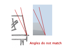 Figure 3. Whoops!