A few weeks ago, my iPhone started having a serious problem: it could no longer search for things. This bug affected the App Library, Mail, Notes, Messages, Settings, and more. Having a device that couldn’t find things was crippling.
All signs pointed to this being an issue with the Spotlight index on the device: the database was corrupted and unable to do queries or updates.
Of course I searched for clues on how to fix this issue and tried the following things:
Forced restart
Changing language and region settings
Toggling location services for Suggestions & Search
Reindexing All Items in CoreSpotlight using Developer Mode
Toggling the App Search settings
Updating iOS from 26.4.1 to 26.4.2
Toggling Siri on & off
Looking at Console output to check spotlightd for errors
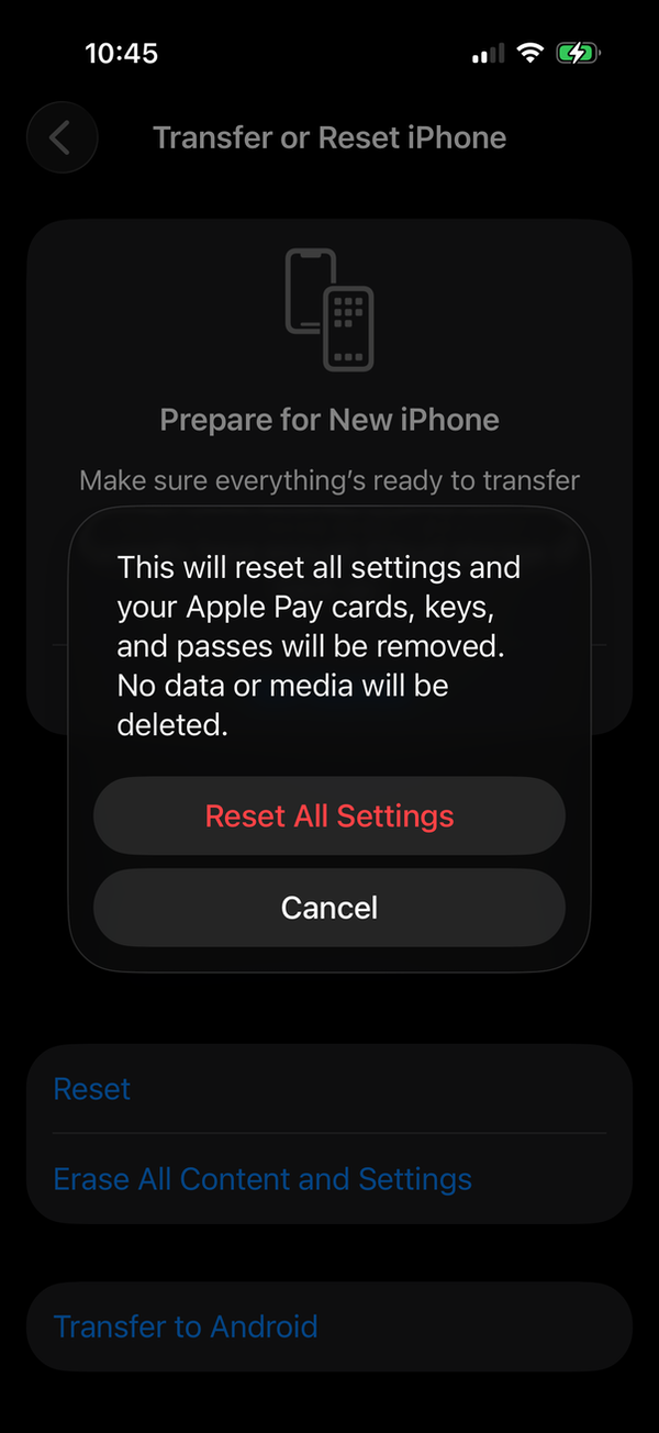
All of the hints I saw online ended with “if this doesn’t work, just Reset All Settings”. When you go to do that, you’re presented with the following dialog:
I’ve been adjusting my settings on my phone since 2007 and honestly couldn’t imagine the fallout from resetting them to defaults. All I knew is that this would be incredibly disruptive to my life for several months as I stumbled over things that needed setup.
For example, would a nice evening in a restaurant with dim lighting be interrupted when I triple-clicked the side button to get the Magnifier to read the menu? Being taken out of the moment by tapping around in Settings was not something I wanted to risk.
That left me with one alternative: a full device backup and restore. I did this on my Mac to make it as speedy as possible, but the process still took a couple of hours. During all of which I was without my primary device.
Afterwards, there were immediately problems:
Apple Pay was reset on both my iPhone and Apple Watch, requiring me to update my drivers license and credit cards.
TestFlight builds were uninstalled: for a developer this is significant.
Logins to apps that don’t use the keychain didn’t work.
The 24 apps using FaceID needed setup again.
All hints in all apps were reset.
Some Safari content blockers weren’t working and needed updates.
All apps prompted for Allow Access on Local Network and other privacy features.
Apps on the Home Screen that required FaceID to open were reset.
Unlocking the iPhone with Apple Watch needed setup.
Developer Mode needed to be re-enabled.
In short, this took several days to sort out. And the entire time, it pissed me off because it was entirely avoidable.
On the Mac, there is a simple procedure to rebuild the Spotlight index. This same affordance is not available on iOS.
It just works, my ass.
Spotlight is a database that’s accessed by a lot of processes in a lot of different situations. It’s reasonable to expect that all this activity can uncover bugs that corrupt the index. The kinds of issues that are hard to reproduce, but easy to repair with a simple button labeled “Rebuild”.
Why doesn’t that button exist on iOS? Maybe it’s a product manager in denial. Maybe it’s because the Spotlight developers are always working on fresh database and don’t ever see the issue (my database had likely existed for months or even years).
Whatever the reason, there are plenty of YouTube videos and Apple Support discussions that show this issue is widespread. My proposal is to add a button to aid customers:
Put it in the Search category, since folks understand this issue as “search doesn’t work”. Do not bury it somewhere deep in the hierarchy because when you have a corrupt Spotlight index, you can’t search in Settings. It’s got to be easy to find that “Rebuild” button.
Add some context for anyone who uses it. The Mac support article mentions that “This can take some time, depending on the amount of information being indexed”.
Show some kind of progress indicator as the index rebuilds, as the Mac does.
One of the things I love doing is naming things. Whether it’s for products, or things that I encounter daily, it’s a habit.
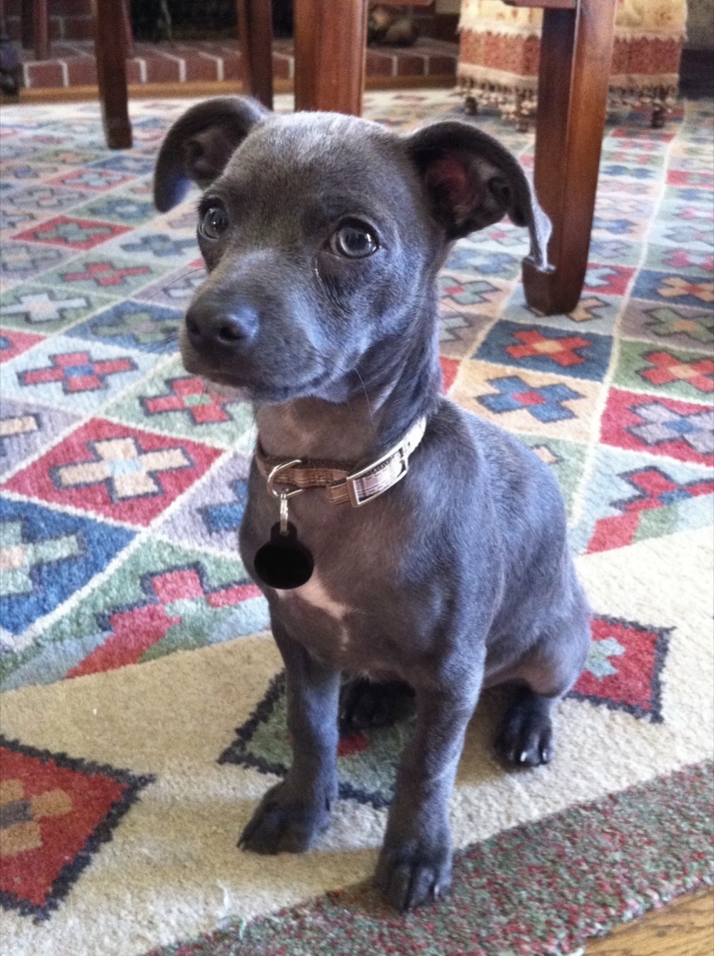
Fifteen years ago, I started a list for our new dog, Pico. My wife and other family members joined in on the fun. Last December, we updated the note for the last time.
I’ve shared this list over the years and everyone gets a kick out of it, but the main reason I’m putting it up here is so I have a place to remember all the good times we had together.
The names are in chronological order, the photos are not.
Our first day together.
Snooty
Pico-bahn
Snoot Butt
Bud
Always on the lookout for suspicious activity.
Officer Pico Rivera, Dog Cop
Snootsicle Von Tootsicle
Struttin’ Von Buttin
Snootsie Von Tootsie
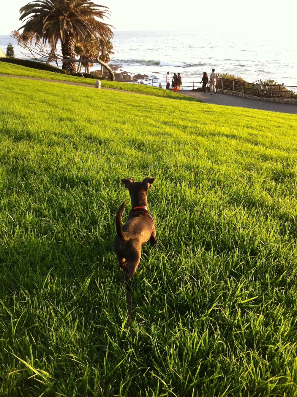
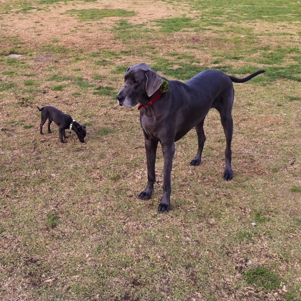
With his 10× doppelgänger at the dog park.
Mr. Toothpick McShivers
Piconator
Snoots
Squeeko
Snootsicle Bootscicle
Packed wet sand is the perfect medium to show off your skills.
Sandy Dandy
Sandicle Dandicle
Budly Studly
Always pay attention to nearby vehicles. Or take a nap.
Captain Snoot of the S.S.Picobahn
Barkey McLoudbutt
Power Snoots
Lord Voratio
Rooter
Barky Boy
Sir Barksalot
High Falutin’ Snootin’
The Force was definitely strong with this one.
Obiwan Snootobi
Turd Burgler
Snoot Doggy Dog
Sheik Yer Snooty
Sir Prancelot
Pink Butt
No shortage of freckles or desire to show them off.
Freckle Pecker – Deck Commander
Snooticus Tooticus
Bupster Pupster
Snootrition
Nudie Snoodie
Food Genius
Quicker Licker
Low tide is the best tide.
Moto Pico
Pink Gooba
A dog can only take so much hot and dusty trail, so hitch a ride.
Bud Bud
Bumpy Gut
Platemaster Supreme
Mister Bits
There was no limit to his licking abilities.
Dr. Bits, Molecular Foodologist
The Leaf Thief
Hellen Killer
Mister Biscuits
Snootrous Boutros-Ghali
All kinds of sizzle.
Little Sizzle (Rapper Name)
Lumpystiltskin
A grunt is the best way to express your unhappiness with a situation.
Grunty McRunty
Yawny (pronounced Yanni)
Mister Slurps
Hacky Jack
Frosty the Dogman
The pleasures of old age and good friends.
Frosty Face (from Lori)
Bubbie
Frankenbutt (after mast tumor removal)
Zipper/Zippy Butt
Like shadows, we’re not really here, but the memories always will be.
Our trusty Brother MFC laser printer and scanner was getting long in the tooth and my wife wanted color printing. After a lot of research, she landed on the Canon MF644Cdw and placed an order.
Initially, we were both happy with the new printer. The print quality is great, the hardware is solid, and the touchpad for configuration and management is better than most.
But after a few months it became apparent that the printer’s networking is completely screwed up. The root of the problem is with Canon’s firmware: it’s not compatible with Apple’s Bonjour.
So how widespread is this issue?
Here is a six year old support thread about “offline” printer on the Mac. And if you search Google for “Canon offline Mac”, there are a ton of web pages and videos explaining how to “fix” the problem.
The problem with the fix is that it’s only temporary. Based on my personal experience, you need to re-fix things when you’re in a hurry to print a shipping label or report. Adding insult to injury, everyone that’s sharing the printer, whether it’s a family member or a work colleague, will need to reset their printer configuration, too.
Initially, this is a mild inconvenience. But after doing it hundreds of times, I renamed our printer “Canon MF” – the initials do not mean Multi-Function.
If you are reading this and still within the return window for the printer, head to your car or web browser right now. As you’ll see below, this is not a printer that will be easy to deal with on a Mac. It will be a purchase you regret.
If you can’t return the printer, keep reading and I’ll explain how things are broken and present a workaround that will prevent the constant “Offline” situation.
If you just want a permanent fix and don’t care about the details, scroll down to You Can Fix This.
Digging In
Since I could find no reports of the weird “Offline” behavior on Windows, I began by investigating the technologies that are specific to the Mac and other Unix-based systems:
CUPS, originally known as the “Common Unix Printing System”, manages the printers, their capabilities, and the queue of print jobs.
CUPS felt like an unlikely culprit: everything prints great when it’s working. After checking the printer drivers against the CUPS documentation, this intuition proved correct.
But when I started looking at Bonjour, it was another story.
The following Terminal command can be used to see what printers are on your local network:
$ dns-sd -B _ipps._tcp
The command is cryptic, like all things in the Terminal, but it means “do DNS Service Discovery, browse for Internet Printing Protocol over HTTPS”.
NOTE: If using a Terminal is new to you, don’t be afraid to try the commands I’m showing: none of them will harm your Mac. You will find the app in the Applications > Utilities folder. You can copy all the text after the “$” and paste it directly into the app. Closing the window will terminate the command.
The command output will contain multiple columns, but it’s the first two columns with a timestamp and add/remove status, that show what’s wrong:
Typically a printer will added when you start the command, and removed when your Mac goes to sleep.
The Canon printer removes itself every few minutes. To the rest of the network that’s using Bonjour (including everyone’s printer settings), it looks like the printer was powered off and on again. Hence the “Offline” state and the red dot in Printers & Scanners settings.
The “Offline” state is also likely to happen when you wake your Mac. The add/remove nonsense is caused by the printer and when your Mac is asleep it may miss the state change. When this happens, it can take 10-15 minutes for the red dot to turn green. When you are in this situation, you can’t add a new printer because it doesn’t exist in Bonjour. You just have to wait.
This is the root of the problem. The constant change of state eventually corrupts the cache used by Bonjour. This, in turn, breaks the CUPS configuration and your printer is either temporarily or permanently “Offline”.
A fancier version of this command speaks when the printer adds or removes itself: this lets you do things like look at the status of the printer in System Settings. After you hear “remove” you’ll see a red dot and “Offline”. An “add” turns the indicator green and shows “Idle”. This will be annoying after awhile, but it does give you great feedback about how Bonjour is messed up:
$ dns-sd -B _ipps._tcp | while IFS= read -r line; do echo "$line"; echo "$line" > /tmp/line.out; if grep -q "Rmv" /tmp/line.out; then say "Remove"; elif grep -q "Add" /tmp/line.out; then say "Add"; fi ; done
What’s in a Name?
When I started writing this report, the Bonjour name for our printer was “Canon MF642C/643C/644C (a5:d7:ad) (16) (a5:d7:a (a5:d7:ad) (28)”. A few days later it changed to “Canon MF642C/643C/644C (a5:d7:ad) (16) (a5:d7:a (a5:d7:ad) (10)”. I have no idea what caused this change, and both the names are ridiculous.
The only thing that’s important in this change are the number in parentheses at the end. Going from “Canon…(28)” to “Canon…(10)” breaks the printer configuration of every Mac on your network.
You can see this by checking the CUPS configuration:
$ lpstat -v

device for Canon_MF642C_643C_644C: dnssd://Canon…(28)._ipps._tcp.local./?uuid=GUID
There is no longer a device for dnssd://Canon…(28)._ipps._tcp. So when CUPS periodically checks the print queues and it can’t find the name, the printer is permanently offline.
When a permanent “Offline” happens, you will need to update your Mac and iOS devices:
Mac: Remove the printer. Add a new printer. Do this on every device in your home or office.
iOS: Turn on Airplane Mode, wait a couple of seconds, turn Airplane Mode off, and pick the new name.
So What’s Really in a Name?
So what’s the deal with the “Canon…(28)” that eventually turned to “(10)” and broke everything? These numbers are appended automatically when another device is already using the same name. If “Craig’s Mac” already exists on the local network, if you try to add it again, Bonjour will use “Craig’s Mac (1)”. Look familiar?
It turns out this Bonjour cache corruption happened on macOS about 11 years ago and it was a clusterfuck. Some devices on your local network, such as Apple TVs or HomePods, act as a backup system that can provide DNS information when other devices are asleep. When this cache gets corrupted, all hell breaks loose.
A printer that constantly adding and removing itself will eventually poison the cache and the next number in sequence will be used. And every time the corruption occurs, new stuff gets added to the end and you eventually end up with “Canon MF642C/643C/644C (a5:d7:ad) (16) (a5:d7:a (a5:d7:ad) (10)”. Lovely.
Can Canon Fix This?
I have no idea what’s going on inside the printer, and from all the support requests on their site, neither does Canon. All I can see is that printer needs to quit and restart Bonjour every few minutes.
Typically removing a DNS service instance happens when the app or process that’s handling the requests needs to quit. It should happen very infrequently. Most likely because you’ve turned the printer off.
Instead of acknowledging issues with Bonjour, the support folks talk about changing your printer configuration. And conveniently ignore the folks who note that they’ve done this “hundreds of times”.
This is not a problem that can be fixed by a new downloadable driver or by power-cycling the printer. It is a problem that will require new printer firmware from Canon. The last firmware update was 2 years ago.
It’s a huge pain in the ass and based on my personal experience it happens when you need the printer right now. Adding insult to injury, everyone that’s sharing the printer, whether it’s a family member or a work colleague, will need to reset their printer configuration.
So I set out to find a way to avoid Canon’s shitty Bonjour implementation in our printer set up.
You Can Fix This
For the most part, it’s possible to use the Canon printer without its “cycling” behavior in Bonjour. The printer will still be generating and changing gobbledygook names, but we will ignore them.
The trick is to use a static IP address. Since Bonjour’s main task is to find your printer’s IP address using a device name, we can skip that step if we already know where the printer is on the local network.
VideoGuy discovered this workaround and shared it on the Canon forums. I’ve made some simple tweaks that let your Mac know about the full capabilities of the printer (duplex pages, color support, supply levels, even a non-generic icon).
1. Find a Static IP Address
To implement this workaround, you first need to know how IP addresses are assigned on your network. Most of the IP addresses are assigned automatically using DHCP. So look around in your router settings for something like “DHCP Range”, “DHCP Start/Finish”. Once you know the range, you can pick an IP address outside of that range.
Say that you see “Start: 192.168.0.20 Stop: 192.168.0.150”. Picking a static IP of “192.168.0.180” is a safe choice because its past “192.168.0.150”.
You can double-check that this address isn’t in use with this Terminal command:
$ ping -c 5 192.168.0.180
PING 192.168.0.180 (192.168.0.180): 56 data bytes
Request timeout for icmp_seq 0
Request timeout for icmp_seq 1
Request timeout for icmp_seq 2
Request timeout for icmp_seq 3
--- 192.168.0.180 ping statistics ---
5 packets transmitted, 0 packets received, 100.0% packet loss
The “Request timeouts” and “100% packet loss” indicate that there isn’t a device at this IP address and will be safe to use on the Canon printer.
2. Change Your Printer
Now that you have a static IP address, you’ll need to update your printer’s configuration. Use the Home button below the touchscreen to get to the top-level of printer menus.
Next, drill down using the following path:
Menu > Preferences > Network > TCP/IP Settings > IPv4 Settings > IP Address Settings
By default, the printer acquires its IP addresses automatically and “Auto Acquire” is turned on. The “Manually Acquire” setting is disabled.
Turn “Auto Acquire” off, and “Manually Acquire” will get enabled. Select it and you’ll be presented with a screen where you input:
IP address: 192.168.0.180
Subnet mask: 255.255.255.0
Gateway address: 192.168.0.1
The first field is the one you want to focus on: it should be set to the static IP address that you picked above.
The last two fields are probably already set correctly because the values were retrieved during the “auto acquire” – if you have problems with them, refer to your router’s settings.
After applying the settings, restart the printer, and run a quick test of the IP address with:
$ ping -c 5 192.168.0.180
Instead of timeout errors, you should see “0.0% packet loss” and know that you have a good connection to the printer. If you see errors, go back to printer’s network preferences and double-check your work.
3. Setup Printer on the Mac
We’re entering the homestretch now!
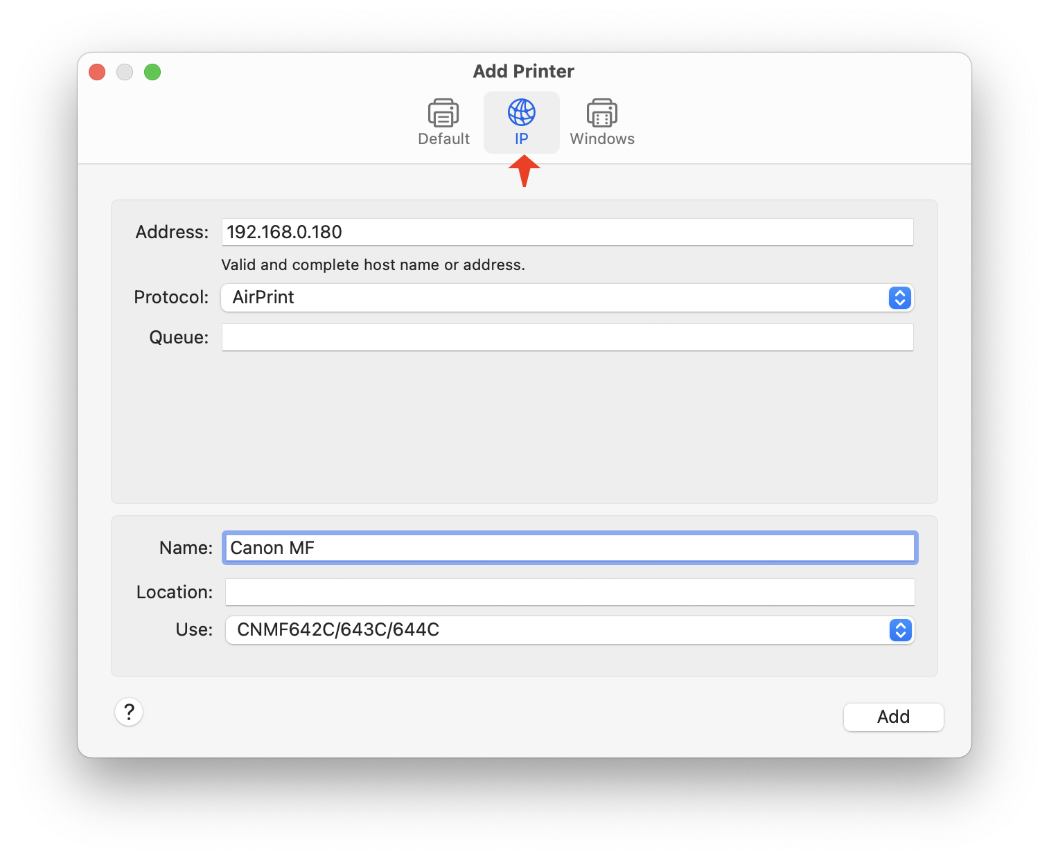
On your Mac, go into Printers & Scanners settings, and select “Add Printer, Scanner, or Fax…”.
Instead of using first panel which shows all the Bonjour devices, pick the middle icon of the Add Printer dialog: this panel will let you add your printer using the static IP address you created.
Enter your static IP address into the first field, then select the “AirPrint” protocol. Make sure that the driver is “CNMF642C/643C/644C” (or whatever is appropriate for your hardware).
Name the printer whatever you want: I chose “Canon MF” (again, not because it’s “Multi-Function”).
Click Add and you will now have a new printer that never goes “Offline”. Woo-hoo!
Note that this workaround only affects printing — when you need to use the scanning features, you will still need to setup a device that uses Bonjour. This configuration will break just as often as the one for printing, but in my experience it’s not so disruptive. I typically use the scanner when doing taxes or other financial things, and having to make a new configuration isn’t a big deal because I’m not in a hurry.
Conclusion
This issue has taken countless hours to resolve. It’s a bug that appears and disappears randomly and is completely confusing from an end user’s point-of-view.
As Mac users, we’re used to things “just working” and in this case that’s just not the case. Bonjour makes finding devices and services on your network “just work”. That is, until a Canon printer gets involved.
If anyone at Canon is reading this, please get in contact: I would love to test any firmware fixes for these Bonjour problems. I’ve been building Mac apps for over 40 years and have gotten pretty good at testing stuff.
A Christmas ornament from my sister-in-law that sums up my year.
January started as normal as can be expected when malicious grifters start making basic decency a radical idea. It turns out the anxiety associated with these political events would be the least of my problems throughout the year.
It felt great to finish up a 12 month project and release the first version of Tapestry. I celebrated with a trip to Louisiana visiting my wife’s birthplace, exploring islands and bayous, and eating more seafood than I thought possible.
An impressive spine.
In April, I turned 65 and signed up for Medicare. I was about to learn how important this was.
Towards the end of that month, I started feeling some tingling in my left index finger and some pain in my neck, especially after working at the computer all day. Initially, I chalked it up to the normal aches and pains of growing older, but the pain just wouldn’t go away.
The next month was marked by tragedy. On May 17th, while taking our dogs for a walk before dinner, our girl Jolie was attacked by dogs that had escaped from their yard. It took every ounce of my strength to get two 50 pound dogs without collars off of our 15 pound pup, but I rescued her, did some quick triage for her open wounds, and rushed her to the vet for four hours of surgery. We were both wrecks, but made it to see another day.
We’re both getting too old for this shit.
Jolie started to recover from her injuries, but she was a 15 year old with a weak heart. On June 4th, I found her unconscious outside the door of my office. She died peacefully and the loss was added to the year’s pain tally.
I also had adverse effects from the dog fight: the pain in my neck had gotten much worse. The adrenaline rush made me move my neck and arm in ways that turned an irritating pain into a persistent one.
In July, we travelled to San Diego to see an outdoor concert. I was living with neck pain all day, every day, and when I couldn’t lift my head to watch the show, I knew I needed help. On the 16th, I had my first appointment with a local chiropractor. X-rays showed degenerative spine disease, which is consistent for someone my age: pain being caused by old cervical vertebrae and pinched discs.
I was staying active in spite of the pain in my arm and neck. My swimming stroke sucked thanks to my limited arm movement and neck pain limited the length of my bike rides.
On August 3rd, while riding my e-bike to Trader Joe’s to do some grocery shopping, I was hit by a car. Someone blocking the road at a 90 degree angle decided to backup while only looking at the camera on their dashboard. They didn’t see me riding in the rightmost lane of traffic.
I ended hitting the D pillar of a SUV with my left shoulder and tearing my AC joint. Then I was thrown from my bike and landed hard on asphalt. The impact broke five ribs and I immediately had a new source of pain on my left side.
The paramedics arrived and got me to the closest emergency room. That’s when we all discovered I had another problem: a punctured lung that was causing my chest cavity to fill with air. This presented itself while lying down waiting for a CT: it’s impossible to express the panic of not being able to breathe or talk. Luckily, my wife was in the room and screamed for help that resulted in a temporary chest vent while I was rushed to a trauma center. Another ride with the paramedics, this time with lights, sirens, and lot more speed.
There was a team waiting for me, and I got a dose of ketamine, followed by a chest tube that was inserted while I was (barely) conscious. As the surgery was ending, the head nurse asked me how I was feeling, and my response was “I’M TRIPPING BALLS”, which got a laugh from everyone in the operating room. It also helped me understand a billionaire that needs the substance to feel joy in his life.
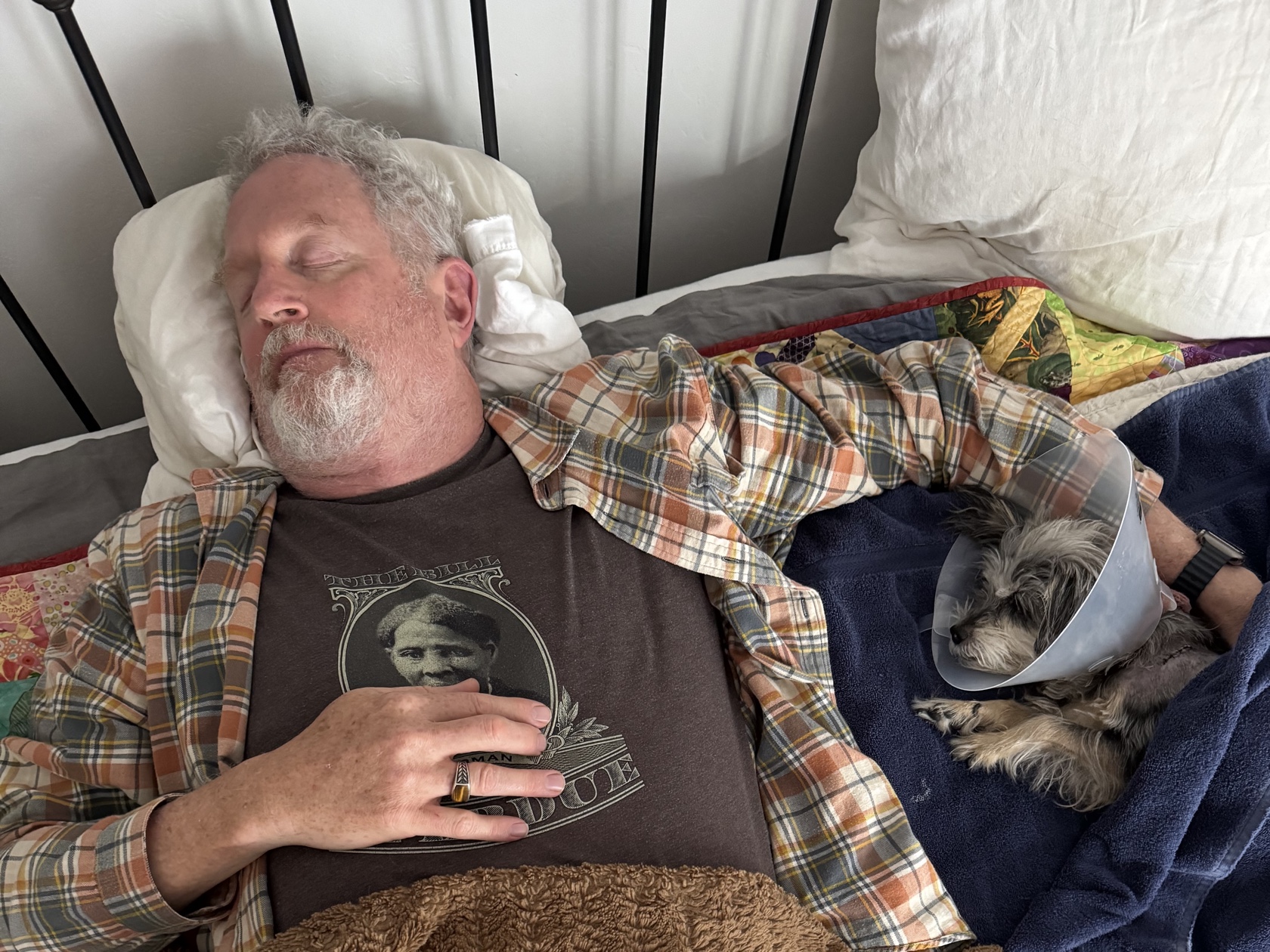
I spent a total of three days in the hospital as the doctors monitored my chest fluids. My main source of pain at that point was the broken ribs: sneezing, coughing, or laughing hurt like hell. What didn’t hurt was my neck and arm: as one nurse joked when I was telling them about my situation: “Hey, you got a free adjustment!”
The view from my hospital room and it’s missing a K.
I felt good enough to spend some time working on Tot 2: all of the App Store purchasing code was done while in a hospital bed. It was a nice distraction and helped us ship the update at the end of August.
Soon after the release I read a blog post that rang true: Irrational Dedication. Both of the Iconfactory’s major releases during the year were willed into existence. Tapestry after a year of work for a new product category (“timeline apps”) that was difficult to explain. Tot while working through various stages of pain.
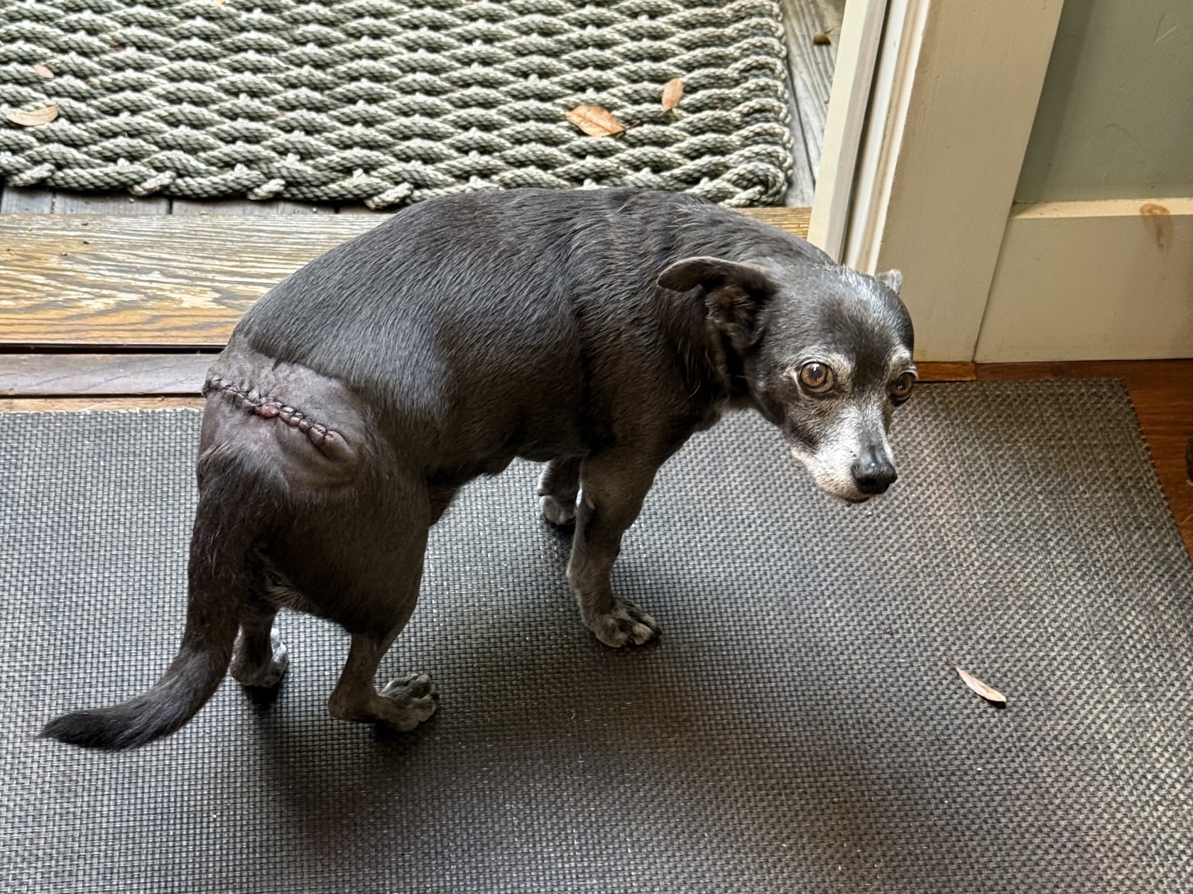
It took about six weeks for my ribs to heal completely. While that was happening, September presented another health issue to deal with: this time for our boy dog, Pico. What started as a small bump on his butt quickly grew into a large Mastocytoma (Mast Cell Tumor). At the end of August he had surgery to remove the mass and he got a new nickname: “Zipper Butt”.
“Daddy, you should try this look.” Click or tap to view.
We were about to put a twist on the old adage about dogs looking like their owners: this owner was about to look like his dog.
This was also the time where my original neck pain returned. It turns out the brain can’t handle more than one pain input at a time – the broken ribs put the nerve pain on the back burner. Chiropractic treatment was providing only temporary relief, so I tried acupuncture in October.
Then, in November, all hell broke loose. At the beginning of the month we took a car trip to Tucson for a family event. I spent most of the trip through the desert with shooting pains through my arms: agony for hours on end.
A week or so later, I started noticing problems with my ability to walk and a numbness throughout my torso. The nerve pain felt like the onset of paralysis. Shit was getting serious.
My primary care physician prescribed muscle relaxers which had no effect. My chiropractor scheduled an MRI on the 14th and we got the results on the 17th.
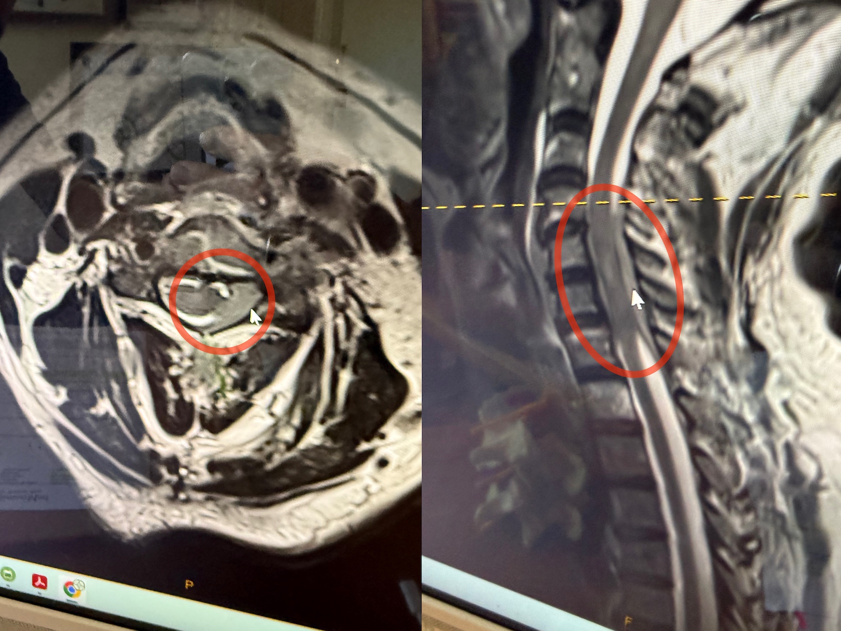
The MRI showed that I had a mass in my spine that was pressing on the fluid that protects and nourishes the spinal cord. My neck was screwed up more than anyone expected and needed immediate attention. A referral to oncology at Hoag Hospital got us into the ER on the 19th.
MRI showing the white spinal fluid around the dark spinal cord being invaded by a mass of gray tissue. Click or tap to view.
There was just one problem: my goddaughter was getting married on the 19th. On a sandy beach, at the end of a rocky path. And I could barely walk.
I’ve been a part of her life since birth and not being able to share this important moment broke me completely. I spent most of the 18th sobbing and feeling shitty about the cards that life had dealt me.
The tests included a two hour full–body scan in a noisy and cramped MRI. Plenty of time to contemplate life and realize that the last time I had been at this hospital was when my goddaughter was born 36 years earlier: a day spent translating for two women who were about to be grandmothers for the first time and didn’t speak each other’s language. (Little known fact: I’m an Italian godfather.)
All the tests confirmed the spinal mass and provided a plan for treatment. I was given steroids to reduce inflammation and felt immediate relief: it was the first time I had been without neck pain in about eight months. Next, a cervical laminectomy would remove part of my spine and permanently relieve the pressure on the spinal cord that was the source of my pain. It would also allow the doctors to obtain a sample for pathology: to determine if the mass inside my spine was benign or malignant.
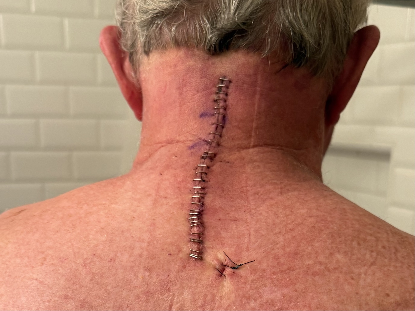
Twenty-nine staples later and my neck felt a lot better. Click or tap to view.
The operation was a success and I was home in time for Thanksgiving. I was so thankful for my wife, family, friends, and medical professionals that were helping me through this rough time. And for the end of a week with opioid constipation.
After the holidays, it was not a shock to learn that the mass was malignant. Everything we had seen suggested that the source was lymphatic. Additional tests, including a PET scan and a lumbar puncture (a.k.a. spinal tap), made it clear that I have a follicular lymphoma in both my blood stream and spinal fluid.
The good news is that this is not a particularly aggressive variant and has therapies that have been effective for decades. It’s going to be something that takes months to treat and will require some hospitalization. But the doctors and I are both optimistic about the outcome.
The surgery to relieve neck pain continues to heal: I still have a bit of muscle soreness but the persistent pain is completely gone. Another reason to be hopeful for recovery.
I still have the nerve damage that caused my initial paralysis. The hope is that as the spinal mass shrinks, my walking and numbness will improve. And the only way to make that happen is with both physical therapy and chemotherapy, both of which I started on Christmas week. Happy holidays!
Luckily, I didn’t have any major issues during the first infusion, but a week later I’m still feeling the effects: overall fatigue, a queasy stomach, and a weird taste in my mouth. Dietary restrictions like giving up red meat, fried foods, and processed sugars seemed important a week ago. Now, the medicinal marijuana my nephew got me for Christmas feels much more significant.
It’s clear there is a long road ahead of me, and while I may have less spine, I am not spineless. The irrational dedication I mentioned earlier is now focused on getting myself back to health.
My personal goal is to swim to a buoy in the Pacific Ocean. It’s going to take a lot of effort to make that happen and I know that stating your objectives is the best way to meet them. (One of the reasons for this blog post, in fact.)
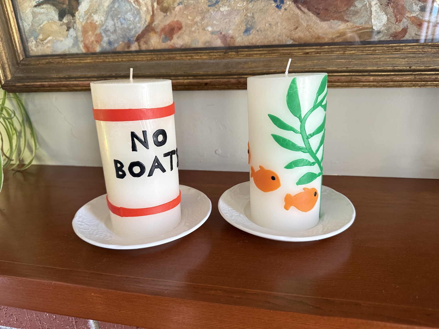
My goddaughters heard about my aspirations and handmade an inspirational gift for Christmas: candles of the buoy itself and the kelp and Garibaldi underneath. I’m going to burn it all down.
Burn, baby, burn.
I had originally wanted to end this essay on that positive note, but the year had other plans. The week after Christmas, Pico started showing signs of abdominal pain and inappetence. He had developed a mass on his liver and spleen, and given his age, the prognosis for recovery wasn’t good. I always knew that saying goodbye to my constant companion of the past 15 years was not going to be easy, but never imagined doing it with all this other shit going on in my life. Consider my ass well and truly kicked.
Even if I’m getting out of the year on emotional fumes, I lived to see another one. My little boy won’t be there to dance around excitedly as I get out of the water this summer, but he will always be a reminder that I never give up.
We’re hearing from customers that some of our apps are running slowly on Tahoe and I suspect that this bug has something to do with it. Unfortunately, it’s hard for customers to check which version of Electron is being used and see if that might be a cause. So I decided to do something about that…
Luckily there’s a script written by Tomas Kafka that lets you check all your apps quickly and easily. I took that script, updated some parts that required Xcode to be installed, and wrapped it up in an AppleScript applet that’s easy to download and run:
When you run the app, you’ll see a short introduction:
The first time you run the app, you’ll see a warning that the app was prevented from modifying other apps on your system. This is “normal” because the app needs to read other apps to do its job:
After all apps are checked, you’ll see the results:
Eventually, you’ll see ✅ in that window and know that one or all of your Electron apps have been updated.
If you’re one of those people who’s wondering when it’s a good time to upgrade to Tahoe, you can run TahoeElectronDetector on older versions of macOS and give yourself an idea of when it’s safe to move to the new operating system.
Additionally, there’s a website that lists the status of the most popular apps. This will be helpful in locating newer versions since some of them will not update automatically.
If you’re a Mac developer who’s hearing from customers about weird slowness, feel free to point them at this web page or give them a copy of the app to check their own system. If you need the source code, it can be downloaded here.
And if you’re a developer, this is your periodic reminder not to use private and undocumented parts of an API. They will break, and in cases like this, it will be spectacular.