I’m happy to announce the release of a new tvOS app called Blank. It turns your screen black and keeps it that way until you press any button on a remote. Seriously, that’s all it does. Here’s the screen you see when you launch the app for the first time:
That second paragraph hints at why this is important, despite the app’s simplicity.
Sleeping Well
As you get older, a good night’s sleep becomes harder to achieve. One thing that works well for my wife and me is to lower light levels before bedtime.
A big ass screen in the living room makes this hard to achieve. If you want to listen to music or a podcast before going to bed, it’s impossible to avoid a bright now playing screen or animated screen saver.
So I wrote Blank as a way to address this problem. Of course, it’s FREE so people besides me and my wife can benefit from it.
New & Improved
The first version I submitted didn’t meet Guideline 4.2 for “Design – Minimum Functionality”. Understandable, because this app was basically the “anti-flashlight” and we all know how that played out.
I took this initial rejection in stride and started working on an update that added some minimal functionality.
When you launch the app, or press any button on the remote, you get a screen with an inspirational quote. After you’ve had time to read it, the message disappears, and the screen goes black. It’s a nice addition and folks who are using the app love it.
I’m glad I did this extra work, and it’s a case where App Review helps a developer improve their product. Here’s what the quote screen looks like:
After some back-and-forth with App Review, the app was approved with these changes. Yay!
But That’s Not All!
An additional benefit became apparent after we started using Blank: it significantly lowers the energy consumption of the screen.
All modern TVs have circuits that detect a blank signal and turn off LEDs to reduce the power required by the device. If you’ve ever felt heat coming off your big screen, Blank makes that go away.
So besides improving your sleep, you’re also helping out our ever warming planet.
There Is None More Black
So there you have it: another addition to our ever growing list of “little apps”. Just open up the App Store on your Apple TV, search for Blank, and click to download the app for FREE.
A prick pulled the plug. And what bothers me most about it is how Phony Stark did it.
My mom passed away just before Christmas. Her decline was something everyone in the family saw coming and we prepared for her demise. It still hurts like hell, but she left with love and dignity. That makes all the difference when it comes to coping with loss.
Twitterrific is something that we’ve all poured our love into for the past 16 years. I’m not usually one to toot my own horn, but we literally crafted the early experience on the service. We often hear that folks joined up because of our app. Our work was definitive and groundbreaking. We loved this app like I loved my mom.
(Note today’s date and the one on our announcement – the fuckwads missed our 16th anniversary by a couple of days! King Shithead probably thought Friday the 13th was lol. I’d love some proof that the API went down at 04:20 in UTC +1.)
Like my mom, the API has been declining for awhile. Endpoints were removed, new features were unavailable to third parties, and rate limiting restricted what we could do. And like my mom, we struggled on and did the best we could, trying to stay upbeat about it all.
What bothers me about Twitterrific’s final day is that it was not dignified. There was no advance notice for its creators, customers just got a weird error, and no one is explaining what’s going on. We had no chance to thank customers who have been with us for over a decade. Instead, it’s just another scene in their ongoing shit show.
But I guess that’s what you should expect from a shitty person.
First, arrogant bastards love seeing their names on tweets and other media. I want to starve him of the things that money can’t buy: respect and attention. Do the same by simply ignoring him and his kingdom.
Secondly, for the past several months I’ve been thinking about where we go from here. When you see decline, you plan for a demise. It was the last thing mom taught me.
I’ve been active on Mastodon since the billionaire bozo took over. And it makes me think.
One thing I’ve noticed is that everyone is going to great lengths to make something that replaces the clients we’ve known for years. That’s an excellent goal that eases a transition in the short-term, but ignores how a new open standard (ActivityPub) can be leveraged in new and different ways.
Federation exposes a lot of different data sources that you’d want to follow. Not all of these sources will be Mastodon instances: you may want to stay up-to-date with someone’s Micro.blog, or maybe another person’s Tumblr, or someone else’s photo feed. There are many apps and servers for you to choose from.
It feels like the time is right for a truly universal timeline. That notion excites me like the first time I posted XML status to an endpoint.
One thing I remember from these early days: no one had any idea what they were doing. It was all new and things like @screen_name, #hashtags, or RT hadn’t been invented yet. Heck, we didn’t even call them “tweets” or use a bird icon at first! The best ideas came from people using the service: all of the things mentioned above grew organically from a need.
That’s where I want to be in the future. Exploring unknown territory that empowers others and adapts to the needs of a community.
There’s no sense in clinging to the personal whims of a clown leading a shit show. Especially when his circus will end up being a $44 billion version of MySpace.
Or maybe you’ve been frustrated that you can’t add that code because you’re in the middle of debugging?
Yeah, me too. Many times.
The locations shown above, and many others, are available from Xcode using the xcrun simctl command. Every application on every device on every platform can be queried. But these lookups are difficult for developers because the information is structured around automatically generated GUIDs. The GUID you’re looking for changes every time a new OS is available, a device is added, or an application is installed. And we do that a lot!
There are other tools available to help you navigate the Simulator, but they all do much more than I really need and take up space in my menu bar even though they are used infrequently. Additionally, none of these tools help find the “On My iPhone/iPad” container used by the Files app: a folder that I use whenever I’m testing import and export code.
By now, you probably know where this is going: yes, I wrote my own utility and call it SimBuddy. It’s a FREE download from the Iconfactory.
SimBuddy uses two popup menus for navigation: the top one shows which devices are running in the Simulator and the one below shows all the applications installed on that device (your apps are listed first). Once you make a choice with those popups, you can use the buttons at the bottom of the window to navigate in the Finder. If you are using app group containers for sharing information between an extension/widget and your main app, you open those folders by selecting the ID and using “Open”.
If the Terminal is more your thing, you can hold down the option key while clicking a button and a path to the folder is put on the clipboard. Paste that into a command line and away you go!
It’s not a complicated app, as you can see from the source code, but it’s one that I’m very happy to have in my developer toolbox now. I hope you enjoy it, too!
P.S. I love putting Easter eggs in apps. This time it’s in the app icon.
Beginning with Xcode 14, the Simulators for watchOS and tvOS are available as separate downloads (iOS and macOS are still “built-in”). This reduces the app download size significantly, but it also means that you now have to manage these large (3-4 GB) components yourself.
When you launch Xcode 14 the first time, you are prompted to download additional platforms. Another prompt is displayed when you try to run a target for a platform without a runtime.
But what are these downloads and where are they stored?
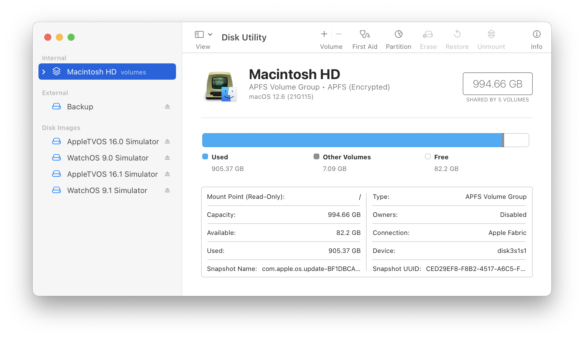
The first hint is when you look at Disk Utility. You’ll see a bunch of new “Simulator” volumes mounted under Disk Images:
Disk Utility showing four Simulator runtimes.
When you select these volumes, you’ll see that they all mount at /Library/Developer/CoreSimulator/Volumes. Within each volume you’ll find a legal PDF and a path to a .simruntime package in a Runtimes directory. This structure is the same as additional iOS runtimes in /Library/Developer/CoreSimulator/Profile/Runtimes. These .simruntime packages contain all the information needed to simulate the device.
Now that you know what Xcode is using, you’ll wonder where it’s getting the disk image. It’s located in a sibling directory: /Library/Developer/CoreSimulator/Images. That folder also contains an images.plist file that contains metadata for the disk images. There are only a handful of files there, but on my Mac they use 13 GB of disk space.
And up until a couple of hours ago, that folder contained 7 GB of data that was incompatible with the current version of Xcode. I had to delete these files manually. But how?
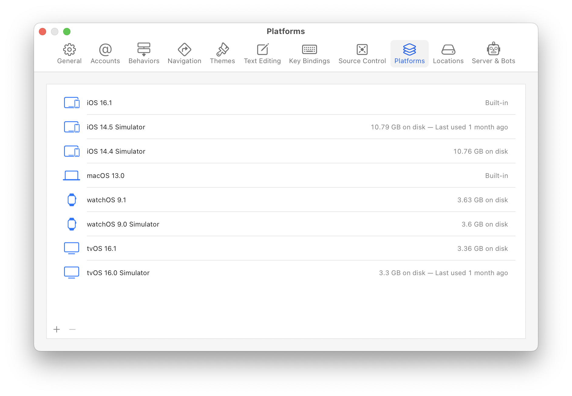
The simplest way to manage this space is using the new Platforms panel in Xcode preferences:
Xcode settings showing all built-in and downloaded Simulator runtimes.
This window also shows when you last used the runtime: in the screenshot above it’s clear that I can get rid of the iOS 14 and tvOS 16.0 runtimes and save about 25 GB of storage. It’s easy to get those runtimes back if needed, just press the + button. (After downloading a new runtime, it can be used in the Devices & Simulator windows to create a new test device.)
If the command line is more your thing, you can use xcrun to gather the same information:
$ xcrun simctl runtime list
Add a -v option there if you want more details (from the images.plist mentioned above). To delete any one of the items listed, use the listed GUID in this command:
$ xcrun simctl runtime delete <GUID>
In the end, this short post saved me 32 GB of disk space. If you’re developing for platforms other than the current iOS, you’ll likely see something similar. As time passes, you’ll need to manually keep an eye on this stuff: Xcode can’t clean things up for you because it has no idea what you need.
It’s been awhile since I’ve done one of these deep dives on what goes on behind the scenes during the development of an Iconfactory app. There’s a common thread to each one: I feel the need to document our work when there’s a major change in how we build user interfaces.
The first one was for the “flattening” of Twitterrific 5, a task that preceded Apple’s work in iOS 7 by six months. The next one was for Flare 2, when the Aqua face of macOS began a dramatic evolution in Yosemite.
With Wallaroo, there’s another major change that may not be noticeable on the surface: it’s the Iconfactory’s first app written completely in SwiftUI.
A Discovery
It all started while I was working on Shortcuts support in Tot. During March of this year, I noticed that there was an action to “Set Wallpaper”. I also learned how Shortcuts could be downloaded, installed, and managed using a URLs.
The Iconfactory has been making wallpaper images since the dawn of time, but it never made sense to make an app because changing your wallpaper was a manual task. Shortcuts radically changed this calculus and the idea for an app was born. I threw together a quick prototype that let you set two wallpapers. Sean and I had the beginnings of Wallaroo.
Our wallpaper prototype became one of those “we’ll do it some day” projects. Then something important happened: WWDC 2022. After Lock and Home Screen customization was announced, the idea immediately became a “we need to do this before September!” project.
Time is Tight
We built Wallaroo from scratch in a little over two months.
The project started with a couple of wrinkles: the “Set Wallpaper” action didn’t work with the new features on iOS 16, so we filed FB10377111 on June 6th (a couple of hours after the keynote ended). We placed our faith in the abilities of the Shortcuts team and decided to carry on in spite of this setback. (We wish everyone at Apple wrote release notes like they do!)
The other wrinkle was that we all had work-in-progress that needed to be finished up. We knew that the short timeframe meant that this was an “all hands on deck” situation, so it wasn’t until the end of June before we all freed up. We put the prototype on TestFlight and got to work.
Divide and Conquer
There were three major areas where we focused our attention:
Content – Hundreds of wallpapers had been created over the years, but resolution and aspect ratio varied widely. Things needed to be cleaned up.
Backend – Over years, we had done releases in an ad-hoc manner: uploading ZIP files to a Patreon account would no longer be acceptable. We needed a server to manage the wallpapers.
Frontend – An app to display the wallpapers: it had to look and work great. Sexy and fast were primary design goals.
Ged, Anthony, Dave, and Talos immediately got to work on the first bullet, but without a backend server, there was no place to put files and metadata. So we made a Numbers spreadsheet and shared it in Dropbox along with the source images. Our Slack channel for the project was filled with “I’m going in” and “I’m out!” to avoid write conflicts. (S.W.A.T. = Software Write Avoidance Technique)
I was responsible for the development of the backend. Importing a spreadsheet CSV file gave us our initial database and images in Dropbox let me manually generate thumbnails and other content that would be needed in the app.
Sean took the lead on the app. We’ve been holding back on SwiftUI due to its immaturity, but the changes in iOS 16 looked great, so we went all in (the only UIKit/AppKit code is in delegate connectors). The data in the spreadsheet was massaged again to give him some real data to use.
Talos took the lead on the app architecture and the wireframe was finished on July 5th. A week later we had enough working code to make a Git repository. A few days later Sean showed us his Captain Pike Appreciation App:
We were on our way, but had less than two months before an iPhone announcement. Time to kick butt.
Butt Kicking
July was a blur. Progress was quick and everyone was heads down on their app responsibilities.
Remember that bug in Shortcuts that prevented Set Wallpaper from working in iOS 16? It was still around and we were starting to get worried. When iOS 16 beta 5 dropped on August 8th, we rejoiced when our test ran. The shortcut action worked perfectly!
Our last update to the shared spreadsheet was on August 10th. From that point on, we were able to use our new content management system to add and update wallpaper. There was still a ton of work needed to clean up metadata and fine tune each wallpaper release.
With the new server up and running, we started testing push notifications. Since Sean’s focus was still in the primary user interface, I started working on the SwiftUI views and models that talked to our backend server. That work continued with integrating the Patreon API and hooking up StoreKit2 for subscriptions. I also had a blast doing the User License and Credits screens.
We started our first beta test with Patreon supporters on August 25th. We were going to make the mid-September release date!
SwiftUI FTW
Looking back on the development, I think there were two things working in our favor: experience and SwiftUI.
We’ve made a lot of apps and have an instinctual knowledge on how to build them. But no matter how little friction there is in working together, you still have to put the pieces together.
SwiftUI is incredibly good at doing that.
Keep in mind that neither Sean or I had created a full-fledged app using SwiftUI (widgets don’t count). We had to learn the idioms and best practices, but once that was overcome, development happened at a lightning pace.
We encountered roadblocks, of course. Tracking down memory leaks was harder than UIKit because of the abstractions. Figuring out how to share an image was a hugehead scratcher. Implementing parallax in a ScrollView was many days of hard work. And you should see the comments in our PagingView!
But overall, the experience was extremely positive. If you’ve been on the fence with this technology, iOS 16 feels like a turning point in SwiftUI’s evolution.
Give It a Go!
Now that you’ve read about how we made it, take Wallaroo for a spin. It’s a FREE download and a fun little app for iOS 16. And a great example of what you can do with SwiftUI.
