Piracy is a fact of life for software developers. There are always douche-bags who think they should get your hard work for free. Sometimes this takes the form of distributing serial numbers, sometimes it’s kracking the application to eliminate the checks. I’ve come to accept this as part of running a software business.
Recently, however, a certain individual has made a claim that Twitterrific has a security vulnerability that allows it to be modified and not display ads. That is a very serious claim; not just for my application but for all Cocoa applications. And it puts my good name in a bad light.
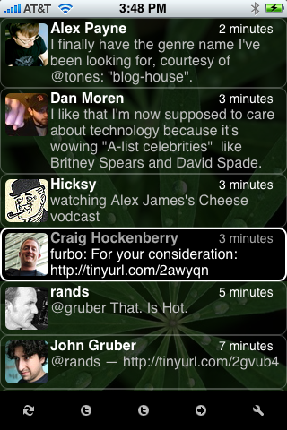
I am not going to link to the individual in question since it’s likely that these claims are attempts to generate traffic (link baiting.) Instead, I’ll link to a salient tweet by my friend John Gruber.
Without getting too technical, the claim is that a tweet received by Twitterrific causes code to be executed. That code modifies the application and eliminates the ads. If true, this would mean that there is a security vulnerability in the Cocoa frameworks that process XML (NSXMLDocument) or text (NSString). A security vulnerability of this type would have broad implications: applications like Safari, NetNewsWire, and anything else that processes XML or text would be vulnerable to malicious payloads. A vulnerability of this magnitude should be reported directly to Apple, not just posted to some shitty little web log.
Fortunately, I have yet to see this exploit actually do anything. Nor has the person making this claim produced any source code showing how it’s done. (Why does a vulnerability have to be released under the GPL anyway?)
All I can assume at this point is that Marc Fiszman is not only a jackhole, but a very dangerous one: and not for the security exploit, but for the libel.
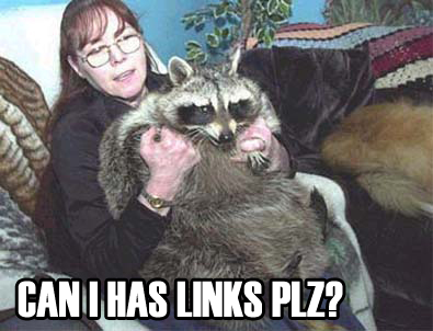
My partner, Dave Brasgalla, has a phrase for this kind of situation: “Don’t feed the raccoons.” Feeding these individuals only makes them want more food and leads to unnatural behavior, malnutrition and disease. So my best course of action at this point is to clear my name and ignore this jerk.
There is some good to come out of all of this: I’m reminded that for every idiot on the Internet, there are hundreds of individuals that are kind and supportive. The comments and registrations we’ve received in response to this incident are much appreciated. I thank you all.