In a previous essay, I briefly expressed some thoughts about why Liquid Glass is inappropriate for the Mac:
I’m having a much harder time seeing how Liquid Glass will benefit other platforms like the Mac or Apple TV (where Apple doesn’t even make the screen). Forcing tactility where it’s not needed or wanted feels like a misstep.
I’ll now go into depth regarding these thoughts.
In 2010, John Gruber wrote The Future of the Mac in an iOS World for the Macworld back page. He explained why the Mac was still so important in the new world dominated by the iPhone:
It’s the heaviness of the Mac that allows iOS to remain light.
…
When I say that iOS has no baggage, that’s not because there is no baggage. It’s because the Mac is there to carry it. Long term — say, ten years out — well, all good things must come to an end. But in the short term, Mac OS X has an essential role in an iOS world: serving as the platform for complex, resource-intensive tasks.
It’s been fifteen years since he wrote that — have we reached the point where the Mac can come to an end?
I’d say not.
Apps like Final Cut Pro on iPad are an impressive achievement, but they lack the features, file management, and expansive screen real estate of the Mac. It’s a great tool for casual editing on the go, but I can’t imagine Apple saying that the Mac app is end-of-life without there being a huge uproar.
Another example is Xcode: even though the hardware on iPad and Mac shares the same processor, there is still no port of the user interface. And even if you can whittle the complexity of an IDE down to fit on a smaller screen, you’d still have problems with locking down the app. On the Mac, Xcode doesn’t run in an app sandbox and does not use the hardening that prevents certain security exploits. iOS mandates the use of both these things: it’s not even an option for app developers.
Xcode also sports 54 entitlements that let it do things other apps can’t. Things like authorization, device pairing, and inspecting the memory of other processes. A port of Xcode to iPad would immediately make it an attack surface for hackers.
So while iPadOS has obviously gotten more capable, I don’t see it displacing the Mac desktop as the place where the heavy lifting gets done.
Now let’s talk about that heavy lifting.
It’s done by professionals who have highly tuned desktop spaces and workflows. Windows and controls are in just the right place so focus can be wholly devoted to the task at hand. Everyone’s workspace is different and as unique as the person who created it.
If you’re someone who’s only using email, a web browser, and some messaging apps to get stuff done, changes to your desktop appearance aren’t going to be disruptive. It’s also likely that you’ll appreciate changes that make it look like your phone.
If you’re doing anything more complex than that, your response to change will be much different.
Have you ever wondered what the inside of a semi-truck looks like? Watch this short tour!
Professionals on the Mac are like truck drivers. Drivers have a cockpit filled with specialized dials, knobs, switches, microwave ovens, refrigerators, and pillows that are absolutely necessary for hauling goods across country. Those of us who are making movies, producing hit songs, building apps, or doing scientific research have our own highly specialized cockpits.
And along comes Alan Dye with his standard cockpit, that is beautiful to look at and fun to use on curvy roads. But also completely wrong for the jobs we’re doing. There’s no air ride seat, microwave oven, or air brake release. His response will be to hide these things that we use all the time behind a hidden menu.
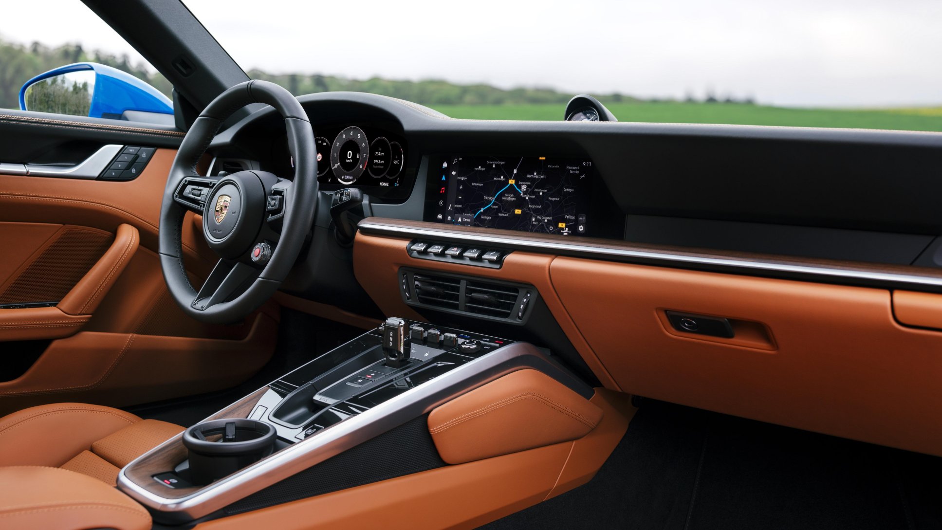
A beautiful Porsche 911 cockpit that’s perfect for high performance driving. But be sure to compare the angle of the steering wheel with the previous photo.
It’s no wonder our reaction is somewhere along the lines of “fuck off”. Or maybe something a little more polite and eloquent. The bottom line is that one size does not fit all: we don’t want a Mac that looks or works like a phone, tablet, watch, or TV.
Worse, this situation is going to be like notifications on the Mac: a minimal design that mimics other platforms, and completely annoying in day-to-day use.
Liquid Glass is currently in a barely presentable state on iOS. It’s going to be like iOS 7 and take another year to sand down the rough edges. And then several more years to tone down the design, as with Aqua.
With the Mac typically lagging other platforms, I don’t expect to see any design improvements on my desktop for several years. It’s going to be an unpleasant and lengthy slog with various accessibility workarounds in place until the standard design looks decent. Or maybe, like with notifications, that will never happen because Alan Dye knows best.
My Mac has been a truck since the beginning of this century. When my desktop computer got Unix and Aqua it was the perfect platform to craft my cockpit. It’s going to be really hard to abandon that and create a new one, but the way things are heading, it feels likely.
Whether you love it or hate it, there is no shortage of opinion on Liquid Glass. I have thoughts about what it is, but today I want to focus on why it exists.
Apple’s public rationale for the new design language is that it offers a universal solution across platforms that takes advantage of recent hardware advances. Its touted benefits are a more lively experience that puts a greater focus on content.
The transition from iOS 6 to 7 was used as an example of how Apple has been successful with visual refreshes. But I don’t think that applies in this case.
In late 2012 and early 2013, there was a movement outside of Apple to simplify user interfaces: the highly textured designs introduced with the first iPhone had run their course. You can see this in our own work with Twitterrific 5 and other apps like Vesper. The launch of iOS 7 in 2013 was startling to some designers and developers, but not everyone. There was clearly a need, and the app ecosystem has benefitted from this change for over a decade.
I’m unaware of anyone outside of Apple who’s thinking “we really need to have more fluid glass in our designs”. Of particular note during the introduction is how much time they spend showing off glass blocks and talking about the physical effect itself. While not addressing the most important question: “why do we need this?”
And I’m pretty sure the answer is “we don’t”. The answer is “Apple does.”
I’ve spent the last few months updating Tot for iOS 26 while watching Sean do the same thing with Tapestry. One thing that’s clear from this work is that you never want a control or container that touches the edge of the screen.
It’s like when safe area insets appeared in iOS 11: it wasn’t clear why you needed them until the iPhone X came along with a notch and a home indicator. And then it changed everything.
There has also been an emphasis on “concentricity”. It’s an impossible thing to achieve and an easy target for ridicule. But it’s another case where Apple wants to take control of the UI elements that intersect with the physical hardware.
All of this makes me think that Apple is close to introducing devices where the screen disappears seamlessly into the physical edge. Something where flexible OLED blurs the distinction between pixels and bezel. A new “wraparound” screen with safe area insets on the vertical edges of the device, just like we saw with the horizontal edges on iPhone X.
The user interface work of the past few months will all make a lot more sense, and developers who haven’t been paying attention will have their “holy shit” moment.
I can see this new physical design being very successful with touch-oriented devices: it will feel natural with a phone, tablet, or watch. Hardware and software becoming one in classic Apple fashion.
I’m having a much harder time seeing how Liquid Glass will benefit other platforms like the Mac or Apple TV (where Apple doesn’t even make the screen). Forcing tactility where it’s not needed or wanted feels like a misstep.
Other challenges, like infusing your own branding into an app with clear buttons will be easier to reason about once the reality of the hardware drops. Until then, stay away from the edges and wait for Apple to reveal the real reason for Liquid Glass.
This site now supports Dynamic Type on iOS and iPadOS. If you go to System Settings on your iPhone or iPad, and change the setting for Display & Brightness > Text Size, you’ll see the change reflected on this website.
This is a big win for accessibility: many folks make this adjustment on their device to match their abilities. Just because you can read a tiny font doesn’t mean that I can. It also is a win for consistency: my site’s font size matches the other text that a visitor sees on their device.
The best part is that this improvement can be realized with only a few lines of CSS:
The font-size property sets the default text size for the page. All browsers recognize this setting and so do you.
The new addition is the font property with the -apple-system-body value. This font is the key to getting support for Dynamic Type. This feature has been in WebKit for almost a decade and is fully documented. This property overrides the font-size that was defined in the line above and our page now has a size that matches the system setting for body text.
One unfortunate side effect of the font value is that it also sets the page in the system font. I like San Francisco, but I don’t want it on my blog.
With a hint from Mastodon, it occurred to me that I could override the face with font-family. So I now have the best of both worlds: a size that makes my visitor happy and a font that makes me happy.
One other addition that I made to my CSS was a tweak for desktop browsers. There is no Dynamic Type setting on macOS (yet?!) and the default size was a bit small for my taste. A @media rule fixed that:
@media screen and (min-width: 801px) {
  body {
    font-size: 1.2rem;
  }
}
Now any browser window that’s wider than 800 points will get a slightly larger font.
You can, of course, use any of the other predefined font values, such as -apple-system-headline or -apple-system-footnote, but you’ll also need to override the family with each use.
But it’s likely that you’re already using em and rem sizes so that elements scale correctly in other contexts. By setting the base size in the html element, my rule for headers “just worked”:
Another important point: if you’re using WKWebView or SFSafariViewController on an Apple platform, it will have the same capabilities as you’ve seen above. This means that you can have dynamic text in a SwiftUI view and a web page that matches exactly. This is why I needed to solve the problem in the first place.
Take a moment to look at your blog, product, or company style sheet and think about how this approach to accessibility can improve things. If you’re like me, in a couple of hours you’ll have a much better site.
On Mastodon, Alex Chaffee points out some of Tapestry’s shortcomings. These are all valid concerns and I’ll deal them individually here (rather than with a long toot thread).
iOS-only
Building for iOS first is a strategic choice. There is a lot of work to do here, and many new concepts that need to be designed and developed, so we’re picking our battles carefully.
Personally, I’d prefer to do a macOS client first, but iOS is a choice that makes the product available to as many folks as possible.
We also get asked a lot about supporting Android and that’s something, like macOS, that we will look at after we have a strong footing with this new concept.
But what about the web?
Another platform we get asked about frequently: can Tapestry be a web app? We covered this in a FAQ, but I’d like to add a little more detail here.
The only way a web app could be done is if there’s a server to marshal requests to the various services. Since we want the privacy and independence of a device-only design, that option is off the table.
If you’re working in a single browser window as a web app, you put all of your code into a single secure JavaScript context. That’s not a problem, but any code you pull in will need things to communicate with all of the services, and in most cases that will leak private authentication data like OAuth/JWT keys and tokens. All it takes is one malicious plug-in to make your life hell.
The root of the problem is that Tapestry’s fundamental design is different than a web browser. The easiest way to think about: it’s an app that asks a bunch of browser tabs if they have anything new to show. Each tab is secure and none of them know what the others are doing. The results that each tab provides are aggregated and displayed to the user.
This design is wholly different from the web we’ve known, but is just as flexible and adaptable. Building a new thing for the community of the open web is what excites me most about this project. Giving folks tools to be creative is what the web has always been about.
Again, we are in the very early days of this project and have no idea where things will head. It’s like if you had asked me in 2006 if a shithead would be running the show in 2024.
I think it’s important to think about how Netscape Navigator was a proprietary product until Mozilla happened. Establishing a new idea is a first step; letting it flourish is another.
All I can say at this point is that I’m fully committed to letting this idea flourish.
Scraping
There is no such thing as a proper web scraper for authenticated content. It’s a cat-and-mouse game where the scrapee wins in the end. We have every reason to believe that Facebook or Instagram will go to great lengths to protect “their” data.
On the other hand, if you want to get standardized information from a page, such as OpenGraph, that’s already something we’re doing.
Posting
The prototype I built (named Muxer) was able to post to Mastodon and Micro.blog. But it’s a harder problem than you first think.
The issue is that each service has a different set of capabilities. On Bluesky, you can’t post video. On Mastodon, you can post polls. With RSS, you can’t post at all. Size limits and file formats differ wildly (including between Mastodon instances).
You quickly end up in a situation where a user interface gets confusing. For example, you have a video ready to post on Mastodon and decide that you’d also like to send it to Bluesky. As soon as you do that, the post button gets disabled and it’s hard to explain to a user why that happened.
It’s also not clear in my mind if cross-posting between services is a good thing or not. Once you have an app that can display information from many different sources, it quickly gets annoying to see duplicates.
As we learn more about this product, and what people want from it, we’ll have a better idea of how to handle posting.
And more…
I’m always happy to talk about Tapestry and explain the thought processes behind it. If you have questions or concerns not covered here, please feel free to reach out on Mastodon.
The new visual appearance and functionality of watchOS 10 is a welcome change. There was clearly a lot of design and engineering effort put into this new interface and the improvements are tangible for most apps.
Unfortunately, the app that I use the most on the Apple Watch has lost much of its usability, both in functionality and accessibility.
I’m talking about the Timer app.
The team designing watchOS clearly knows what it’s doing. Using the infinitely large corners of the Apple Watch display to leverage Fitt’s Law shows remarkable insight. The new gestures, while unfamiliar at first, feel like they will be as transformative as when phones no longer had Home buttons.
The only explanation I can find for the Timer’s design regressions is an unfamiliarity with some use cases. In the following critique, I’ll focus on how the watch is used in the kitchen and how older customers struggle with the new layout. Suggestions will be kept to a minimum: the effort here is to be descriptive, not prescriptive.
History
The Timer has been my favorite app since it debuted in the first version of watchOS. It was basic: you could only set one timer and you had to do it manually (there were no presets).
Why was this interface so useful to me? Because I spend a lot of time cooking.
My watch became the perfect timer. It went with me wherever I was making a meal. No more situations where you set a reminder in the kitchen and don’t hear it go off because you are outside at the barbecue.
The next version of the Timer added presets for 1, 3, 5, 10, 15, and 30 minutes along with settings for 1 or 2 hours. This, to me, was the pinnacle of its design on watchOS. Why?
Those time settings, placed in a neat grid, provided all the functionality I needed. I only used the first six timers, but I used them often.
But more importantly, the navigation of that magic grid could be done without hands. Any cook can tell you that there are times where uncooked food on your hands is either dangerous or messy. Dressing a chicken, gutting a fish, or making meatballs are all times where you will not want to touch an Apple Watch.
Instead, you will navigate with your nose.
That’s right, a capacitive screen works with any part of your body. I can easily start a new timer or cancel a ringing timer just by holding it up to my face. And when you’re cooking, you do that often.
Which leads to the next interation of the watchOS Timer. The addition of Recents made getting to the 1/3/5/10/15/30 settings more challenging because scrolling with your nose is significantly more difficult. Thankfully, once you positioned the magic grid on the device, going into and out of timers could be done quickly and easily.
And the efficency of selecting a timer is very important when you are setting a dozen of them every hour. How can that happen?
Cooking Times
So now let’s look at some of the specific things that cooks need from the Timer app. To give you an idea of the basic challenge, you can ask this simple question:
How long does it take to carmelize an onion?
The correct answer is: “I have no idea”. There are too many factors involved:
How much water content is in the onion?
How large is the onion?
What’s the ambient temperature in the kitchen?
What kind of pan are you using?
What’s your current elevation?
What you do know is that it will take about 15 minutes for the onion to soften up at a medium heat. And then you check it. And probably lower the heat and set a timer for 10 minutes. And check it again. And then probably do a 3 or 5 minute timer on low heat a couple times. And when that’s done, you go with one minute and do your best to not burn them. This is how you end up setting a dozen timers in an hour.
All cooks have this inherent knowledge: when a recipe says “15 minutes” you know that means “check it at 10 minutes” and go from there. I don’t even trust times on frozen pizzas: are you absolutely sure that your oven temperature is 425º F?
This is exactly why the magic grid in the Timer app is so important. It has all the common checkpoints a cook needs. It’s also why Recents are a non-feature while cooking: after you’ve done your 5 minute checkpoint and go back to Recents you need a timer for one minute but 5, 30, 15, and 3 are the most recent.
Another aspect to cooking is that you’re typically in a hurry and juggling multiple tasks. Setting a timer manually is much quicker and safer than relying on Siri. A kitchen also tends to be a noisy place, with multiple conversations and background music. If Siri doesn’t understand what you’ve said, you’re going to end up with burnt onions.
Growing Older
The challenges of growing older are numerous, but the one that I struggle with the most is vision. My eyes suck.
If you’re a young designer, you have no idea what’s coming. I didn’t.
It’s common for aging eyes to be affected by presbyopia. The focal difficulties associated with this disease means you have to concentrate more to read small text. That is exacerbated when the text contains repeated symbols. The contrast of the text against a background is also important.
In short, symbols like “01:00” and “10:00” increase cognitive load because they can’t be read at a glance.
Also of note: your health is a much bigger concern as you grow older. You are reminded of your mortality every day when you struggle to put on your socks. The Apple Watch’s health monitoring features become essential as you enter this stage of your life. I’m confident that Apple has a lot of aging users for this device.
It’s likely that the problems faced by a large portion of the customer base aren’t known by a young design team. I’m hoping this essay will help with that.
The Comparison
Now that we’ve covered some of the specific needs of old farts and people who like to cook, let’s look at how changes in watchOS 10 affect both functionality and usability for these groups.
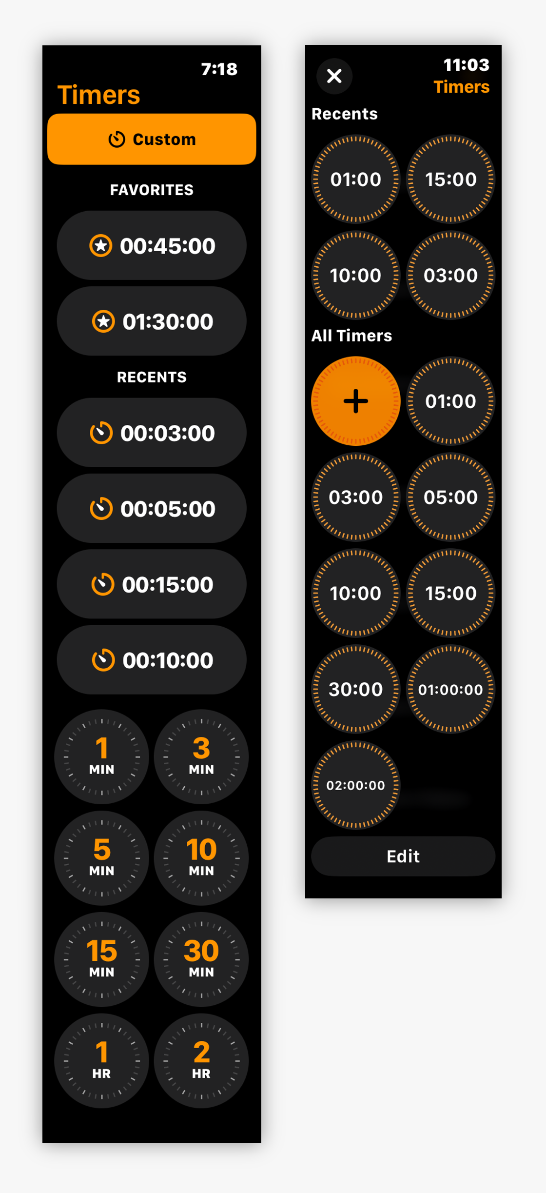
As we discuss these changes, I’ll be referring to the image below which shows how things looked before (left) and after (right) the new watchOS version:
The interface for picking a timer on watchOS 9 (left) and watchOS 10 (right)
Functionality
The root of the problem on watchOS 10 is that setting a timer is now done in a modal presentation (with a close button in the upper-left corner).
This means that no position is maintained between uses: the Recents are always at the top and have the ordering problem noted above. The magic 1/3/5/10/15/30 grid is only accessible by scrolling.
The new UI is impossible to use hands-free. Cooks who want to set or change a timer while deboning a chicken are out of luck.
This problem could be remedied if the last position in the modal view was maintained as in previous versions of watchOS. If maintaining the scroll position is not possible, an affordance to remove or collapse Recents would help by putting the magic 1/3/5/10/15/30 grid at the top of the view.
Additionally, the All Timers list begins with a big plus button. This breaks the muscle memory associated with 1 minute being in the top-left position – it’s now in the top-right.
In my experience, adding a timer is a rare occurance. I’ve done it twice in the 8 years I have owned an Apple Watch. Both were for laundry: one for a washing cycle and another for a drying cycle.
Putting the big plus button at the end of the list, and closer to Edit, feels like a better solution that makes the list more readable and familiar.
Accessibility
When you compare the screenshots of the previous and current versions you can easily see that watchOS 10 is more consistent. The list is also shorter because favorites have been folded into All Timers. These are both good things.
But the consistency works against me and my failing eyesight. Everything looks the same and it’s difficult to know where I am within the list. (Remember that you only seeing four of the circles on the watch face: there are points while scrolling where you can’t know if you’re in Recents or All Timers.)
As noted above, differentiating between “01:00” and “10:00” takes more effort. Not only is the text smaller, but there’s a lot of extra noise that affects readability. The text in watchOS 9 used “1 MIN” and “10 MIN”, with the numbers presented in an accent color to emphasize the minutes. It was much more readable.
The need for leading and trailing zeros to maintain consistency also leads to a situation where timers that are longer than 59 minutes get smaller text that’s harder to read. Luckily, the need for a 10 hour timer in my life is unlikely, so I don’t have to deal with reading a tiny “10:00:00” and “01:00:00”.
The leading and trailing zeros made some sense in watchOS 9’s Favorites and Recents list where each button’s label aligned well with its siblings. But with the grid layout in watchOS 10, the need for zero padding is not necessary and just feels like visual noise.
(Note that users with VoiceOver hear “one minute”, not “zero one colon zero zero” or “one minute zero seconds”. Visual noise for normal eyesight should be reduced just as it is with the spoken audio.)
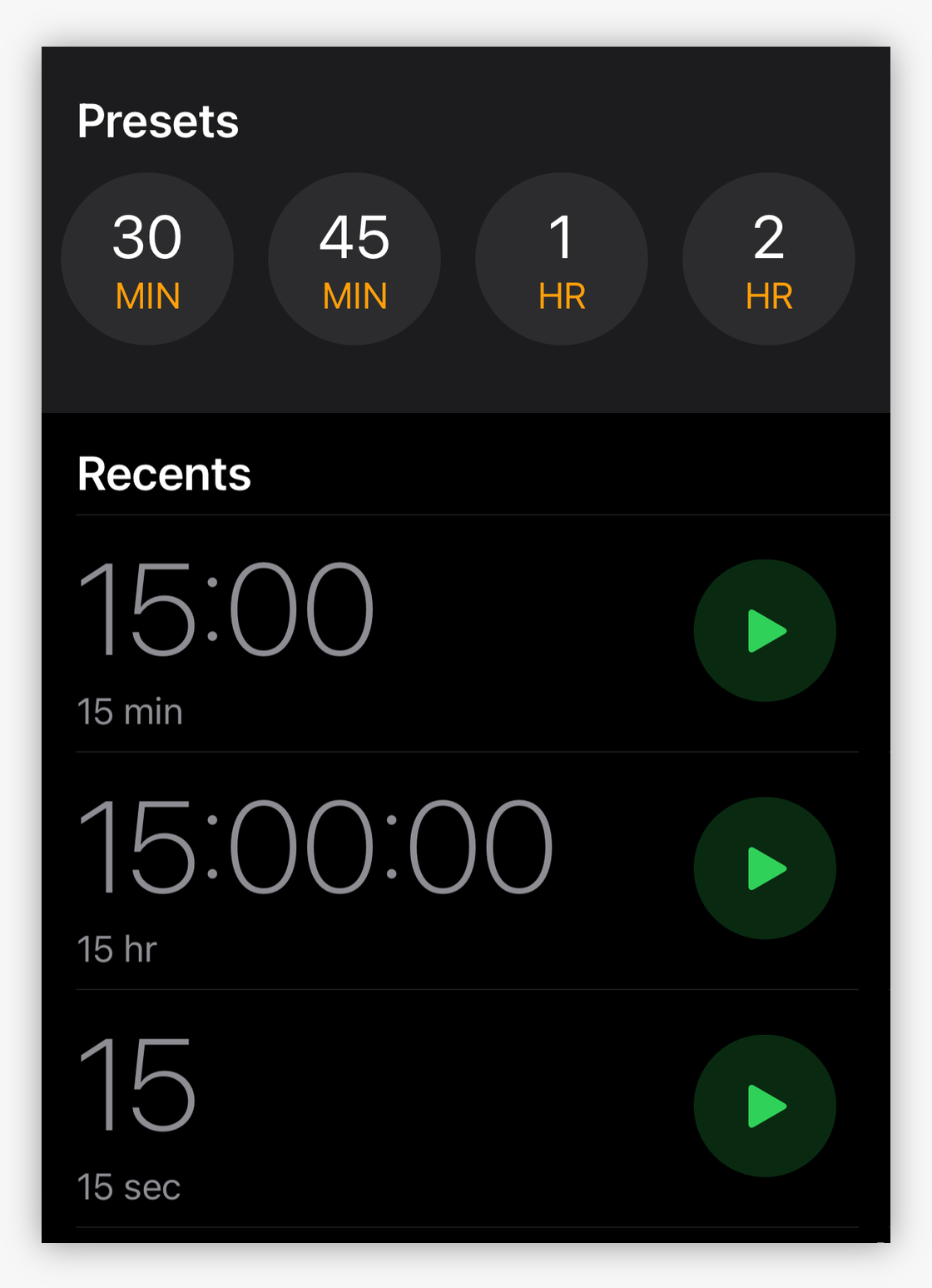
My first thought was that these changes on watchOS were an effort to get consistency across platforms, especially with the addition of multiple timers in iOS 17. This does not appear to be the case:
The Clock app on iOS 17 showing how timers are formatted in various contexts.
I have also wondered why seconds are shown as a part of the standard format on watchOS. I’m sure there are people that set timers for 12 minutes and 34 seconds, but they are certainly the outliers. When was the last time you had a pizza that needed 11:45 in the oven or a load of laundry that took 45:11?
People think in minutes, so minimize their cognitive load by focusing on that unit of time. By doing this, you could improve accessibility for everyone by using BIGGER NUMBERS on a small screen.
(Seconds could be handled in a way similar to the new Modular Ultra watch face. Dimming the trailing seconds would allow someone to know that “1:23” is one minute and 23 seconds and not one hour and 23 minutes. Again, minutes are the thing that’s most important to people.)
In summary, this is a rare case where less consistency would make for a better and more accessible user interface.
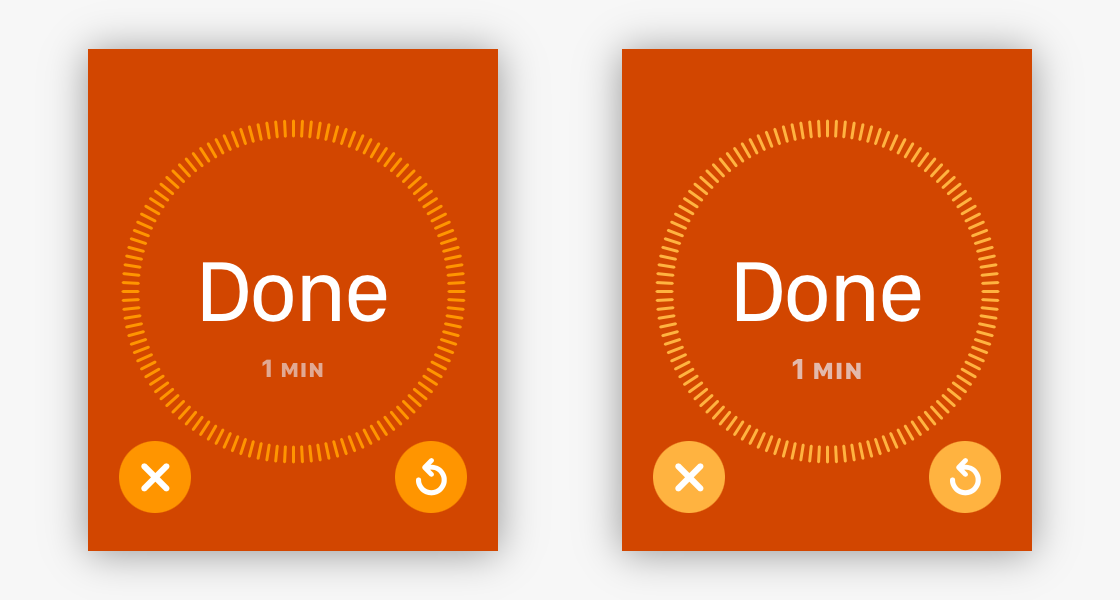
One final accessibility problem in the new Timer app is when one completes. Here is what you see, both with and without accessibility features turned on:
Bold text in the default size (left) and with increased contrast and size (right)
The image on the left has bold text turned on with the default text size. On the right, you see what happens when you make the text size larger and increase the contrast.
The timer length on this screen is not accessible and cannot be improved with accessibility settings. The dim text on a bright orange background is incredibly hard for me to read. I think the information hierarchy is the root of the problem.
“Done” is not the most important thing on this screen when you have a timer that completes: the length of what just finished is most significant. People will know what a bright orange screen and ringing means. They may not know which timer fired, and that can only be determined by reading “1 MIN” in dimmed out text at a much smaller size.
While counting, the current state of the timer belongs in large white text. When the count is complete, the length of the timer that finished has that same level of importance. This significance increases when you have multiple timers.
(Confusing timers with similar lengths is an easy thing to do: I nearly screwed up two COVID tests at a time when they were in extremely short supply. This happened because I didn’t notice the “5 MIN” and “15 MIN” text.)
At least the timer text in the screenshots above is not “01:00”. Please don’t make this consistent, too.
Conclusion
I’m honestly not looking forward to the next year with the Timer app. It’s going to be an irritation dozens of times every day.
My only hope is the other great improvements in watchOS 10, especially with workouts and activity tracking, will make up for it. 🤞
If you need to get in touch with me about any of this, there’s FB13212554. If you’re a developer who feels similarly about these regressions, please dupe this feedback (it’s a copy of this blog post). Otherwise, you can send your comments to Apple directly.