I’m 57 years old and my eyesight is getting worse every year. As a result, I have a newfound appreciation for the accessibility features that Apple builds into its products: they’re a lifeline for people who have problems worse than mine.
With such a unique and concerted effort towards accessibility, it’s surprising to see Apple ship a major OS release with a glaring usability issue. Yet that’s what we have in watchOS 4 when Bold Text is enabled.
I originally started using Bold Text at the suggestion of a friend and purely for aesthetic reasons. But as I used this feature, I found it also helped me read the information on my watch. It became an essential part of my user experience.
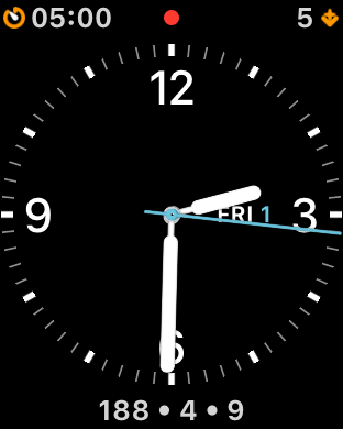
If you’re one of the lucky people who’s not using Bold Text on watchOS 4, you’re used to seeing clear and crisp icons for complications:
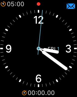
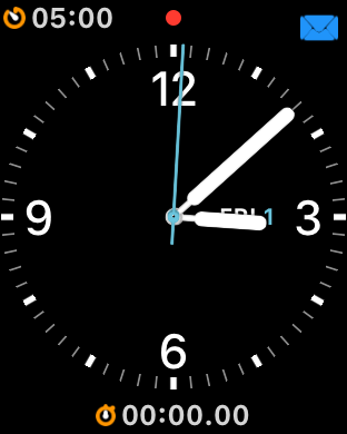
On the other hand, if you’re using Bold Text to help with legibility, you’ll find that the complication icons are fuzzy and sometimes impossible to distinguish:
What’s particularly concerning about this issue is the imprecise rendering has been around since I first reported it in watchOS 2.2 over two years ago!
(The gray part of the image above is a template for what should be rendered, the blue part is the what’s drawn on screen.)
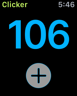
It’s annoying when your assets aren’t displayed correctly, but the fringing artifacts in Clicker don’t affect its accessibility.
But now this problem has worked its way onto the most important part of my Apple Watch and makes it hard for me to tell what’s on its face. It’s time to either fix this damn bug or rename the setting Bold Text and Complications That Look Like Ass.