Here’s what I’ve been pouring my heart and soul into since the day WWDC 2014 ended: Flare 2.
We started working on this project well before WWDC. A significant redesign that put content first had been completed. A lot of code had been written and the app was working well.
But…
WWDC was a cornucopia for developers. There were suddenly so many new things we could do on both iOS and OS X. It was overwhelming and exciting at the same time.
And…
Three things stood out for us: the new look for Yosemite, iOS 8 extensions, and CloudKit. We had always wanted to do something with Flare that needed these things. It really felt like we won the Apple developer lottery.
We could now create great photographic effects on our Macs and apply them to the photos taken with the camera that’s in our pocket. Perfect. Simple.
But even with a simple and perfect goal, execution is never easy. I think there’s always a lot to learn by looking back at the struggles you encounter during product development, so here are some things Anthony, Talos, Travis, Wolfgang, Sean and I encountered during our journey.
Yosemite’s User Interface
The Flattening
As I noted above, we’re acutely aware of the direction that OS X and iOS user interfaces are heading. We’ve been striving to put content first for a couple of years now. This effort started with Twitterrific 5.
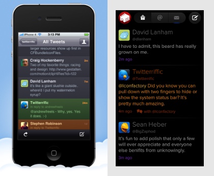
Note the date of the post in that last link: December 2012 was six months prior to iOS 7 and “flat user interfaces” being announced at WWDC 2013. While everyone else was making interfaces like the one on the left, we created the one on the right:
Click on the image to see a bigger version
We saw the same opportunity to simplify Flare. It was possible to create an app that put the customer’s content frontmost while retaining advanced controls to adjust the photo when needed.
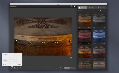
This is where we were at on May 28th of this year. Anthony’s mockup was already very flat and content-centric:
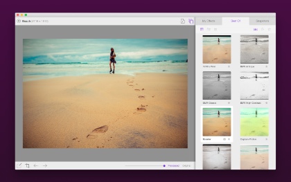
Of course, after WWDC we realize we could do even more to simplify the user interface. Here’s how the final product turned out:
(If you’re at all interested in interface design, I suggest downloading a copy of Flare just to try it out. There are a lot of animations and other effects that can’t be expressed in static screenshots.)
As a company, designing and implementing a user interface for Yosemite is a very important exercise. We have clients who want us to help move their apps in a similar direction, and the only way to become an expert with this stuff is by making it.
Here are a few observations from the “Yosemitification” of Flare. (And yes, we used “Yosemitify” frequently in our internal discussions!)
Tint & Themes
The influence of iOS 8 goes beyond the flatness of the design. We wanted to use control tint color to give the user feedback on the state of the application. The tint color also gave us a visual anchor between the two platforms were Flare runs: the purple tint links the user interfaces on iOS and OS X.
Unfortunately, OS X only supports the notion of two tints: blue or graphite. In the end, we wrote our own control cell classes that used a custom tint color. I’m hoping to have the time to open source this code some day: many products besides ours are embracing multiple platforms and these controls will be very helpful to other developers.
Another subtle touch in the Flare user interface: it supports both the light and dark themes in Yosemite. The theme support in Yosemite allows you to change the entire control hierarchy’s appearance at any time. We use this capability as another way to put the customer’s content first: sometimes their photos look best on a black background, other times a white background.
Vibrancy
There was a very common theme throughout Flare’s development. We would add vibrancy to the interface, and then a couple of weeks later, we’d remove it.
Personally, I think it’s a lovely and subtle effect. But it’s just too easy to use it in a way that interferes with usability. Text and other lightly stroked information (such as icons) can disappear on the subtly colored gradients that you have little control over.
The last vibrant holdout in Flare was the header at the top of the list of effects. In fact, we removed it the day before the app was submitted for review! The thumbnail images looked really cool sliding up underneath a transparent header, but since we don’t have control of the content generated by the thumbnails, it was much too easy to have colors that rendered the icons and text unreadable.
(In the screenshot above, you will notice a slight color shift between the header and the thumbnail content that’s not in the final product: the screenshot was created before we removed the visual effects view.)
Vibrancy does still have a place in our app. It works great in the “guided tour” for displaying help over the content and controls of the interface. This guided tour is also a piece of UI that we’re all very proud of: we wish we could sit down with every customer and say “Hey, look at this!”, but this tour is a really great alternative.
iOS 8 Extensions
Tools
Let’s just say things were a little rough development-wise at the beginning. Extensions are an awesome addition to both OS X and iOS, but as with anything new, they were also fragile. At one point, the only debugging tool was my old friend printf(). Not having Instruments available to track down memory leaks makes you appreciate the awesome power of that tool.
As new versions of Xcode came out during the iOS 8 beta, the situation improved steadily. This is why they call it the “bleeding edge.” I just want to know why I always forget this when starting out with something new and shiny :-)
I’ll have some more to say about these tools in the very near future: I’m working on a field guide for iOS extension development.
Memory
As someone who developed an app on the original iPhone using iOS 2.0, I didn’t think there would ever again be so many problems with managing memory. I was wrong.
Creating the Photos Extensions in Flare Effects was a huge challenge. First off, the most recent cameras have very high resolution. For example, the native size on my iPhone 6 is 2448 x 3264 pixels. That’s over 20 MB of source data you need to deal with.
These big images are being handled in an XPC process that runs at the same time as the Photos or Camera processes. You’re not the only one who’s dealing with a lot of pixels.
Compounding this is the fact that you usually need several of these big images around for compositing and other effects. Luckily, a lot of the magic in Flare (and iOS 8 in general) is done with Core Image, so a lot of the heavy memory requirements can be offloaded to the GPU via OpenGL ES. But even then, you have to be very careful: a post on Stack Overflow about managing textures across thread boundaries, literally saved our ass. I owe Max a beer.
Wolfgang did some amazing work to get our very complex filters running smoothly on iOS. Despite the APIs for Core Image being nearly identical between OS X and iOS, the data and parameters you feed the filters have very different requirements. Textures, scaling factors, extents and many other things had to be adjusted for the new platform!
The situation with memory was a constant struggle. In fact, it was even an issue after we had the app approved and ready for sale. We discovered a crashing bug that only happened on the iPhone 6 Plus because it needed a @3x preview image that weighed in at over 20 MB! Rejecting a binary and resubmitting for review the day before an Apple Event is not for the faint of heart.
CloudKit
As developers we often complained about the opaqueness of iCloud. Things would happen and you’d have no idea what was going on behind the scenes.
With CloudKit, that all changed. We’re now responsible for every little thing. Every response, every error, every piece of data. That’s a good thing, but the age-old fact remains: syncing is hard.
Luckily, my colleague Sean likes hard problems and built a syncing system that “just works”. Even then, we’re a little afraid we haven’t covered all the bases: just before submitting the app for review, we discovered an issue where expired tokens weren’t being handled correctly (because we’d switched from the development servers to the production servers.) To be honest here, our fingers are still crossed as we deploy this to millions of potential customers.
Still, the flexibility and breadth of this new API makes it all worthwhile. It makes it possible for us to get cool and free photo effects to folks on iOS even if they don’t use our Mac product. Doing something like that prior to iOS 8 and CloudKit would have been cost prohibitive from an infrastructure point-of-view.
Conclusion
So there you have it, a roundup of all the fun stuff that went into making Flare 2. We hope you enjoy it!


