There’s no doubt in my mind that Apple is going to overhaul the look of Mac OS X in the next version. As more and more apps bridge the gap between the desktop and mobile, the lack of consistent branding and design across platforms is becoming a problem.
I fully expect to see flatter user interfaces, squircle icons, a new Dock, and Helvetica Neue as the system font. We’ve already explored a flattened UI and new icons in xScope, but I was still left wondering what the app would look like with Helvetica Neue as the system font. There’s a lot of custom drawing in xScope and I was pretty sure there would be some areas where sizing and placement would be wrong because the metrics for Lucida Grande were assumed.
So I wrote this.
This category swizzles the NSFont class methods to return a different system font. The instance method to initialize a font from an archive (like a XIB) is also swizzled and the font is replaced if it’s Lucida Grande. The MAC_OS_X_VERSION_NT definition is both an inside joke and a way to make sure your code can adapt to any font.
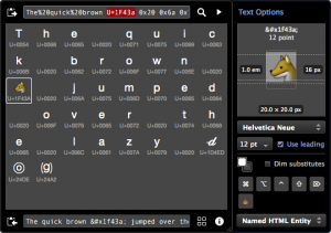
Here’s what one of the new tools in xScope 4 looked like before using the category:
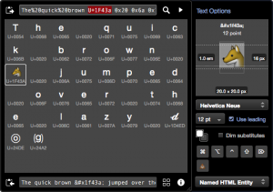
And here it is with Helvetica Neue as the new system font:
As you can see, there are lots of small misalignments, both in my custom controls and the ones provided by Apple.
Changing the system font will be a bit like the transition to the Retina Display: lots of small tweaks to keep our apps looking perfect. Now would be a good time to start looking for areas where your app is going to need work.

