Apple has recently released Xcode 4—a major part of this release is an overhaul of the user interface. Change in your development environment is always a bit disruptive, but overall I think the move towards a single-window environment that adapts to different working modes is a good thing.
But this post is not to debate these changes to the programming environment. Rather, I’d like to discuss the new documentation viewer and how it has become unsuitable for both Mac and iOS development.
Apple’s technical documentation has always been top-notch: well written with just the right amount of technical detail. Unfortunately, the documentation viewer that we use to read this valuable information has been declining in ease of use over the past few releases.
It has gotten to the point where frustration with usability overshadows the excellent content. The best way to describe these annoyances is by example: I often get the feeling that the writers who create this prose don’t understand how we use it. Hopefully, this critique will help Apple create a viewer that’s just as good as the information it holds.
A corrupt index
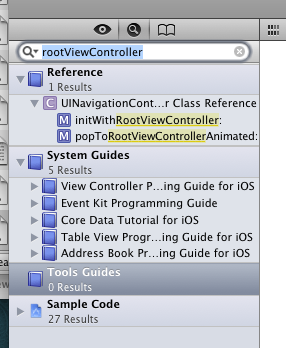
A developer coming from Xcode 3 will have a terrible first experience with the new documentation viewer. Any previously installed documentation sets are incompatible with Xcode 4. Methods that you know exist just don’t show up:

There are also problems with the Jump Bar navigation stack not being recorded correctly and the browsing history being unavailable (the back button isn’t available when it should be.)
Presumably, there is a corrupt or incompatible index. The workaround is to delete and re-install the documentation set, but this is far from obvious.
Since I currently have three different versions of Xcode installed (and will continue to use Xcode 3 for the foreseeable future), I’m wondering if this corrupted/incompatible index will continue to be a problem. Fingers are crossed, but at least now we know what to fix if it breaks.
Popup hell
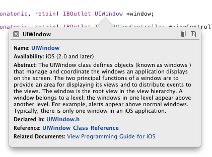
When you hold down the option key and click on a symbol in Xcode, you see the following window:

For novices, this window has some utility—it provides a simple way for them to dig into what is probably unfamiliar territory (“What’s a UIWindow anyway?”).
The problem is that this window becomes a roadblock for experienced developers. We know damn well what a UIWindow is: we need to dig into the details of this important class. Maybe we want to know more about the rootViewController instance or look at some of the methods in UIResponder (because we know it inherits from that.) This helpful popup quickly becomes a hindrance.
In previous versions of Xcode, holding down the shift key along with the option key gave you a quick way to avoid this popup help. In Xcode 4, that shortcut is gone.
Considering that this feature can get in the way hundreds of times per day, this is truly popup hell.
No methods
Once you get the documentation index in working order and actually make it past the popup help, your next hurdle is to locate the information you seek. Let’s say we’re looking for some background on what happens when a new -rootViewController instance is assigned. We’ve got the page of documentation, but there aren’t any controls to show the methods for the UIWindow class:
Besides being a pain in the butt, this is wholly inconsistent with the behavior in the code editor:
(Note that typing “ro” is enough to select “rootViewController” in the code editor’s popup menu. That, followed by the enter key gets you to the code of interest.)
From a developer’s point-of-view, the header files and the documentation page go hand-in-hand. Make the UI affordances the same and we don’t have to think about whether we’re looking at code or the words that describe it.
With a little more digging, you’ll find that you can get to the rootViewController documentation with the Jump Bar. Unfortunately, it takes a lot more effort than in the code editor: you have to click on the class name, and then move the mouse until the subcategories appear. Choose “Instance Methods” and wonder why rootViewController isn’t there. Then move the mouse back and try Properties.
Bingo (but you don’t feel like a winner.) And forget about navigating these lists quickly and easily with the keyboard as you can with the code editor.
Unmanaged complexity
Our final navigation problem is reading chapter-based documentation. These are the crown jewels of Apple’s developer documentation. Titles like The Objective-C Programming Language, iPhone Human Interface Guidelines, and the Cocoa Fundamentals Guide are essential reading for all developers, both beginner and advanced. As I began learning about Xcode 4, of course I turned to the excellent User Guide.
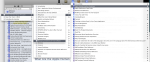
These guides typically span many chapters when sections that cover a wide range of topics. And this is how you navigate through those chapters:
Managing complexity, indeed.
The pity here is that someone in developer documentation has forgotten that a Table of Contents tells a much more important story than the individual chapters. A roadmap lets you visit the destinations efficiently.
To get an idea of how painful this is, try finding the recommended Singleton implementation in the Cocoa Fundamentals Guide using the Jump Bar. I’ll wait. (For extra credit, count how many menus you open in the process.)
Of course the documentation viewer has a search function, but even that’s a bit laborious because you have to click on a lot of disclosure triangles to find the right item in the results. Why aren’t the relevant results opened automatically? (And, yes, option clicking the disclosure triangle can be used to achieve this goal, but the question still remains: why isn’t this the default action?)
Updated March 29th, 2011: Matt Neuburg has discovered that for some documents, search results don’t show where your term occurs; you’re shown a higher-level page, but not the actual page.
The root of the problem here and with the method names in the class documentation, is that a deep hierarchy is too hard to navigate. Present the information in a single list and it becomes much more useful. Imagine how bad the code editor navigation would be if it presented a hierarchy based upon classes, properties and methods. It’s flattened into a single menu for a reason: and those same reasons exist in the documentation viewer.
The Jump Bar is a great addition to Xcode, but it’s true power lies in having a predictable end point. With code, that end point is a function, property or method. With documentation, that end point is elusive: it varies depending both with the type and the structure of the documentation you’re viewing. And that’s a real problem when you’re looking for something.
ePub, not PDF
While we’re on the subject of this long-form documentation, why isn’t more of it available in the ePub format used by iBooks? It’s pretty safe to assume a huge majority of Mac and iOS developers have an iPad and like to use it for technical documentation. Searching for “Apple Developer Publications” in iBooks results in only six books. That’s a great start, but there is still a lot of documentation available only in PDF.
PDF is, of course, an option for iBooks. But turns out to be unsuitable because there is no back button. If you click a link in the PDF file, it’s a one way proposition. And for technical documentation, that’s a deal killer.
ePub also has the advantage of better font control and image viewing.
Some good news
Fortunately, it’s not all bad news. This new version of the documentation viewer seems to keep track of its place on the page much more reliably than in the past. Gone are the days where hitting the back button put you back as the top of the page (instead of the method or property you were looking at previously.)
This one simple fix will save developers a huge amount of time. Thanks!
Ingredients
This situation with the Xcode document viewer has gotten so bad two developers, Alex Gordon and Jean-Nicolas Jolivet, have taken matters into their own hands. This ultimate workaround is an application called Ingredients.
Ingredients parses the HTML files used by Apple’s own viewer and persists the information with Core Data. The result is quick access to the documentation you need with advanced options to filter and sort to your liking. Recent work by Troy Gaul added an item to the Services menu so a keyboard shortcut can be created to view the selected symbol from any text editor (include Xcode.)
If the problems mentioned above affect you adversely, take a look at this alternative documentation viewer. And please take a moment and file duplicate bug reports using the Radar links above. This is the best way to give Apple an idea of how much this is affecting our daily work. Thanks!
Updated March 22nd, 2011: The developers of Ingredients are now accepting donations.


