Summary
Changes to the Dock in Leopard do not follow the Human Interface Guidelines
Steps to Reproduce
- Set desktop background to a light and solid color to make the shadows appear more clearly. In the examples, I used Solid Mint.
- Make sure Preview and TextEdit are displayed in the Dock. Additionally, you can download and launch Transmit as another example.
- Look at the Dock.
Expected Results
The Human Interface Guidelines contain three salient points:
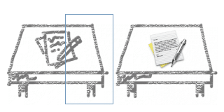
- Application icons look like they are sitting on a desk in front of you.
- Utility icons are depicted as if they were on a shelf in front of you. Flat objects appear as if there were a wall behind them with an appropriate shadow behind the object.
- Perspective and shadows are the most important components of making good Aqua icons. Use a single light source with the light coming from above the icon.
Reference: Icon Perspectives and Materials and Tips for Designing Aqua Icons
Based on this information, you’d expect the Dock to use either the desk or shelf perspectives. You would also expect a single light source to be used.
Actual Results
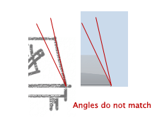
The floor displayed on the Dock does not use the perspective of the desk in front of you, nor does it appear as a shelf. Because there’s a difference between the floor angles and the traditional desktop icon angles, many icons look wrong.
An example is the Trash, which has a slight tilt forward. The Transmit truck also looks like its pirouetting on the front-left tire.
 Figure 1. Angle defined by Human Interface Guidelines
 Figure 2. Angle defined by Leopard Dock
 Figure 3. Whoops!
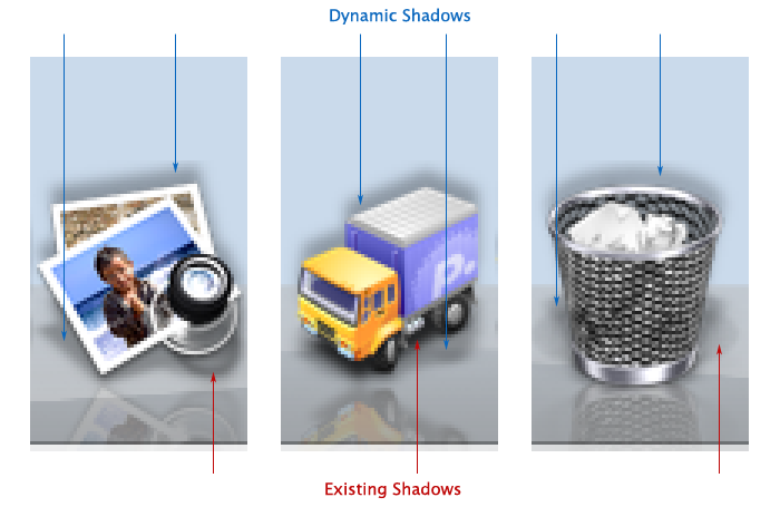
Also, the shadows displayed in the Dock are coming from three separate light sources:
- The traditional icon shadow, where the light source is above the icon (traditionally from the viewer’s left-hand side.)
- A new dynamically generated shadow which uses a light source in the top-middle of the screen.
- Another dynamically generated shadow which uses a light source in the lower-middle part of the screen.
The dynamically generated shadows often conflict with the shadow added by the icon artist.
As an example, look at the loupe in the Preview icon or the halo on the Trash icon. The shadow underneath the Transmit truck is another example.
 Figure 4. How many light sources do you need?
Another inconsistency is that the “built-in” shadow is shown in the reflection—the dynamic shadows are not.
Finally, the shadows make no sense at all when the Dock is placed on the left or right side of the screen. The shadows below the icon end up floating out in space because they have no surface to be cast upon.
Regression
Previous versions of the Dock used a shelf perspective and did not have dynamically generated shadows, so this was not an issue.
Hundreds of designers have been producing icons for tens of thousands of applications by following the Human Interface Guidelines. Changes to the Dock should respect these guidelines since changing existing artwork is not an option on such a large scale.
If you’re a developer or designer with an ADC account, you might want to let Apple know if this will be a problem for your applications. Reference Radar Bug ID# 5301211.
Update: It’s good to know that there is at least one other person who thinks this is a problem. This bug report is a duplicate of Bug ID# 5176881.
Update: More proof that perspective in the new three dimensional Dock is not well thought out: Physics still matter, even with special effects.
Update: I wouldn’t have written this bug report if the Dock in Leopard looked like this.
Update: Bet you didn’t know that the Dock also defies the laws of gravity.