Responsive Color with Media Queries

Introduction

This page demonstrates how to use the latest web standards to display images with higher quality. For more information on the color management techniques that make this possible, check out my book Making Sense of Color Management published by A Book Apart.

Make sure to check the source code of this page for details about the examples shown below.

This <div> changes the background-image CSS property with the new color-gamut @media query. This code lets the background image match the display's resolution and color space.

The color-gamut media query

A photo that uses a media query to select a wider gamut image

The photo above uses a color-gamut media query to detect a display with a DCI-P3 color profile.

This new media query lets you choose an image that best matches the display. Product photography and hero images with wide gamuts can look much better than with today's default of sRGB.

Check the source code to see the mechanics of this media query. The photo is courtesy of Jeff Carlson.

Simulated color-gamut change

A photo that uses a media query to select a wider gamut image

Since the color-gamut media query is only a draft proposal at the CSS Working Group, there is limited support in today's browsers. The example above uses a min-width media query to adjust the image and give you simulation of the effect.

Make this window wider than 600 pixels and you'll see a more vibrant rendition if the browser supports color profiles (see below). You may need to refresh the page to give the browser a chance load and cache new sources for the <picture> container.

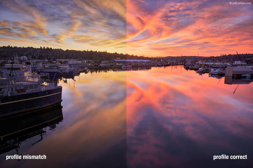
Testing color profile support

A photo with a embedded profile that will be obvious when it's not being used

In a desktop browser, the photo above will be rendered correctly because there is wide support for images with embedded color profiles. The image above was created in Photoshop using a color profile that rotates the hue values by 135°, causing blues to become green and oranges to become purple. The image's messed up raw color values are transformed by the browser into visually correct ones using the color profile.

Unfortunately, on mobile devices, there isn't wide support for embedded color profiles. If you view this page on an Android device or an older iPhone or iPad, you may think you're hallucinating. Don't worry: the wild colors are happening because the color profile isn't being processed.

Safari on iOS 9.3 (and later) and the Edge browser on Windows are currently the only browsers that handle color correctly on mobile. This is situation is likely to improve over time: just remember that it was seven years between Safari adopting color management in 2005 and Chrome having the same capability in 2012.

Simulated color profile mismatch

A photo that demonstrates a color profile mismatch

The previous example was an extreme case, but the lack of color management can be surprising in subtle ways. In the photo above, the right side shows what the image looks like when the ProPhoto RGB color profile is processed correctly.

The left side shows the muted colors that result when a wide gamut image is displayed on a device that can't handle it. A visitor to your site on Android would see the image on the left, while someone on iOS would see what's on the right. When you use the <picture> container, you can avoid this problem.

Check color-gamut in JavaScript

The button above will run the color-gamut media query in JavaScript using window.matchMedia. An image that's appropriate for the display will then be loaded dynamically with test results in the caption.

This technique can be used to adjust page elements so they mach the screen's gamut and to tailor requests for image resources that are loaded dynamically.